Breaking the rules of composition
Jan 4, 2017 11:50:19 #
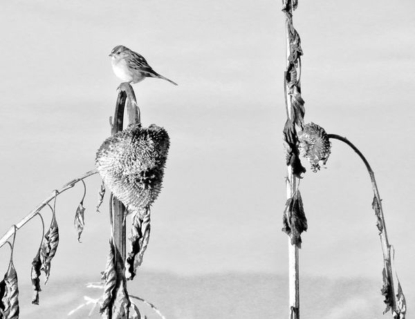
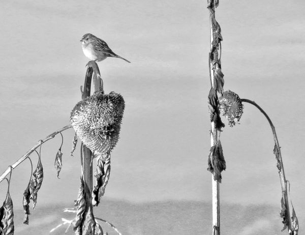
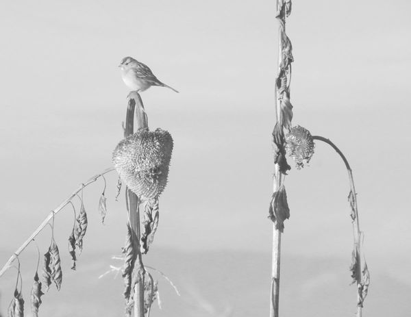
Your feedback requested on composition and pp. Please be sure to give the "why" 
Thank you!

Thank you!
Jan 4, 2017 12:11:29 #
Interesting composition, the second one is the one I like because it has a bit more contrast.
Regarding your title "Breaking the Rules of Composition," I have a problem with calling them rules. Rules imply that they need to be rigidly applied, which disagree with. I think they are a guide and a very good guide at that. But I object to the common idea that they are indeed rules.
Regarding your title "Breaking the Rules of Composition," I have a problem with calling them rules. Rules imply that they need to be rigidly applied, which disagree with. I think they are a guide and a very good guide at that. But I object to the common idea that they are indeed rules.
Jan 4, 2017 12:11:52 #
My eyes kept looking left to right and back.I cropped just on the bird and stalk,it was more pleasing to look at.then move the image to the right side of crop,so it gave some space for the bird to look out.When I compose a shot,it happens very quickly for me,almost no thought,but it " feels " right,then I take the picture.just some quick thoughts from my view.
Jan 4, 2017 12:13:41 #
I prefer #2. Nice composition. It is more defined, captures better detail.
Jan 4, 2017 12:16:21 #
#2 is the best to me. I would have cropped the stalk on the right as it leads the eye away from the subject. Just my opinion, though.
Jan 4, 2017 12:16:43 #
LarryFB wrote:
Interesting composition, the second one is the one I like because it has a bit more contrast.
Regarding your title "Breaking the Rules of Composition," I have a problem with calling them rules. Rules imply that they need to be rigidly applied, which disagree with. I think they are a guide and a very good guide at that. But I object to the common idea that they are indeed rules.
Regarding your title "Breaking the Rules of Composition," I have a problem with calling them rules. Rules imply that they need to be rigidly applied, which disagree with. I think they are a guide and a very good guide at that. But I object to the common idea that they are indeed rules.
Thanks for commenting! I'm so glad you brought up the drawback to using the term "rules." If they are rules, there are a whole bunch of examples of successful breaking thereof, aren't there

I imagine, though, that having the guides in place help those new to photography (or art, because I had a painter friend who late in life took up photography and her compositions were always spot-on). A place to begin and to help train the eye.
Jan 4, 2017 12:17:45 #
LarryFB wrote:
Interesting composition, the second one is the one I like because it has a bit more contrast.
Regarding your title "Breaking the Rules of Composition," I have a problem with calling them rules. Rules imply that they need to be rigidly applied, which disagree with. I think they are a guide and a very good guide at that. But I object to the common idea that they are indeed rules.
Regarding your title "Breaking the Rules of Composition," I have a problem with calling them rules. Rules imply that they need to be rigidly applied, which disagree with. I think they are a guide and a very good guide at that. But I object to the common idea that they are indeed rules.
Think of them as, "As a rule, these ideas might improve your composition."
I don't like either of these images. The stick on the right is a distraction. The bird is too small. Birds look better in color.
I'd crop way in and put the bird's eye on one of the upper third power points.
Jan 4, 2017 12:19:39 #
oceanarrow wrote:
My eyes kept looking left to right and back.I cropped just on the bird and stalk,it was more pleasing to look at.then move the image to the right side of crop,so it gave some space for the bird to look out.When I compose a shot,it happens very quickly for me,almost no thought,but it " feels " right,then I take the picture.just some quick thoughts from my view.
Thank you so much for your time! I was curious how folks would feel about the bird looking out of the frame, as well as the stalk on right leading up and out. Sometimes quirky can be enjoyable, sometimes frustrating. And this subject may lend itself more to traditional, and a feeling of serenity.
Jan 4, 2017 12:20:07 #
Commando wrote:
I prefer #2. Nice composition. It is more defined, captures better detail.
Thank you kindly

Jan 4, 2017 12:22:15 #
kpmac wrote:
#2 is the best to me. I would have cropped the stalk on the right as it leads the eye away from the subject. Just my opinion, though.
Thank you so much for your visit. Yes, there are definitely elements that take one's eye out of the frame; I was curious how that would come across: frustrating or interesting (or other) - and applying to the whole image, whether one could be coaxed back to check out texture or other details.
I appreciate your viewpoint!
Jan 4, 2017 12:26:00 #
MtnMan wrote:
Think of them as, "As a rule, these ideas might improve your composition."
I don't like either of these images. The stick on the right is a distraction. The bird is too small. Birds look better in color.
I'd crop way in and put the bird's eye on one of the upper third power points.
I don't like either of these images. The stick on the right is a distraction. The bird is too small. Birds look better in color.
I'd crop way in and put the bird's eye on one of the upper third power points.
Thank you, MtnMan. Your comments speak to the more tried and true compositions, for sure. The "bird being too small" is only if we think of the bird itself as the subject. I hoped to elicit interest in "bird on dead sunflower in a field of dead sunflowers."
Regarding "birds look better in color," we could discuss that opinion for awhile - lol - and provide examples of our preferences.
In this case, the bird is a plain brown sparrow sitting on a dead sunflower. The only color in the scene, other than brown, was the sky. Without color, I thought more attention could be given to lines , curves and textures of the overall scene.
Thanks so much for your time and opinions! I'm grateful for your feedback.
Jan 4, 2017 12:36:37 #
wdross
Loc: Castle Rock, Colorado
Linda From Maine wrote:
Your feedback requested on composition and pp. Please be sure to give the "why" 
Thank you!

Thank you!
I think it is at an interesting and challenging composition.
First, I would crop slightly from the bottom and the left. This would biring the sparrow slightly further into the photograph and place the two stalks approximately on the thirds demarcation. This would also "enlarge" the subject matter a little more.
Second, I would increase the contrast a little more while keeping the background similar to your first download. Making the background as "bland" whitish as possible detracts the least from your subjects. Gray backgrounds usually don't work as well as a black or a white backgrounds.
As far as your downloads go, I personally like the first one. One other composition that you could try is a vertical of just the one stalk with the bird. It just depends on how much image quality there is in the original file.
Jan 4, 2017 12:54:40 #
wdross wrote:
I think it is at an interesting and challenging co... (show quote)
Thanks so much for your in-depth comments! Regarding cropping, did you mean crop from right rather than left, as cropping from left moves the bird even closer to edge of frame. I might be mis-understanding.
I like your point about background tones very much. I really like contrasty b&w images, so that makes your suggestion even more appealing.
Regarding another composition of just the bird and sunflower, I do have several closer shots I took during that outing that are just about the bird and one flower.
Thank you for your time!
Jan 4, 2017 13:11:09 #
wdross
Loc: Castle Rock, Colorado
Linda From Maine wrote:
Thanks so much for your in-depth comments! Regardi... (show quote)
I could be wrong, but I feel cropping just slightly, and I do mean slightly, from the left places the stalk closer to one third demarcation and becomes more of a lead-in for the bird even if it does place the bird a slight bit closer to the edge. The bird is just a small part of this photographic composition and I feel needs something to help leading to it, namely the stalk and sunflower. That is also why I suggested a vertical composition and cropping out the other stalk so the bird becomes a bigger part of the composition.
Jan 4, 2017 13:26:07 #
wdross wrote:
I could be wrong, but I feel cropping just slightl... (show quote)
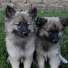
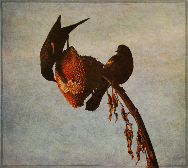
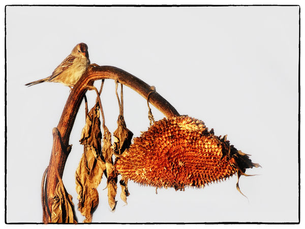
OK, thanks again for your time! Here are two of the several closer shots I was able to capture. I've done several processing experiments, including a b&w with grunge. #1 below has a texture file added. #2 below has a lot of added color and warmth, for MtnMan

If you want to reply, then register here. Registration is free and your account is created instantly, so you can post right away.

