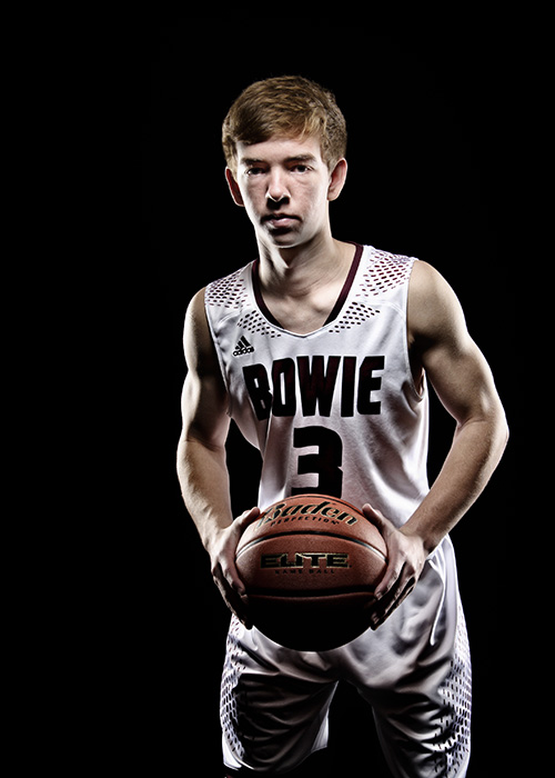
Does this type of processing look appropriate for a black background...
Dec 17, 2016 09:13:53 #

oneillj wrote:
I'm doing Posters for a basketball team and though... (show quote)
For me, I would reposition the BB so you can read the name on the ball.
Dec 17, 2016 09:16:01 #

Dec 17, 2016 11:15:26 #

For once (Ah!) I find most of the posters off the mark.
- The facial expression is what makes the picture work. It is in par with the mood. Smiling girl in there? Naw.
- The dark shadow under the face also is part of the image. Lighten it and everything is off-kilter.
- Re-position the ball to what? Is this a commercial? Nope so while it seems a good idea it is not. Bring back the skin tone? Come on now. Lightening the forefront and using 'natural colors'?
- This is the worst thing one can do 'improve this shot.
Think about what you are looking at folks.
This image is not about being accurate over anything but to transmit a different approach to this type of photography. The whole thing is done properly w/o exaggeration.
Oh, even the cut feet work so don't go there.
To the op: Listen to YOUR instinct. You are way ahead than many here.
By the way, this is what I mean with 'yup' Something that is good needs no comment.
Dec 17, 2016 19:06:22 #

Dec 17, 2016 22:09:02 #
Dec 17, 2016 22:15:51 #
This time it does not work as well.
The head is lower. The body is bent forward. This creates too many shadow issues.
The ball held that way is also an issue.
Note this is an opinion but comparing the two, the first image was definitively a winner. This one is not.
Come to think of it... The girl is saying, 'This is mine, come and get it'. This guy is saying nothing other than 'I play with this'.
Dec 17, 2016 22:24:28 #
Well, the girl is just a stand in from the day before. She would rather get back to my classroom and finish watching The Secret Life of Pets. I just needed to check my lighting setup and run the processing by you guys.
Dec 17, 2016 22:38:45 #

I like it, oneillj! The black background makes the subject stand out nicely.
Dec 17, 2016 22:40:10 #

The light Diffuse the skin. I'd try putting lights forward Diffuse it with a sheet in a frame or something for me light is to far back creating lots of shadows.
Dec 17, 2016 23:31:46 #
dirtpusher wrote:
The light Diffuse the skin. I'd try putting lights forward Diffuse it with a sheet in a frame or something for me light is to far back creating lots of shadows.
I had them step back about 6 inches from the middle of the beauty dish so I can get the ball lit. The Photoshop processing is what creates the contrasty look. The dish had a grid on it.
Dec 18, 2016 00:37:46 #

Rongnongno wrote:
This time it does not work as well.
The head is lower. The body is bent forward. This creates too many shadow issues.
The ball held that way is also an issue.
Note this is an opinion but comparing the two, the first image was definitively a winner. This one is not.
Come to think of it... The girl is saying, 'This is mine, come and get it'. This guy is saying nothing other than 'I play with this'.
The head is lower. The body is bent forward. This creates too many shadow issues.
The ball held that way is also an issue.
Note this is an opinion but comparing the two, the first image was definitively a winner. This one is not.
Come to think of it... The girl is saying, 'This is mine, come and get it'. This guy is saying nothing other than 'I play with this'.
I agree.
Dec 18, 2016 03:08:20 #
I definitely like the first one... the second one, not much at all. The girl looks like she has attitude, in a good way, not bad. Her expression is right for what you are trying to accomplish. The second one just doesn't cut it... his expression, the way he is holding the ball, his stance, don't do anything for me or the photo.
Dec 18, 2016 10:10:16 #

Rongnongno wrote:
This time it does not work as well.
The head is lower. The body is bent forward. This creates too many shadow issues.
The ball held that way is also an issue.
Note this is an opinion but comparing the two, the first image was definitively a winner. This one is not.
Come to think of it... The girl is saying, 'This is mine, come and get it'. This guy is saying nothing other than 'I play with this'.
The head is lower. The body is bent forward. This creates too many shadow issues.
The ball held that way is also an issue.
Note this is an opinion but comparing the two, the first image was definitively a winner. This one is not.
Come to think of it... The girl is saying, 'This is mine, come and get it'. This guy is saying nothing other than 'I play with this'.
I agree with Rongnongno on this
Dec 19, 2016 14:05:56 #
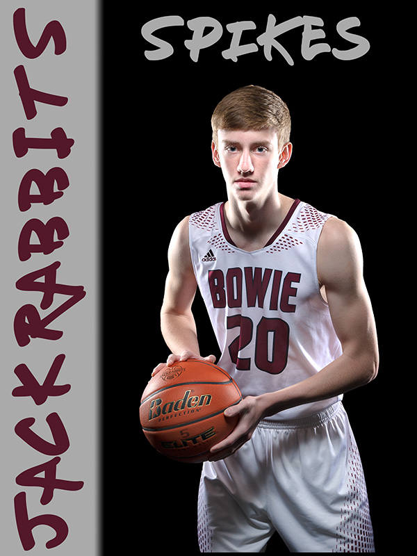
Well, here's what we finally decided on. HS basketball posters to put up in the gym. Someone else did the girls team. This is one of 11.
Dec 19, 2016 14:30:59 #
oneillj wrote:
Well, here's what we finally decided on. HS basketball posters to put up in the gym. Someone did the girls team. This is one of 11.
I like it ...new pose , lighting looks better....JackRabbits....Spike??? What do those represent?? just curious
If you want to reply, then register here. Registration is free and your account is created instantly, so you can post right away.