Color Mgmt on Photoshop
May 4, 2012 02:57:52 #
When you get the RAW pic, you have a lot of adjustments to play with.
Move all the sliders ( little bit at a time ) and see what changes.......... it is almost endless !
Then save your final set up as a TIFF file and you can re-adjust again !
Move all the sliders ( little bit at a time ) and see what changes.......... it is almost endless !
Then save your final set up as a TIFF file and you can re-adjust again !
May 4, 2012 03:01:42 #

My PS7 does not have Highlight/shadow but my CS4 does - I switch I use PS 7 most always but switch to CS 4 when I need the wonderful tool H/S
Turbo wrote:
Depends on what PP software you use.
If you have access to PhotoShop, you can work with EXPOSURES, Shadow / Highlights ...etc and get different effects.
I also wonder if you shot that pic in RAW ??
That way, you can really control the final outcome.
If you have access to PhotoShop, you can work with EXPOSURES, Shadow / Highlights ...etc and get different effects.
I also wonder if you shot that pic in RAW ??
That way, you can really control the final outcome.
May 4, 2012 08:15:02 #
May 4, 2012 10:28:44 #
May 4, 2012 12:54:24 #
FotoFan wrote:
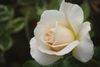
Yes, I have Photoshop CS5 and I shot it in raw. Looking for suggestions on how to manage the color.
Turbo wrote:
Depends on what PP software you use.
If you have access to PhotoShop, you can work with EXPOSURES, Shadow / Highlights ...etc and get different effects.
I also wonder if you shot that pic in RAW ??
That way, you can really control the final outcome.
If you have access to PhotoShop, you can work with EXPOSURES, Shadow / Highlights ...etc and get different effects.
I also wonder if you shot that pic in RAW ??
That way, you can really control the final outcome.
Yes, I have Photoshop CS5 and I shot it in raw. Looking for suggestions on how to manage the color.
One of the issues that all of us who try to help out is we cannot see the actual flower. From the responses that I see you should be able to figure out a lot of your issue with this image.
By the way, when I shoot digital, I have 2 standards.
1. I shoot raw
2. I shoot manual.
Jusst my way of doing it. Everyone do your own thing.
Most important of all KEEP SHOOTING!
May 6, 2012 01:40:05 #
Thank you for all your helpful responses. Will keep trying some of the ideas. Still a novice on Photoshop so nowhere to go but up..
Just wanted you all to know - I entered a rose photography contest today and walked away with "Best of Show." this rose came in second prize. Another photo won Best of Show.
Just wanted you all to know - I entered a rose photography contest today and walked away with "Best of Show." this rose came in second prize. Another photo won Best of Show.
May 7, 2012 07:54:52 #
FotoFan wrote:
Thank you for all your helpful responses. Will keep trying some of the ideas. Still a novice on Photoshop so nowhere to go but up..
Just wanted you all to know - I entered a rose photography contest today and walked away with "Best of Show." this rose came in second prize. Another photo won Best of Show.
Just wanted you all to know - I entered a rose photography contest today and walked away with "Best of Show." this rose came in second prize. Another photo won Best of Show.
Congrats!! Show us your winning photo!
May 8, 2012 16:50:05 #

Try going to "Curves," selecting the adjust for grays eyedropper (the middle one of the three in the curves dialog box), and moving the cursor (now a sight) over a white and clicking.
May 10, 2012 01:20:59 #

FotoFan wrote:
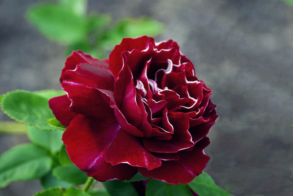
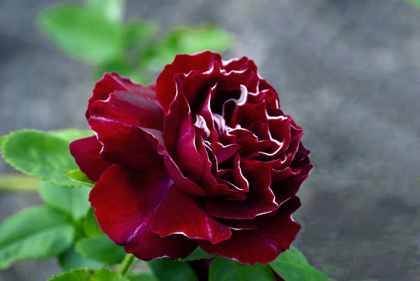
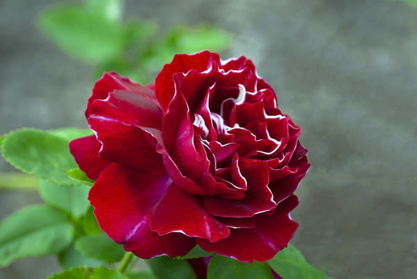
I have this image that I cannot get the color right on printing. It is a rose that has petals edged in white. It is somewhat of a rare rose. I want to get the right color of a deep burgundy while keep the white clear and not muted. It seems when I get the color of the rose right the white edges become muted. In printing the color is still not quite right - almost there. I print on an Epson R2880 which gives beautiful prints.
What would you do to this image to get the coloration correct?
What would you do to this image to get the coloration correct?
Are you letting the copier manage the color or are you letting photoshop manage the color. when you print and the dialog box comes up you should let photoshop manage colors.
May 10, 2012 05:06:56 #
grilldog
Loc: Central Texas
I whole heartedly agree with what rocar7 said-"Lots of good advice so far. Not sure if you are saying that the print colours are not the same as you see on screen. If that is the case you need to profile your display and printer. That way you will get the same colour printing that you see on screen."
Then you can see what your original image looks like. I've read many times to start with the histogram. I looked at your histogram in Levels and saw that it was underexposed (the right part of your 'curve' did not enter the right 2 sections of the graph). Lighten the image.
Then there is what I call 'the ever present reddish/orange cast' that affects most original digital images. Experiment with Color Balance to help reduce/eliminate it. Adjust all three tones- shadows, midtones, and highlights. Then use Saturation and/or Selective Color to adjust red and magenta color channels to hopefully get the 'right' shade of deep burgundy.
Needless to say there are literally millions of different adjustments that one can make. Oops, I almost forgot. You can use Curves to adjust the red channel.
The closer you are to the correct Exposure and White Balance then theoretically the fewer color adjustments you will have to make.
The best advice is to take an image, roll up your sleeves and experiment with each of the Image Adjustments- mainly levels, curves, color bal, br/contrast, hue/satur, and selective color. Get a feel for what each can do. Here are 3 versions.

May 10, 2012 21:27:13 #
played with these. I gave it more red then went back to read you wanted it burgundy.Not sure how to get my photo in here that I worked on.............

If you want to reply, then register here. Registration is free and your account is created instantly, so you can post right away.