For Your Pleasure: TEN C2
Mar 27, 2016 02:00:14 #

With the success of TEN Chapter 1 let's start Chapter 2 and see what awaits us! S-
What To Do Next:
- Read the second lesson Better Contrast Creates Better Stories
- Carry out the Creative Exercise at the bottom of the lesson
- Select one of your images to post and discuss the questions
- This should be informal and interactive. So talk, talk, talk!
- Ill give a go ahead when were ready to move to the next lesson
- But feel free to cheat and read ahead if you want!
Mar 27, 2016 09:30:00 #

One to get us started. I reserve the right to add another later :)
beautiful vs. ugly
man-made vs. nature
ephemeral vs. permanent
beautiful vs. ugly
man-made vs. nature
ephemeral vs. permanent

Mar 27, 2016 13:21:19 #

Linda From Maine wrote:
One to get us started. I reserve the right to add another later :)
beautiful vs. ugly
man-made vs. nature
ephemeral vs. permanent
beautiful vs. ugly
man-made vs. nature
ephemeral vs. permanent
Starkly perceived contrast, indeed!
Dave
Mar 27, 2016 17:17:26 #

Linda From Maine wrote:
One to get us started. I reserve the right to add another later :)
beautiful vs. ugly
man-made vs. nature
ephemeral vs. permanent
beautiful vs. ugly
man-made vs. nature
ephemeral vs. permanent
That's a real good contrast.
Mar 27, 2016 19:03:14 #
Mar 27, 2016 19:10:34 #

Linda From Maine wrote:
One to get us started. I reserve the right to add another later :)
beautiful vs. ugly
man-made vs. nature
ephemeral vs. permanent
beautiful vs. ugly
man-made vs. nature
ephemeral vs. permanent
Wonderful and perfect for this assignment!
Mar 27, 2016 19:13:37 #
minniev wrote:
Wonderful and perfect for this assignment!
Thanks so much, Minnie.
Mar 27, 2016 22:06:10 #
Uuglypher wrote:
...and I leave it to the viewer to perceive the contrast I've intended to be perceived.
Sorry...tried to get the download to show, but no dice!
Dave
Sorry...tried to get the download to show, but no dice!
Dave
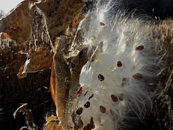
So let's try this one....
Dave
Mar 28, 2016 08:43:22 #
Uuglypher wrote:
So let's try this one....
Dave
Dave
I'm always attracted to the softness of the silk coming from the hard textured pods of milkweeds. Beautiful, Dave.
Mar 28, 2016 08:54:55 #

Linda From Maine wrote:
One to get us started. I reserve the right to add another later :)
beautiful vs. ugly
man-made vs. nature
ephemeral vs. permanent
beautiful vs. ugly
man-made vs. nature
ephemeral vs. permanent
Your contrasts are wonderful Linda. I like everything about this image. I am still trying to figure out what I will shoot for this chapter.
Mar 28, 2016 14:09:08 #
Andrea.Jarrell wrote:
Your contrasts are wonderful Linda. I like everything about this image. I am still trying to figure out what I will shoot for this chapter.
Thank you, Andrea!
I started a list of ideas, based on what I could find from some online articles. Would love to have people add more suggestions!
1. Above vs. Below
2. Active vs. Lazy
3. Child vs. Adult
4. Ancient vs. Modern
5. Amateur vs. Professional
6. Animal vs. Human (especially if each is somehow impersonating the other!)
7. Apart vs. Together
8. Asleep vs. Awake
9. Beauty vs. Ugliness
10. Big vs. Small
11. Calm vs. Excited
12. Clean vs. Dirty
13. nature and city
14. mythic and real
The first day I went out looking for contrasts, I knew I'd find some "obvious" ones in orchards and farmland: spring awakening vs. winter dormancy, and fertile vs. fallow:
http://www.uglyhedgehog.com/t-377290-1.html
Mar 28, 2016 21:07:23 #

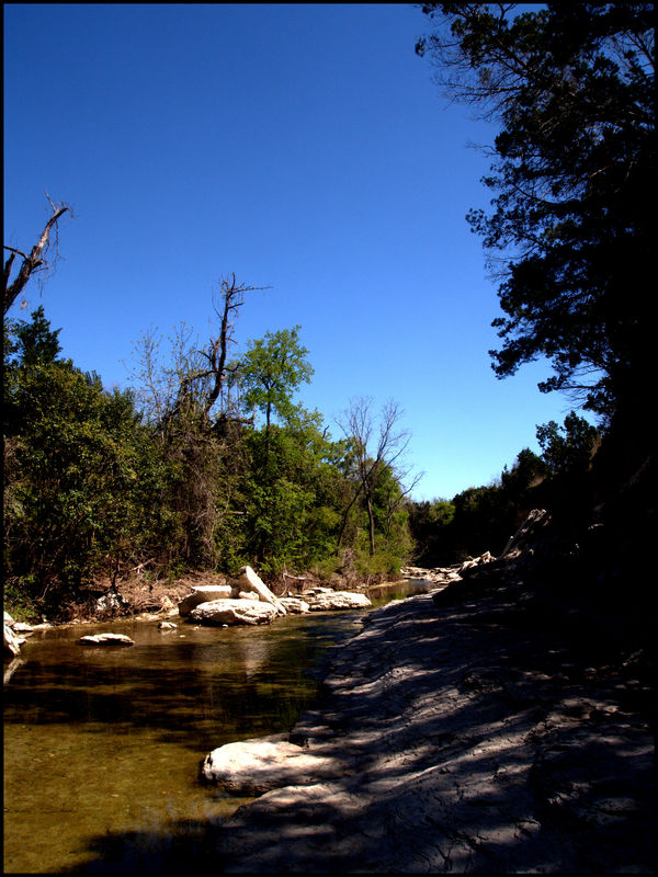
Linda and Dave - wonderful shots to illustrate contrast. Linda has thrown in lots of ideas here.
Here is my take - light and shadow
Here is my take - light and shadow
Mar 29, 2016 01:19:10 #
sundar wrote:
Linda and Dave - wonderful shots to illustrate contrast. Linda has thrown in lots of ideas here.
Here is my take - light and shadow
Here is my take - light and shadow
Hi, Sundar,
Light and Shadow are well contrasted here, and yet, as a lover of the out-of-doors and as a photographer I perceive just as strongly the "coolth" in those shadows, contrasted with the warmth felt sitting on a rock in the sun on the bright side of the stream...and the water's slow flow in the "inside" of the curve contrasted with its more rapid flow at the outside of the curve...against the "cut-bank" , and the excellent perspective in your image calls to mind the contrast between the near foreground and the far disappearance of the stream around that distant curve.
A lovely image, Sundar, with a number of contrasts...we are still in brown/tan early spring here in East River, SD, an I'm impatient for such stronger seasonal changes as you've shown us!
Thanks for posting!
Best regards,
Dave
Mar 29, 2016 01:25:37 #
Linda From Maine wrote:
One to get us started. I reserve the right to add another later :)
beautiful vs. ugly
man-made vs. nature
ephemeral vs. permanent
beautiful vs. ugly
man-made vs. nature
ephemeral vs. permanent
Linda,
I do like the complexity of contrasts perceived among the beautiful rainbow and the (possibly) two competing forms of energy suggested by the wind farm rotors and the power lines likely carrying energy with a very different "footprint" than that from the wind.
And I'm delighted that the rough, harsh texture of the dried, opened milkweed pod was perceptible...the milkweed "fluff" and it's rough, uncomfortable pod are one of my very earliest textural contrast memories from very early childhood...likely late infancy...I know I had to held up to be able to feel the plant and its parts.....
Dave
Mar 29, 2016 05:59:18 #
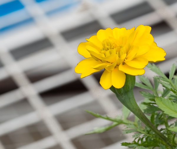
Back over to the local garden centre yesterday.
Contast between man and nature.
Contast between man and nature.
If you want to reply, then register here. Registration is free and your account is created instantly, so you can post right away.