Two Light Painting Shots
Mar 3, 2016 23:44:57 #
I took these two shots Sunday afternoon, and they were my first two light painting images I have even done. I tried to get two distinctly different effects to see how they would turn out.
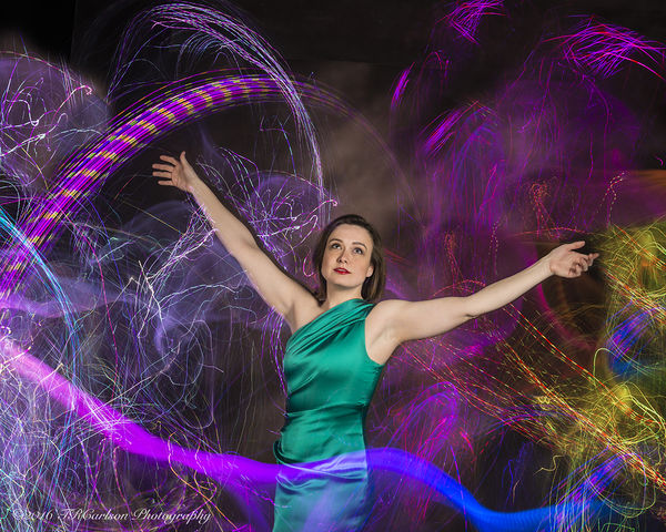
The first one #1 with all the colored lights is what I have often believed to be common in light painting - vibrant, active, exuberant, fun, entertaining, and filling up the frame. I used a Nikon D800 and a Nikon 24-70mm lens, shot using ISO 00, F/8, and bulb setting of course. A ribbon type strand of multicolored minute LED lights with it's own power source was used and quite aggressively swung around as they were moved around (person walking) in front and behind the model. A strobe light was used to freeze the model and the total exposure was probably around 90 seconds or so. What are your thoughts, what could I have done better, dies it grab your attention and why and how?
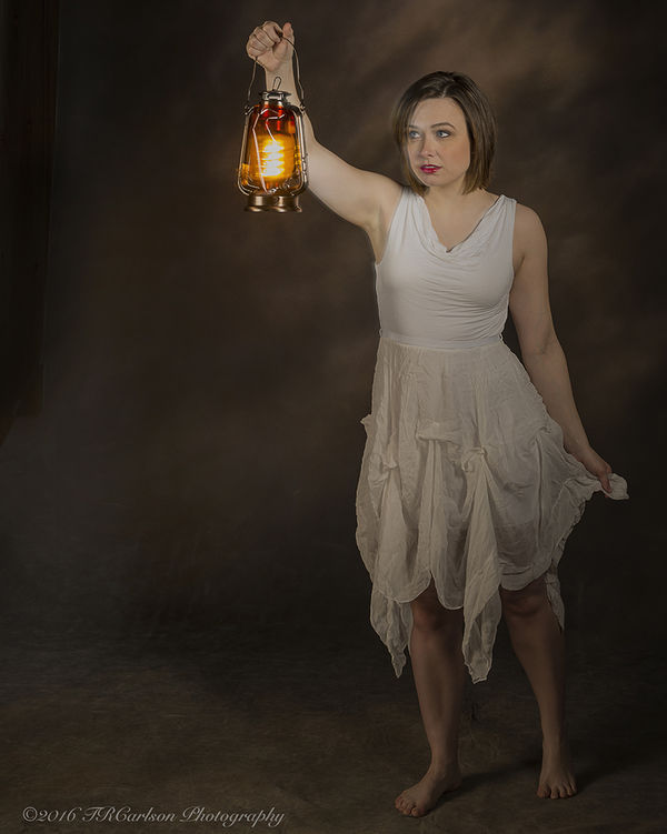
The second shot #2 was taken with a single LED lantern and is a more quiet, subdued atmosphere. I was going for a quieting effect, passive possibly, or mysterious or seeking out the unknown walking along in a darkened area possibly like a cave or basement with the light providing or lighting up the path. It is not supposed to be exciting, but perhaps adventures seeking out the unknown. Once again, same camera set-up and equipment was used, but perhaps the shutter was only open for 30 seconds from start to finish (guesstimating).Are you drawn into the image, the 'story'. the suspense perhaps, or what kind of feeling does it arouse when looking at the image?
Thanks for considering my images.
Best Regards,
Tom
The first one #1 with all the colored lights is what I have often believed to be common in light painting - vibrant, active, exuberant, fun, entertaining, and filling up the frame. I used a Nikon D800 and a Nikon 24-70mm lens, shot using ISO 00, F/8, and bulb setting of course. A ribbon type strand of multicolored minute LED lights with it's own power source was used and quite aggressively swung around as they were moved around (person walking) in front and behind the model. A strobe light was used to freeze the model and the total exposure was probably around 90 seconds or so. What are your thoughts, what could I have done better, dies it grab your attention and why and how?
The second shot #2 was taken with a single LED lantern and is a more quiet, subdued atmosphere. I was going for a quieting effect, passive possibly, or mysterious or seeking out the unknown walking along in a darkened area possibly like a cave or basement with the light providing or lighting up the path. It is not supposed to be exciting, but perhaps adventures seeking out the unknown. Once again, same camera set-up and equipment was used, but perhaps the shutter was only open for 30 seconds from start to finish (guesstimating).Are you drawn into the image, the 'story'. the suspense perhaps, or what kind of feeling does it arouse when looking at the image?
Thanks for considering my images.
Best Regards,
Tom
Mar 4, 2016 00:05:04 #

First of all Im jealous cos you have a willing model by the looks of things. The lady in my life although an ex stage performer would never agree to do this.
Love them both and it looks like fun. Cant think of a way to improve them but if it was mine I would plan to repeat number 1 but with a wilder hairstyle and vampish makeup on my model with maybe stick on tattoos. The opposite to the sweet very pretty gal you have now. But remember I do like the theatrical.
Number two the pose is wonderful the look of apprehension just perfect the lack of shoes the choice of a genius and for a next time shot I would like to see some background. An old barn an industrial complex again a bit theatrical. Not sure if this lady would be willing to stroll about in public waving a lantern lol
But seriously Tom as they are they are quite remarkable my friend and refreshingly different.
Mar 4, 2016 08:29:16 #
Billyspad wrote:
First of all Im jealous cos you have a willing mod... (show quote)
Billy - I like your idea of a crazy hairdo (spiked or frizzed out) and that would be quite fitting for the first image. I guess that, to me, would be like 'Steve Martin as a Wild and Crazy Guy' atmosphere! Tattoos would also seem somewhat fitting for that , here again, would be promoting more of a Carnival type atmosphere in my mind?
Image #2 to me is more like a theatrical type setting where the gal is slowly seeking out the unknown not knowing exactly what she will find. I'm not sure a barn or industrial setting would be fitting? Also, I would either have to take her out someplace to get that background (not sure how that would happen with a light painting photo?) or turn the image into a composite and put in a desired background.
She is actually a little older than most models I have shot and more mature acting, so I did enjoy being able to use her in this shoot. She is also an assistant or aid type employee for a professor at a university, and does modeling on the weekends.
Your comments are well taken and I can see you put a little thought into them before you started typing. I take your comments under advisement and you had some very good ideas which never really crossed my mind. Your input was most appreciated. Thank you.
Tom
Mar 4, 2016 09:52:14 #

Tom, I'm not qualified to comment regarding studio settings or human models, but just wanted to tell you how much I like your creativity!
As with creativ simon's intricate abstracts, these are great fun to enjoy from "the other side," so to speak :)
As with creativ simon's intricate abstracts, these are great fun to enjoy from "the other side," so to speak :)
Mar 4, 2016 10:12:38 #

Pretty good job for your first attempts at this. The light painting in the first and the lighting in the second work well. My only quibble is the framing. Something bothers me about the first one. I do not know if it the centered composition or her legs cut off. In the second one, like the model, I am looking for the darkness and void to the left. Where is it! Having more space there would create some mystery. Also, I would leave more space above here.
A final minor comment. I do not like seeing copyrights in pictures. The file should have it. If you sell prints, then put them there. The reality is that they mean very little because you first have to find a potential violation and then you have to prosecute it.
Thanks for posting and keep painting....
Mar 4, 2016 10:14:18 #
I am not qualified to comment, but have to. That second one has a terrific impact to me. Cut at the waist, the bottom half is almost biblical to me with the bare feet, wonderful floor texture, and the soft light on fabric and form.
She is a beautiful model, I only wish the top half had the same mood as the bottom part of the image. Perhaps a candle, the light she holds looks too clean, and the light on her face is too strong (but that is me and my impression) - I would like more mystery and texture on the top half of that image.
She is a beautiful model, I only wish the top half had the same mood as the bottom part of the image. Perhaps a candle, the light she holds looks too clean, and the light on her face is too strong (but that is me and my impression) - I would like more mystery and texture on the top half of that image.
Mar 4, 2016 10:21:53 #
pfrancke wrote:
I am not qualified to comment, but have to. That ... (show quote)
I think you are on to something here. What bothers me is that her chest is lighter than her face. After all, the face (or lamp) is the center of interest, especially her look. The brighter clothing draws the viewer's eye, not the face as it should be. The face can have the same brightness which would be logical if only the lamp were lighting the scene. Then, the chest should be toned down.
Mar 4, 2016 15:33:54 #
abc1234 wrote:
Pretty good job for your first attempts at this. ... (show quote)
Let me see, in the first one, I did not shoot more than what you see - I didn't crop her feet off, so I didn't include her feet. I was thinking that the fanfare of lights would negate the necessity of having her feet in the frame and actually take away from the 'beauty' of the image. I should have known better since in Portraiture cutting off limbs and appendages is considered poor photography - Oops! As for the centered positioned in the frame, I did that purposely since I was trying to get in all the color lighting, I guess since it was a light painted image. I also thought the display of the arching color strand of light to camera left was rather important and it balanced with the yellowish and blue conglomeration caddy corner to the camera lower right part of the frame - it looked pretty balanced to my eyes? I am never really sure about the copyright and when and if it needs to be included. I have read and been told that one should always include a copyright by other photographers (Pro & Amateur) and watch on UHH all the time to see who and when and if a copyright has been put in. I think that would be a great topic for discussion and to hear varying viewpoints. I do know that they are quite easily gotten rid of and people never know, so what's the point, right? I am always in a quandary about copyrights and never used to include them. I would like to trust everyone here on UHH, but there is always 'one'. Once an image is put on the internet, it really is open for anyone to take and use, so really, what is the use of copyrights?
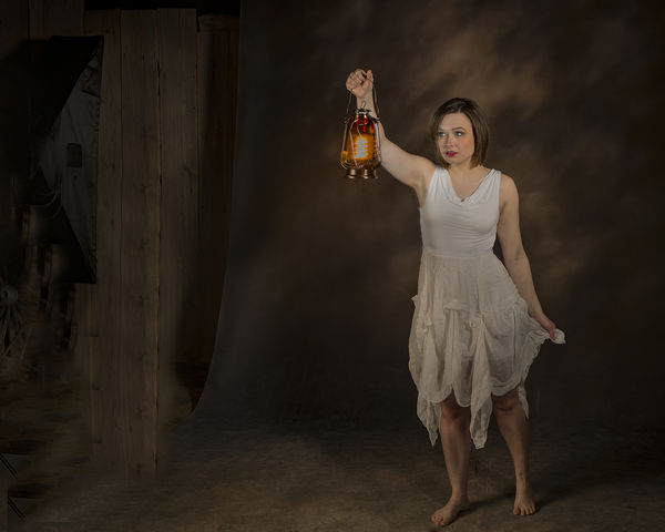
The second image is one I did crop as seen here on my upload. I did it this way since I wanted to portray her on her journey looking for whatever she could find. Hence, less space on camera right and more on camera left. However, there were a couple pieces of equipment further out to camera left and there was more light as well. I could have cloned out the equipment and darkened the remainder. Why I did not, I'm not sure, other than I was thinking there would have been too much dead space which I have been cautioned about before. These things are good to hear about because they are parts of processing I often times ponder about and always like to have feedback to get other viewpoints and reasons. Perhaps I will post another image including a little more space on the left, but it will not be as processed/finished as if it was a 'final' image. Then, you can let me know what you think, OK?
Thanks,
Tom
Mar 4, 2016 15:49:13 #
pfrancke wrote:
I am not qualified to comment, but have to. That ... (show quote)
piet,
Take a look at the image I just uploaded (post above yours) after reading your suggestions/comments as well as abc1234's comments.
Thanks,
Tom
Mar 4, 2016 16:32:02 #
trc wrote:
piet,
Take a look at the image I just uploaded (post above yours) after reading your suggestions/comments as well as abc1234's comments.
Thanks,
Tom
Take a look at the image I just uploaded (post above yours) after reading your suggestions/comments as well as abc1234's comments.
Thanks,
Tom
Hi Tom,
I can see how you have improved the lighting in post. Personally I like the composition from the first better (but also understand that more post can clean up issues).
I really like the contrast/play between the lights and darks (Chiaroscuro?) in the lower half and would love to see a similar effect on the facial features. (ultimately meaning perhaps different lighting). I can see how the light in the chest area is no longer over-powerful.
I am in awe of you guys that work on portraits and people with light - I can see how it can be something that a life-time is spent on working and perfecting.
Edit -- Tom, I want to be perfectly clear about something. You have a good image. There is some good stuff there (to me). I am only pushing my viewpoint because I think that a retake of this model with your goals could be a stupendous picture that belongs on a magazine cover! (not that I could do that) You've got some of the pieces in place.
Mar 4, 2016 18:01:17 #
Szalajj
Loc: Salem, NH
abc1234 wrote:
...
A final minor comment. I do not like seeing copyrights in pictures. The file should have it. If you sell prints, then put them there. The reality is that they mean very little because you first have to find a potential violation and then you have to prosecute it.
Thanks for posting and keep painting....
There have been numerous discussions here on UHH about Copyrighting pictures, and references to the US Copyright Laws.
Essentially, not only do you need to add your copyright data to the images taken by your camera, so it's in the EXIF data, but you also need to include a copyright watermark on the photo. But the final step is to also register your work with the Copyright Office, either individually or as part of a group registration.
Yes, you need to catch your photo being used, to prosecute, but you also need to prove the shot was yours to begin with.
That's where your watermark or copyright mark becomes important. If you can prove your picture was published the first time with the data intact, then the data was stripped from the work, your case is stronger.
Mar 5, 2016 13:42:54 #
pfrancke wrote:
Hi Tom, br br I can see how you have improved the... (show quote)
Piet,
Thanks for pushing. That would be so cool if I ever got a picture on the front cover of a magazine. For that matter, if I ever got a picture any place in a magazine! Thanks, my friend.
Tom
If you want to reply, then register here. Registration is free and your account is created instantly, so you can post right away.