Enhancing motion blur to separate subject from background
Jul 30, 2015 14:44:05 #

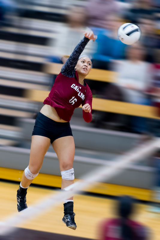
There was a bit of motion blur in the original image but I was not happy with the level of separation of subject and background. In photoshop I masked out the player and added motion blur to the background and aligned it with the angle of the bleachers.
in retrospect I think that I should have rotated it 180 degrees - since the density of the blur on the spectator's shoulder makes it seem that the camera was panning R to L ... which doesn't make sense for the position of the outside hitter approaching the net from L to R.
I wrestled with where to post this image. It seems that it fits here - but since I am also wanting feedback - maybe I should have posted to the photo critique page?
1) Does the blur work?
2) Does it make the image seem unrealistic?
3) Over-processed?
Jul 30, 2015 14:53:46 #

Worry not - anyone who visits here will gladly offer their opinion and not hold back :)
Personally, I like it a lot! Mainly because you caught such great intensity on the player's face, as well as the position of her body and the ball.
Since I don't have much experience with motion blur, contrived or real, I can only say that from a casual viewpoint, nothing jumped out at me as "wrong" or distracting from the action and excitement of the moment.
Jul 30, 2015 15:37:41 #

You did well with your masking as there is no halo around her.
But the motion blur makes her look like she was composted in and flying across the screen.
But the motion blur makes her look like she was composted in and flying across the screen.
Jul 30, 2015 16:14:55 #

Nice action shot Timspix.
A little too much blur for me though.
I'd go with just enough blur, so that you could not make out the face of the people in the stands.
A little too much blur for me though.
I'd go with just enough blur, so that you could not make out the face of the people in the stands.
Jul 31, 2015 07:39:36 #

I think the blur is a matter of taste, no right or wrong to it. My problem is that it is not realistic. Blur may work for an object moving rapidly and horizontally. However, three other things bother me more.
1. The blue outline on the ball.
2. The diagonal streak across the bottom. I would clone it out.
3. The person in the lower right. Again, clone him out.
Good luck.
1. The blue outline on the ball.
2. The diagonal streak across the bottom. I would clone it out.
3. The person in the lower right. Again, clone him out.
Good luck.
Jul 31, 2015 09:05:57 #

hlmichel wrote:
You did well with your masking as there is no halo around her.
But the motion blur makes her look like she was composted in and flying across the screen.
But the motion blur makes her look like she was composted in and flying across the screen.
:thumbup: :thumbup:
Jul 31, 2015 11:14:08 #

timspix wrote:
There was a bit of motion blur in the original ima... (show quote)
I like the shot, but I too think the amount of blur is a bit more than necessary. I don't do extra blur-what there is there is. This may not be a legitimate question since my experience is less than limited, but as the young lady is jumping, shouldn't the background blur have been vertical more than horizontal?
Jul 31, 2015 13:39:23 #

I would say that using motion blur has given a better result than using a more static blur like Gaussian would have produced.
To get away with less blur, why not use a multi-pronged approach for the background - turn down the contrast, highlights toned down, slight desaturation, de-noise.
To get away with less blur, why not use a multi-pronged approach for the background - turn down the contrast, highlights toned down, slight desaturation, de-noise.
Jul 31, 2015 19:26:17 #
Thanks for all of the feedback.
(my reply includes the challenge to many of you to find your local university or even top level high school volleyball program and go take in a match. These are top notch athletes that will amaze you with their power, grace, choreography, and speed.)
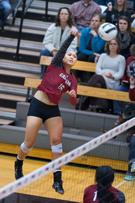
@ABC1234 I've redone the picture with some of your suggestions. The "diagonal streak" you mention (if it's the white one you are referring to, is the net. These gals get way off of the floor on an outside hit. So in the reworked blurred image - I masked out the net so that it is not blurred and is, I think, now clearer as to what it is.
@JCam the blur is pretty close to the "original" direction. An outside hitter leaves the floor a good 10'-12' from the net and lands with feet just barely on their own side of the net. At the moment of the image here, Koko Atoa-Williams is at the top of her arc and moving almost completely L to R.
@ R.G. when I redid the PS I added an HSL layer and dropped the saturation on the background as you suggested. I also made the blur about half of what it was.
(my reply includes the challenge to many of you to find your local university or even top level high school volleyball program and go take in a match. These are top notch athletes that will amaze you with their power, grace, choreography, and speed.)
@ABC1234 I've redone the picture with some of your suggestions. The "diagonal streak" you mention (if it's the white one you are referring to, is the net. These gals get way off of the floor on an outside hit. So in the reworked blurred image - I masked out the net so that it is not blurred and is, I think, now clearer as to what it is.
@JCam the blur is pretty close to the "original" direction. An outside hitter leaves the floor a good 10'-12' from the net and lands with feet just barely on their own side of the net. At the moment of the image here, Koko Atoa-Williams is at the top of her arc and moving almost completely L to R.
@ R.G. when I redid the PS I added an HSL layer and dropped the saturation on the background as you suggested. I also made the blur about half of what it was.
Aug 1, 2015 01:29:50 #
Jim Soholt
Loc: California Central Coast
Tim,
To me, the most recent version strikes a good balance. There is good emphasis on the player, yet the "background" (her surroundings, the context in which she is performing) isn't lost. I use the same combination of blur and the reduction of contrast and saturation, as I find it a useful approach. Nice shot.
Respectfully,
Aug 1, 2015 07:35:04 #
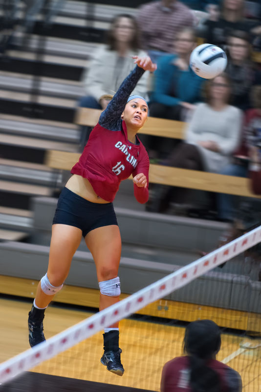
Timspix, I am going to be the odd person out here. I can hear the boos already. I think the original is not just the best rendering technically but also the most interesting artistically. I like the context of the shot. All eyes are rightfully on her. Just look at the spectators. Now, the white streak has meaning: it is the net. Shame on me for not getting that in the edits. Here is the interesting thing for me. You captured the player in midair and she is reasonably sharp. Look at her focus. What conveys the motion so strongly to me is how her t-shirt flopped up over her belly button. A spontaneous touch. You cannot stage these things. Her right arm is in the perfect position. A split second before or after would have destroyed the shot. And then the blur of the ball conveys motion. What an interesting contrast, her sharpness and intensity versus the blur and plainness of the ball. You could not have done better. I wonder if a little more sharpness might even help her to stand out more.
All this being said, my comments take the picture in the opposite direction of the original post and I can hear the boos as I hit the send button.
Now, for what I do not like and would fix but would need the original file. The cropping is good but those crooked handrails and seats drive me crazy. I am just a straight-up kind of person. I would use my favorite tool in LR, the radial filter and punch up the brightness and contrast or clarity of the ball ever so slightly to make it stand out more. Finally, I would add a negative vignette, -10 or -20 or so, to draw the eye subtly on to the player.
Aug 1, 2015 07:51:31 #
andrew.haysom
Loc: Melbourne, Australia
Tim,
You've done a great job of masking out the player as the centre of interest, and I think the second one with less blur is much better, but I'd also suggest something else that may improve it.
In both cases you have the background with a "motion" blur, even in the softer second one, the people in the background show a discernible about of motion.
To me, this shot wouldn't have motion blur in the background, as motion blur implies that the subject (e.g. the people in the background) is moving relative to the camera.
I'd use a "Gaussian blur" or similar which will give you more of a "depth of field" blur than a motion blur.
Regards,
Andrew
Aug 5, 2015 09:06:56 #

andrew.haysom wrote:
Tim, br You've done a great job of masking out the... (show quote)
Exactly what I was going to say....but different :lol: Instead of Gaussian blur which everyone seems to use for everything, I'm not sure what version of what program you are using (maybe you mentioned it in the original post?) I think lens blur would work better.
The people and everything in the background of the last one are better, but the person in the foreground is not good at all. That's not what shallow depth of field looks like. Shallow depth of field is very hard to make realistically. I admit that I cringe when I see some posts of a flat Gaussian blur behind a sharp subject. I've yet to see it done convincingly. (sorry Andrew. Feel free to post one with Gaussian blur and prove me wrong)
As I usually mention in most of my comments. They are my OPINION, and worth exactly what you pay me for them. Do what works for you, and take everyone's comments with a grain of salt.
Aug 5, 2015 09:43:25 #
Quote:
.... The people and everything in the background of the last one are better, but the person in the foreground is not good at all. That's not what shallow depth of field looks like. ... grain of salt.....
Salt is good. So I wonder whether maybe I should add more blur to the person in the front since the idea is anything stationary should be blurred as the camera is following the moving player. Or maybe I should ask her out to remove all blur?
The physics of it does mean that for depth of field blur things closer to the subject need to be less blurred and things farther away more blurred maybe I could do a series of masks? But then again that's way too much pp for an image of this type.
Thanks for all of the great suggestions so far!
Aug 5, 2015 14:46:53 #
timspix wrote:
Salt is good. So I wonder whether maybe I should ... (show quote)
Phlearn.com has a good tutorial on how to fake shallow depth of field using one mask, but various shades of gray to let things show through. Might be worth taking a look. If anyone can help you with a solution, Aaron would be "the one"
If you want to reply, then register here. Registration is free and your account is created instantly, so you can post right away.