Evaluating "How much" PP
Jun 17, 2014 19:26:28 #

I've learned my way around various PP tools and can do some extreme things to photos. But, that has left me have difficult time deciding on what "should be" the final result.
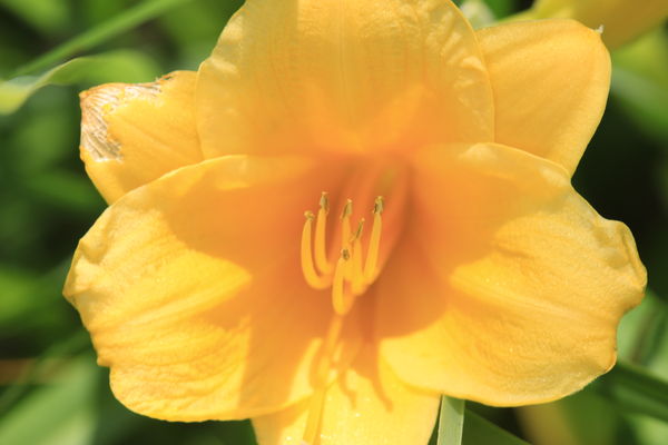
Here is a sample of what I mean. PP in Elements
I know that "it has to look good to me" but, are there any guidelines??
Thanks RegisG
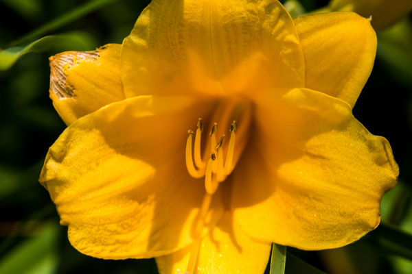
Here is a sample of what I mean. PP in Elements
I know that "it has to look good to me" but, are there any guidelines??
Thanks RegisG
Jun 17, 2014 19:30:40 #
Jun 17, 2014 19:33:35 #

RegisG wrote:
I've learned my way around various PP tools and can do some extreme things to photos. But, that has left me have difficult time deciding on what "should be" the final result.
Here is a sample of what I mean. PP in Elements
I know that "it has to look good to me" but, are there any guidelines??
Thanks RegisG
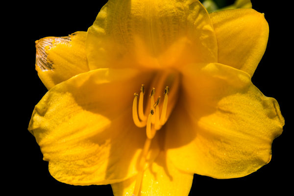
Here is a sample of what I mean. PP in Elements
I know that "it has to look good to me" but, are there any guidelines??
Thanks RegisG
The detail is much clearer in the second. Whatever you did to it, you brought out some detail that was not visible in the first one. In the first version, the yellows are almost blown out.
Jun 17, 2014 19:44:37 #
The second shot has more detail. To me, that is the better shot. As for guidelines, Peterson in his book "Exposure" talks about creatively perfect exposure. In other words, what makes the photo look its best is the right amount of pp or the proper exposure. Who determines creatively correct.... you do. That is unless you are doing the photos for someone else who is paying you. Then they decide what they like best. (within reason, of course, since it is still your reputation).
Jun 17, 2014 20:19:42 #

Middle one. The lack of detail around the 3rd one makes it look fake.
Jun 18, 2014 00:45:52 #

Jun 18, 2014 07:34:02 #

The consensus so far seems to be that if you can process the shot to bring what was really there and/or what your perception saw that the shot does not yet have--that is okay. I agree.
Jun 18, 2014 08:24:24 #
artBob wrote:
The consensus so far seems to be that if you can process the shot to bring what was really there and/or what your perception saw that the shot does not yet have--that is okay. I agree.
Yep, that sounds like what I'm reading too. Which leaves a lot of room to enhance or overkill.
Thanks all for chiming in with help.
RegisG
Jun 18, 2014 09:27:57 #
RegisG wrote:
Yep, that sounds like what I'm reading too. Which leaves a lot of room to enhance or overkill.
Thanks all for chiming in with help.
RegisG
Thanks all for chiming in with help.
RegisG
Actually, you can do whatever you want! You bought the camera and software, took the time to shoot the photo and process it, so unless you are trying to sell it, the main customer you must please is yourself. If you like photos to look like you saw the scene, then process to bring out that look. If you like artistic presentations of photos, then practice that. If you've always admired the old school film photographers, then try your hand at black and white conversion. The beauty of it all is, we have wonderful tools to pursue photography in any way we want, and a pleasant place here to share our results. So keep having fun!
Jun 18, 2014 09:29:10 #
Middle one. Never been a fan of cutting out flowers and putting them on a black background.
Jun 18, 2014 09:32:49 #

I prefer number 3 because I have a penchant for dark backgrounds for my flowers. Unless the background is interesting and supports the flower itself, I find it distracting.
As for the flower itself, I think version 3 is best. Version 1 is obviously too light. Version 2 is much better and by being darker, it creates the impression of having more detail. In fact, it does not. The darkening brings out what is already there but hidden by the overexposure. However, version 2 is slightly too dark for me and version 3 gets it right. Brighter, cheerier color while preserving the detail.
I do not like the cropping. I prefer framing the entire flower. And I would get rid of the little leaf behind the flower in its upper right.
Now that you have gotten a decent jpg, how about getting brave enough to shoot raw. You may find the colors are better.
Jun 18, 2014 10:42:34 #

RegisG wrote:
I've learned my way around various PP tools and can do some extreme things to photos. But, that has left me have difficult time deciding on what "should be" the final result.
Here is a sample of what I mean. PP in Elements
I know that "it has to look good to me" but, are there any guidelines??
Thanks RegisG
Here is a sample of what I mean. PP in Elements
I know that "it has to look good to me" but, are there any guidelines??
Thanks RegisG
Like the second best...the attached image was my attempt at repairing the damaged petal...not necessarily the thing to do...just did it... :D

Jun 18, 2014 10:56:15 #
hb3 wrote:
Like the second best...the attached image was my attempt at repairing the damaged petal...not necessarily the thing to do...just did it... :D
That is just a great fix. And, that's the kind of "repair" that I need to consider often. And, it helps me understand that we can go as far in making object/scene look real as if in perfect lighting, and perfect form. Or, we may otherwise choose to take liberty in using a photo to create an artistic piece.
Thanks again,
RegisG
Jun 18, 2014 11:03:40 #
RegisG wrote:
That is just a great fix. And, that's the kind of "repair" that I need to consider often. And, it helps me understand that we can go as far in making object/scene look real as if in perfect lighting, and perfect form. Or, we may otherwise choose to take liberty in using a photo to create an artistic piece.
Thanks again,
RegisG
Thanks again,
RegisG
Glad you liked the repair of the petal...enjoyed working with it.... :-)
Jun 18, 2014 22:27:31 #

artBob wrote:
The consensus so far seems to be that if you can process the shot to bring what was really there and/or what your perception saw that the shot does not yet have--that is okay. I agree.
I'd suggest that isn't even close. Why the fixation on reality as you might have seen it?
The job of the artist is to help you see something different. I doubt anyone would claim that Picasso was seeking to imitate reality. Or Ansel Adams.
Your definition might be OK for snapshots, but not for photography.
If you want to reply, then register here. Registration is free and your account is created instantly, so you can post right away.