Wallpaper - Morning Coffee
Feb 13, 2014 22:13:56 #

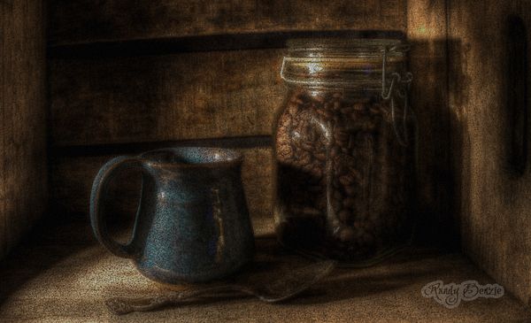
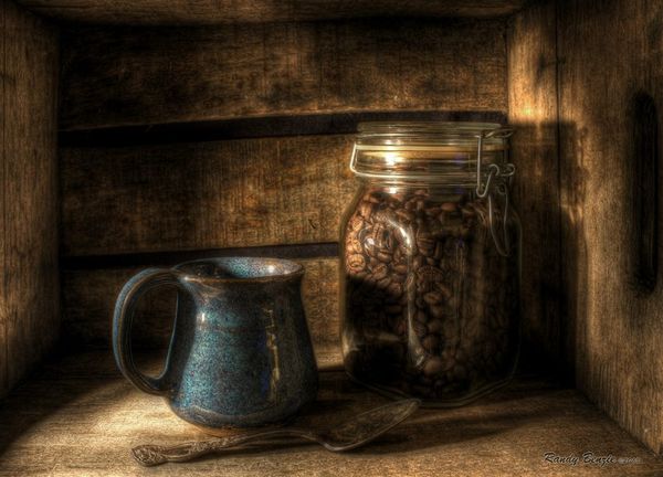
I was playing around with some of my older images...
Offering this one up for folks to enjoy as a computer desktop wallpaper.... Would like some feedback on how well it fits your screen and if you feel it is a good contrast to your icons...
Enjoy....
Offering this one up for folks to enjoy as a computer desktop wallpaper.... Would like some feedback on how well it fits your screen and if you feel it is a good contrast to your icons...
Enjoy....
Feb 13, 2014 22:18:23 #

Awesome. The deep rich colors are as rich a s the coffee. The lighting is very nice too. I would hate to put icons of it.
Feb 13, 2014 22:23:16 #
Fergus wrote:
Awesome. The deep rich colors are as rich a s the coffee. The lighting is very nice too. I would hate to put icons of it.
Thanks :) , Really appreciate that! But I really was wondering since people have different screen sizes and resolutions how well this worked when set to "stretch" for the wallpaper.. Aspect ratio is such a pain, certainly when it comes to doing prints at different sizes... :)
Feb 13, 2014 23:17:09 #
All it needs is steam coming off of the hot contents and ME! Nice work as always, Randy.
Feb 14, 2014 06:30:42 #

Feb 14, 2014 06:46:32 #
Mike D. wrote:
All it needs is steam coming off of the hot contents and ME! Nice work as always, Randy.
:) Thanks!.. Yes steam would have topped it off.. A bit out of my PP expertise ... :)
Feb 14, 2014 06:47:33 #
J-SPEIGHT wrote:
:thumbup: :thumbup: always interesting images Randy
Thank you very much... I have posted this before, but this is a new edit with a different cropping, contrast and texture....
Feb 14, 2014 08:39:06 #

Feb 14, 2014 08:49:50 #

Travesty wrote:
I was playing around with some of my older images...
Offering this one up for folks to enjoy as a computer desktop wallpaper.... Would like some feedback on how well it fits your screen and if you feel it is a good contrast to your icons...
Enjoy....
Offering this one up for folks to enjoy as a computer desktop wallpaper.... Would like some feedback on how well it fits your screen and if you feel it is a good contrast to your icons...
Enjoy....
It's gorgeous, thanks! I had to re-size to 1200 pixels on one side; otherwise it only shows a bit of the middle. Still doesn't fit to the screen shape exactly, but I'll take it :)
Feb 14, 2014 08:50:12 #
frjack wrote:
Has a nice Dutch Masters genre painting feel to it.
:) Thanks... I do like the comforting warm feeling....
Here was my original edit.....
Feb 14, 2014 09:10:59 #

I like it but really like the 2nd version, which you say is the original version, a lil' better :)
Feb 14, 2014 09:40:03 #
MissStephie wrote:
I like it but really like the 2nd version, which you say is the original version, a lil' better :)
Thanks :) ... I like them both for different reasons, but the 1st one however I did just to be used as a wallpaper, which is the reason for the texture and the darker tones... Makes it a bit easier to see he icons... :) Thanks for looking and taking the time to comment... :)
Feb 14, 2014 10:21:07 #
I have a 15" laptop. I used the 'set as background' feature after I clicked download...it fits the screen well but leaves a bit on both sides....top and bottom fit well, and it is a nice non-glaring background. I like it. Thanks for sharing this.
And I have to add...it's so cool to have The Crate on my monitor!!!! :) :) :)
And I have to add...it's so cool to have The Crate on my monitor!!!! :) :) :)
Feb 14, 2014 10:26:21 #
Travesty wrote:
Thanks :) ... I like them both for different reasons, but the 1st one however I did just to be used as a wallpaper, which is the reason for the texture and the darker tones... Makes it a bit easier to see he icons... :) Thanks for looking and taking the time to comment... :)
That does make a lot of sense..... :thumbup: Even though you said "wallpaper" I was still thinking, picture..... my bad... :oops:
Feb 14, 2014 10:46:14 #
Linda From Maine wrote:
It's gorgeous, thanks! I had to re-size to 1200 pixels on one side; otherwise it only shows a bit of the middle. Still doesn't fit to the screen shape exactly, but I'll take it :)
:) Thanks Linda... Is it set to "Stretch"?
If you want to reply, then register here. Registration is free and your account is created instantly, so you can post right away.