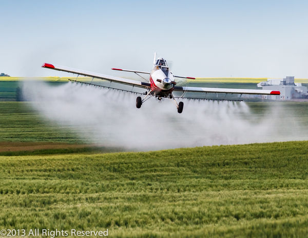
Crop duster in action
Oct 31, 2013 19:31:25 #

lighthouse wrote:
I'll be disagreeable, I'm good at that apparently.... (show quote)
No, I wouldn't bounce you on this one, Lighthouse. I agree. I am not sure that the plane would stand out better against the sky. Not only that, if you've ever watched these planes up close, coming over you, you would realize that when the plane gets low, that is the exciting thing about watching them. These guys are pretty skilled pilots.
Nov 1, 2013 00:11:13 #
I would like to truly thank everyone for taking the time to comment on this post. Your comments are truly appreciated and your c&c have me to look at this image in many different ways, again thank you.
As I mentioned in my original post that i was interested in receiving feedback on the composition amongst other things. I too thought that the industrial plant in the background is distracting.
Even though they are separated by almost 2 miles, the aircraft and the plant ending up on the same plain and along with the compression of the telephoto lens, visibly compressing the distance between the plane and the plant resulting in a not so pleasing effect.
So applying many of your suggestions, here is the revised version for your consideration. Cropped the image so the horizon is on the top one third line, remove the vignetting, attempted to even out the sky, and warm the image slightly. Your thoughts between the two images would be appreciated.
Thank you

Nov 1, 2013 00:16:31 #
Nov 1, 2013 08:07:15 #

Gibar wrote:
Sorry, forgot to click store original
I like this much better at first glance I thought it was a whole different shot. The only thing I would have done different is to leave a little more on the right, but this crop does pretty much get rid of the distracting buildings. With some very careful cloning you might be able to remove the rest. Even so this is a great shot to have gotten.
Nov 1, 2013 09:05:51 #

Gibar wrote:
Sorry, forgot to click store original
Big diff. from the first shot ..I think it is much better.. In this one I even noticed the heat distortion from the exhaust. something I didn't even notice in the original. to me this would prove the focal point in the photo is receiving much more of the attention. Nice job Gibar
Nov 1, 2013 12:11:19 #
If this were my photos I would have:
(Comments relative to original post)
1) Cloned out the buildings.
2) Replaced the sky
3) turned the sky and ground golden.
(Comments relative to original post)
1) Cloned out the buildings.
2) Replaced the sky
3) turned the sky and ground golden.
Nov 1, 2013 12:20:34 #
PalePictures wrote:
If this were my photos I would have:
(Comments relative to original post)
1) Cloned out the buildings.
2) Replaced the sky
3) turned the sky and ground golden.
(Comments relative to original post)
1) Cloned out the buildings.
2) Replaced the sky
3) turned the sky and ground golden.
I can see the sky and buildings thingy .. but who sprays golden crops ? It would tend to make the photo unrealistic.
I do have to agree though the golden color would possibly make the craft jump out at you
Nov 1, 2013 12:23:06 #
Old Salt wrote:
I can see the sky and buildings thingy .. but who sprays golden crops ? It would tend to make the photo unrealistic.
I do have to agree though the golden color would possibly make the craft jump out at you
I do have to agree though the golden color would possibly make the craft jump out at you
I think, and jump in here if I am wrong Pale pictures, but I think he is saying turn golden as if a sunrise or sunset.
Nov 1, 2013 12:29:20 #
Old Salt wrote:
I can see the sky and buildings thingy .. but who sprays golden crops ? It would tend to make the photo unrealistic.
I do have to agree though the golden color would possibly make the craft jump out at you
I do have to agree though the golden color would possibly make the craft jump out at you
It would be unrealistic. It is something Russ does very well. It probably isn't what the OP had in mind. I love the last crop that the OP did. That is the way I would do this photo. But, it would be interesting to see what Russ does. It would be an artsy thing.
Nov 1, 2013 12:56:24 #
Old Salt wrote:
I can see the sky and buildings thingy .. but who sprays golden crops ? It would tend to make the photo unrealistic.
I do have to agree though the golden color would possibly make the craft jump out at you
I do have to agree though the golden color would possibly make the craft jump out at you
I assure you with a couple of years of practice you can turn everything Golden while casting a Golden glow(Color cast still keeping the mist white) on the Mist of the duster. ..... and you wouldn't be able to tell.
Below is a photo I posted that I color enhanced.
Still don't believe?
God never put anything in front of us perfect. He gave man a brain to make it so. (This is a little different thought than what most believe. Your philosophy, your opinions and the walls you build around you will make or break you..
I have given you the full enhanced background for you to use as wallpaper if you wish. You can also practice on the before image to try and make the before image look like the after. (It's taken me several years to learn how to do that.)
Before
After
Nov 1, 2013 13:02:02 #
PalePictures wrote:
I assure you with a couple of years of practice yo... (show quote)
I believe. What program did you use to do that? Wow!
Nov 1, 2013 13:10:10 #
I used Photoshop CC.
Green is often not the most appealing color, especially when you have it in portraits. Green is the opposite of skin color and usually doesn't, play well. Much better to use a color wheel and use complimentary colors in a photo.
Color study is often not mentioned in analysis. That's why I wanted to bring it up here. Colors can do as much as anything to give a photograph a feel. Knowing how to apply color selectively is imperative for quality imagery.
Once you understand that you can target a color in Post Processing your whole world changes.
Nov 1, 2013 13:12:36 #
Nov 1, 2013 13:20:39 #
Nightski wrote:
Could I do something like this in Elements 11?
Probably. I tend to use a lot of adjustment layers and filters that may not be available in Elements. I am preparing a series of Masterclass Tutorials like my B&W series that explains color enhancement. Many people ask me to tell them how I did what I did. You really have to see it done. I sometimes will have 50 or 60 layers in Photoshop. It becomes photorealistic art. The idea is to make it look photorealistic.(As Joel Grimes says about his work.."I am selling a fake")) This takes a lot of practice. I still learn new stuff every day.
Nov 1, 2013 13:22:48 #
Nightski wrote:
It would be unrealistic. It is something Russ does very well. It probably isn't what the OP had in mind. I love the last crop that the OP did. That is the way I would do this photo. But, it would be interesting to see what Russ does. It would be an artsy thing.
Yes I think it would be interesting to see what Russ would do. If interested have a go at it, Russ.
If you want to reply, then register here. Registration is free and your account is created instantly, so you can post right away.