Posts for: mariposa84
Aug 21, 2014 08:10:44 #
QuickShooter101 wrote:
I agree with Tommy .A lot of photos I take are not perfect in my eyes because I judge them pretty hard . But I keep a lot of them any ways just to remember the moment .
Thank you for looking and commenting.
Aug 21, 2014 08:09:56 #
kubota king wrote:
Although I agree with a lot of what was said already .And in your heart you already knew the answer to your question .I would hang on to them until you get the shots you want . They after all , still put a smile on your face , and warmth in your heart I bet.Tommy
Thank you i won't be putting these in the recycle bin just yet but i want to be able to get those higher quality images so i can be proud of the capture and not just the subject :) thank you for looking and commenting!
Aug 21, 2014 08:06:00 #
i don't know how this got posted twice sorry.
Aug 21, 2014 08:05:57 #
Apaflo wrote:
Lets think out of the box for a bit. br br First,... (show quote)
I loved your explanation i have never heard it explained it that way before and it made PERFECT sense to me! Thank you i enclosed the edits that you suggested ...it hurt a little to crop out that smile but after i did i didn't really miss it LOL! Again thank you for taking the time to look and comment to help me.
Aug 21, 2014 07:54:09 #
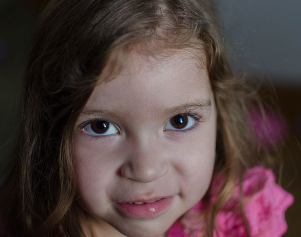
ecobin wrote:
Here's what I see:
1. A very beautiful little girl - be very proud!
2. The eyes should be tack sharp but are not - always focus on the eyes.
3. Cutting off top of head is common and in some circles artistic but do not cut off the chin.
4. The white balance is a little cold - try a gray card or expodisc especially when indoors and using more than one light source.
Great subject and model for your photography - keep it coming.
1) Thank you I am :D
2) The one eye is tack sharp but because of the f/1.8 the other eye is not i may have gotten away with a little higher aperture but she doesn't allow time for fiddling with settings lol
3)thank you will keep this in mind
4)thank you will try to remember to do this
Thank you for looking and commenting i very much appreciate it.
Aug 21, 2014 07:48:19 #
pgl wrote:
#1 for me but would like to see more light on her face.
Cute little girl. :)
Cute little girl. :)
I didn't think to use the on camera flash but your right if i had attached the flash and done some bounce lighting it would probably have looked even better... next time :)
Aug 21, 2014 07:46:30 #
dirtpusher wrote:
1
for me
for me
Thank you for looking and commenting.
Aug 20, 2014 18:05:53 #
djtravels wrote:
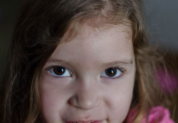
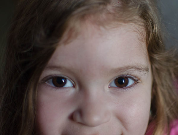
The second one is too tight on a beautiful little girl. Give yourself some wiggle room and crop to suit in PP. Tough lighting conditions, having to shoot @ f/1.8.
Thank you that is what i was afraid of with the second one the smile is killer and i love the eyes but i was unsure if the crop killed it... unfortunately as I said she was walking toward me and all i had on on was my 35 mm prime so i was stuck either catch the smile or risk losing a moment. :(
Aug 20, 2014 16:53:45 #
I am having a difficult time critiquing my work on these shots... its my baby girl. I realize that i have cut off some of her chin and head in the first shot and even more in the second. She is 3 years old and was walking toward me when i took the pictures (she won't stand still for me even with bribery). In a beginner photography class I took on portraiture i remember it being said that in some cases its OKAY to cut some parts off. Do any of you agree with this statement if yes do either of these photos come close? I have NOT cropped them this is just what i was able to capture.
Aug 10, 2014 08:10:26 #
photoninja1 wrote:
Much better. I agree with C.M. the focus is still soft on the majority of the flower. Shooting at a higher f stop will give you a lot more depth of field, but it appears that your system may be focusing in front of the subject. It might be worth the time to shoot a test series to confirm the focusing accuracy.
I am certain in is user error as i was again on my tippy toes on a step stool to take this picture i probably moved slightly but i will mention it to my husband so he can check it. Thank you for looking and commenting.
Aug 10, 2014 08:08:14 #
Country's Mama wrote:
I think your focus is still off, but your composition is much better, though in my opinion could be improved by moving the flower to the right as it is leaning to the left. With the left lean and so close to the edge it leads your eye out of the image and not into it. But all that being said leaving room all the way around makes this quite an improved image.
The colors and exposure are beautiful.
The colors and exposure are beautiful.
Thanks for looking and comenting
Aug 9, 2014 19:20:53 #
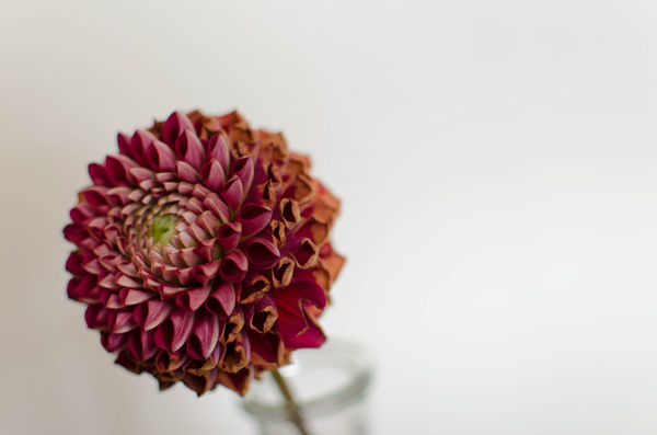
Ok here we go again hopefully this one is better then the previous.
Aug 9, 2014 19:05:53 #
MtnMan wrote:
DOF too shallow leading to OOF in front. Use f-stop of 16 at least.
Also need to have some free space around the bottom of the flower and get the whole thing. It is OK sometimes to cut off things like parts of people's heads but it needs to be deliberate.
Also need to have some free space around the bottom of the flower and get the whole thing. It is OK sometimes to cut off things like parts of people's heads but it needs to be deliberate.
yes i am sorry the front was my intention but i missed my mark ... thanks you for looking and comenting.
Aug 9, 2014 19:04:46 #
Linda From Maine wrote:
The hint of stem and vase is very pleasing at that aperture. However, I'd like to see the foremost petals in focus rather than the ones further back.
I love the simplicity of the composition, the perspective, and the empty space, but cutting off the flower at the bottom edge of the frame really bothers me :)
I love the simplicity of the composition, the perspective, and the empty space, but cutting off the flower at the bottom edge of the frame really bothers me :)
Thank you for looking sorry about cutting off the flower i didn't intend to as mentioned earlier this picture was taken on my tippy toes on a step stool. So probably as i pressed the shutter button i moved just a hair. :(
Aug 9, 2014 19:02:40 #
Nightsky wrote:
Shooting at f/2.2 you have a very limited depth of... (show quote)
Yes thank you i did not crop it this way unfortunately the angle i was at was on my tippy toes on a step ladder, I am short and the only "nice" wall area was for me to put the vase on top of something so i needed more height .... this being said i was shaky and i focused in the wrong spot. As mentioned i do have other photos some that i wasn't on a step ladder :) as for the aperature i noticed that as i went to a smaller aperature the flower became much darker and almost black so i took it at that higher aperature to let more of the natural light get to it so we could actually see the photo. Yet a failed attempt ... its fine i will keep trying :) Thank you for your feedback it is truly appreciated.