Posts for: GPoyner
Sep 21, 2019 15:59:01 #
I use PaintShop Pro and AfterShot, it's been a number of years since I've upgraded it; but have no problems with it (just used it today) and my upgrade price for those two items and even the video editor was still less then your yearly price (granted I've been a Corel customer for many years). Plus I get more than what Adobe was offering for a fraction of the costs.
Jun 29, 2015 19:34:05 #
PalePictures wrote:
Natural light.
Can you tell me which image you like best and why?
As always I hope they translate well.
Thank you for looking!
Russ
Can you tell me which image you like best and why?
As always I hope they translate well.
Thank you for looking!
Russ
First off - it's been awhile since I've replied and by no means a professional, but here are my thoughts.
Well I like Bill's - there is more depth to the photo, and not as processed as I have seen in the past (meaning grunge upon grunge - if that makes sense). I also like that I can see his eyes more, I can look into his eyes and try and see how he got there. There is more contrast in Bill's photo then Kevin's which gives it the depth and separation from the background. Especially since there is more lighter gray (white) in the photo then Kevin's.
Kevin's is good, but it seems to be missing something. His eyes are good, and I don't mind that they are not following his nose per say. He himself looks good, maybe it is the background blends a bit too much for me into him. I also would like to have a bit more room to where he is looking as to give it more of a story of long past. If you are going old school (and I know you are a master at these things) maybe go with a even more faded photo but yet a higher contrast on the important parts (as in the outline of his face, eyes and details of his wrinkles) - not a washed out photo just a bit of pop.
Now again, far from the expert and I always have that problem of not going far enough or going to far. Hopefully now that I'm on my own (besides the two teenagers), I can find some time and gumption to get back out there and practice some more.
Good work on both of these photos
GPoyner
May 3, 2015 20:07:07 #
Rich2236 wrote:
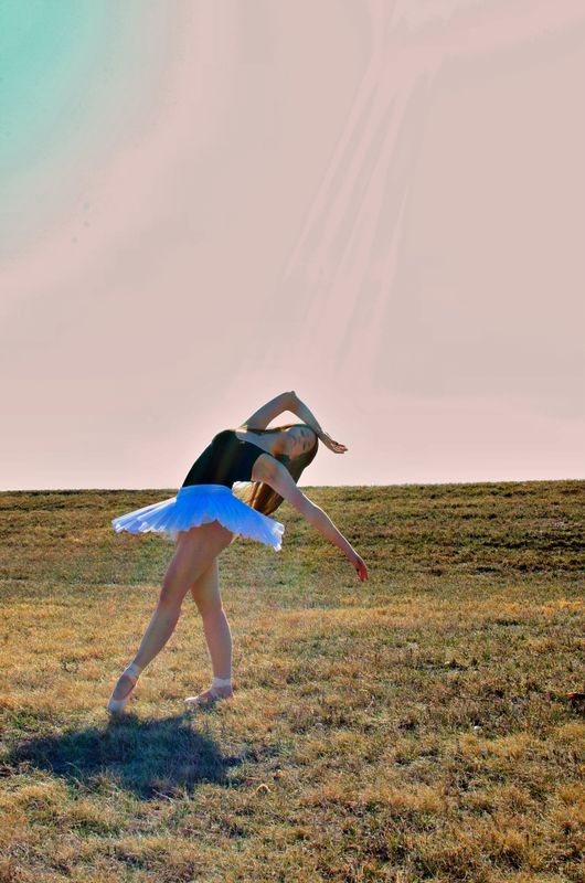
An excellent pose, GP
.and the light streaks are perfectly in line with her pose. I would crop a little off the bottom, say to the edge of her shadow
also, i would love to see an enlarged view. Click "store original" Otherwise, a beautifully posed shot.
:thumbup: :thumbup: :thumbup:
Rich
:thumbup: :thumbup: :thumbup:
Rich
Thanks Rich, agree cropping will help a bit. I got a little hurry up and post since it has been a long time since I have posted anything; the pose is all her I have no coordination in my body unless of course it is volleyball! GPoyner
May 3, 2015 20:05:15 #
LLucas wrote:
Her pose is very beautiful!
I'd like to see her feet closer to the horizon with a solid sky behind her (horizon chops her in half) and maybe a tighter crop so I can see her face better.
But, the light is pretty on her body and like I said, that POSE is incredible. Good job.
I'd like to see her feet closer to the horizon with a solid sky behind her (horizon chops her in half) and maybe a tighter crop so I can see her face better.
But, the light is pretty on her body and like I said, that POSE is incredible. Good job.
Thanks LLucas, I'm still debating on seeing her face better, in the means of bringing a little mystery behind who IS that dancer. Yes cropping is in order, not sure on the feet to the horizon, the solid sky brings not much interest for me. Let me think on that one...GPoyner
May 3, 2015 20:02:28 #
lalezo wrote:
In my judgement, you might do a bit of cropping, otherwise a very nice image.
Lloyd
Lloyd
Thanks Lalezo - yes cropping is in order a bit from the top and a bit from the bottom. GPoyner
Apr 30, 2015 19:12:48 #
It's been awhile, but I have been out shooting when I can. Here is a photo that I took of my daughter. Yes the processing could use some work and the banding in the sky is a bit bothersome (most likely of me trying to get the rays to show, ok because I was trying to get the rays to show more); but I do love how the rays of the sun hit her and align with her body.
Please don't hold back any comments, suggestions, tips, tricks or feedback is greatly appreciated.
Thanks GPoyner
Please don't hold back any comments, suggestions, tips, tricks or feedback is greatly appreciated.
Thanks GPoyner
Dancing in the Sun
Jan 5, 2015 18:16:32 #
EdJ0307 wrote:
Since there seems to be a disagreement as to whether this is the Short-billed Dowitcher and Long-billed Dowitcher, I Googled both and found these images. This should settle the issue.
Ok...now that is funny! Thanks for the laugh! GPoyner
Nov 30, 2014 10:55:24 #
Tamalero....yes you could write the coupon again in the forum for others to use. Thank you for the offer. GPoyner
Nov 29, 2014 18:24:54 #
Thank you for your kindness; I did upgrade my paintshop so received a coupon from that. Have a wonderful night....GPoyner
Nov 29, 2014 17:29:41 #
Thanks Tamalero....the coupon can only be used starting Dec. 8th. I'm still only getting the 68.99 deal. GPoyner
Nov 29, 2014 17:13:08 #
Interesting, I went directly to their site and it came up 68.99. I wanted to go directly to the source and not click on the link...thus why I got the 68.99 price (USD). GPoyner
Nov 29, 2014 16:23:01 #
Thanks, but when I looked it was for 68.99 on sale. Did you have another coupon that you used? GPoyner
Oct 28, 2014 17:22:54 #
Try this link:
https://support.google.com/nikcollection/answer/3002252?hl=en&ref_topic=3001412
Thanks GP
https://support.google.com/nikcollection/answer/3002252?hl=en&ref_topic=3001412
Thanks GP
Oct 27, 2014 17:41:16 #
Oct 27, 2014 16:07:30 #
hlmichel,
I don't know if this would work, but you could try and see if it does - if you are getting more relaxed expressions from your models with sunglasses on - see if you can find some that are not so darkening - meaning ones where you can see the eyes - I have a few that I don't wear because they are just cheap ones that do nothing for protecting the eyes. GP
I don't know if this would work, but you could try and see if it does - if you are getting more relaxed expressions from your models with sunglasses on - see if you can find some that are not so darkening - meaning ones where you can see the eyes - I have a few that I don't wear because they are just cheap ones that do nothing for protecting the eyes. GP