Posts for: Crichmond
Apr 18, 2019 09:15:58 #

Apr 18, 2019 08:27:42 #
jaymatt wrote:
He’s a good-looking fellow!
That he is!
Thanks!
Apr 18, 2019 08:20:13 #
Linda From Maine wrote:
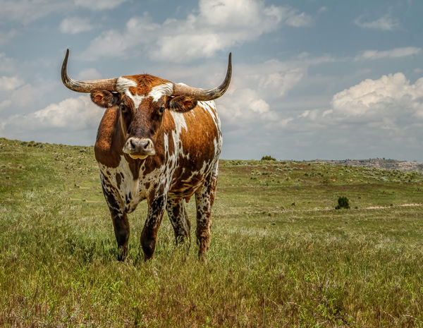
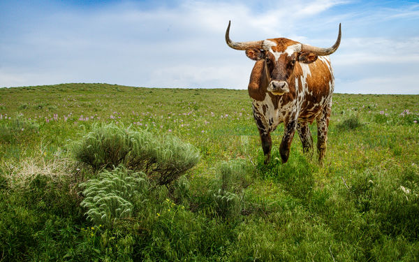
That could be painstaking work to remove that barbed wire - a good challenge for those looking to increase their skill. The steer is hugely photogenic and you've given him the setting and processing he deserves  Delightful work, Claud!
Delightful work, Claud!Thank you!
Apr 17, 2019 21:13:14 #
saxman71 wrote:
Nicely done. I could not tell if you had not told me. I've been shooting some backgrounds as well and using masks to do composites. I think a lot of photographers do it. One fellow I follow always has a nicely shot bird on a great perch with an extremely clean background. There's no way that happens in nature as much as it happens to him.
I like to composite to practice my photoshop skills. Keeps me up to date with various techniques.
Birds can be difficult for the reason you mentioned.
Thanks for the comment.
Apr 17, 2019 20:15:22 #
Apr 17, 2019 19:56:11 #
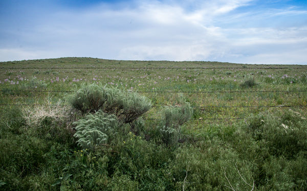
While traipsing around the panhandle of Nebraska we (my wife and I) found a field to shoot. So I shot it. Then a day or so later we found this cow. So I shot it.
So I decided to put them together and came up with this composite.
Thanks!
So I decided to put them together and came up with this composite.
Thanks!
Apr 17, 2019 12:37:11 #
SalvageDiver wrote:
Very cool image and process. I love the subdued teal and orange colors of Dylan Furst images. I'll be trying this more often. Thanks for sharing.
Mike
Mike
My pleasure!
Apr 16, 2019 12:49:44 #
Linda From Maine wrote:
A highly engaging result! Thanks so much for your time in putting this together, Claud.
My Pleasure!
The color-grading process is elaborate, so to save time for the next image I created a Lightroom develop preset and three brush presets.
I'd be happy to share those with anyone who might be interested.
Thanks!
Apr 16, 2019 11:04:43 #
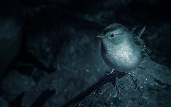
This image spawned from my participation in the Use of Light and Dark Challenge in the Post-Processing Digital Images section.
http://www.uglyhedgehog.com/t-587279-1.html
I had not heard of chiaroscuro (Italian for light-dark), but I am aware of the strength or even importance of using shadows and highlights or whites and blacks to create strong contrast. So I snooped around YouTube and found a tutorial on using Lightroom to create a moody style Color-grade. In the past I’ve dodged and burned and used luminosity masks to create image drama, but watching this tutorial I became aware of using color-grading and brushes as well.
The tutorial was entitled “To Edit Like Dylan Fursty On Instagram.”
http://www.youtube.com/watch?v=FeCE7Zw7_jU&list=PLgBEIQRS9aBK2_8WXytnXsPmq2768Zf-e&index=13&t=0s
This is my first attempt at that process. I used Lightroom’s basic panel to desaturate green and color-grade the image, split toning to increase the blues, calibration for more effect, HSL for color adjustment, and curves to add some contrast. Selected brightening in the image was created using the elliptical tool and brushes; and finally Photoshop for fine tuning.
Apr 16, 2019 09:26:49 #
dpullum wrote:
When is B&W not B&W,,,, obviously when it is blue.... very effective Cyano-Metallic look.
Thank you!
Apr 15, 2019 18:58:27 #
Linda From Maine wrote:
Very compelling work, Claud.
Thank you!
Apr 15, 2019 17:34:23 #
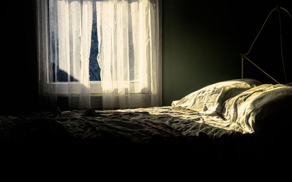
I’m offering this an example of chiaroscuro, spawned from the Use of Light and Dark Challenge in the Post-Processing Digital Images section.
http://www.uglyhedgehog.com/t-587279-1.html
I added a dark and moody desaturated green color-grade using the basic panel, split toning, calibration, HSL, and curves in Lightroom. Selected brightening was created by way of the elliptical tool and brushes.
I also used Photoshop for some fine tuning.
http://www.uglyhedgehog.com/t-587279-1.html
I added a dark and moody desaturated green color-grade using the basic panel, split toning, calibration, HSL, and curves in Lightroom. Selected brightening was created by way of the elliptical tool and brushes.
I also used Photoshop for some fine tuning.

Apr 14, 2019 10:00:07 #
Yes! Thank you!
This should be fun!
This should be fun!
Apr 13, 2019 18:18:29 #
Linda From Maine wrote:
Claud, since you and Vince chose the same photo, I... (show quote)

My pleasure!
Great study and practice on light!
Thanks!
Apr 13, 2019 17:14:44 #
Hi!
I also imported the image into Lightroom for basic editing, and then exported to Photoshop for the heavy lifting.
In Photoshop I used a series of luminosity masks in conjunction with curves to manipulate the darks and the lights and add a bit of warmth to the light. I also did a little dodging and burning, sharpening, added a light vignette, and then finished by cropping to the 16 x 10 perspective.
Thanks for letting my play!
Claud