Posts for: BobR
Jan 9, 2016 21:29:32 #
Hi everyone. I'm back at work on this project after a hiatus for the holidays. Thank you all whom have replied offering suggestions so far.
I have two lights with soft boxes each with 5 -32 watt 5000k bulbs pointed at the drawings now on each side. Its not so much I cant get the WB correct but it seems like the camera just underexposes the white. Ive tried various picture control settings, aperture settings , anything I could think of.
I have two lights with soft boxes each with 5 -32 watt 5000k bulbs pointed at the drawings now on each side. Its not so much I cant get the WB correct but it seems like the camera just underexposes the white. Ive tried various picture control settings, aperture settings , anything I could think of.
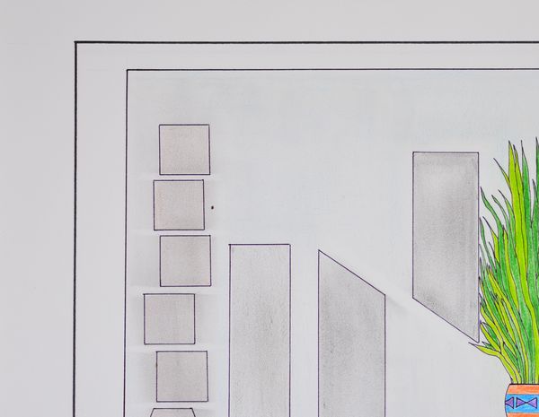
Here straight out of the camera. F3 , iso100, exposure comp 1.3 ,
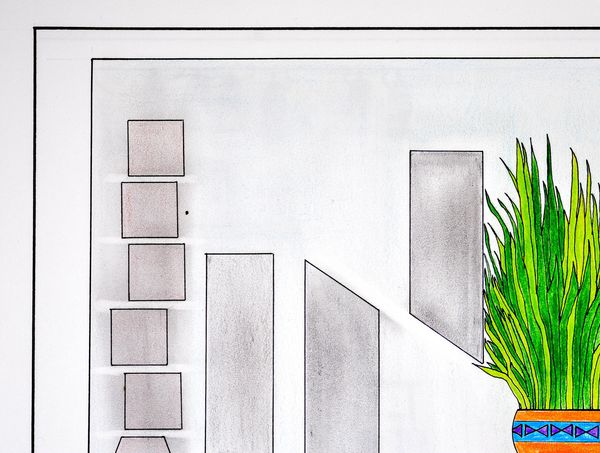
Same pic after tweaking in lightroom. Colors and everythiung are close but still itsn't quite white enough...
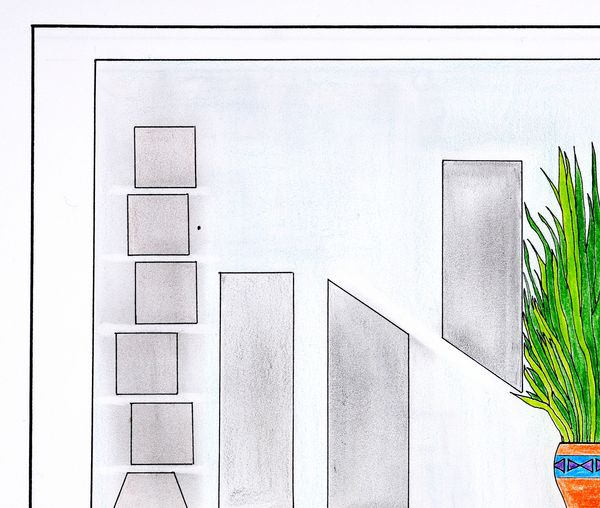
Best results so far and maybe the best I'll get. let the camera do the thinking(auto exposure) then just contrast
Nov 26, 2015 20:07:32 #
Happy thanksgiving everyone! Took this tonight of my son with the Chiminea roaring...

Nov 23, 2015 17:13:28 #
merrytexan wrote:
Beautiful sunrise shot bob...great way to start the day!
Thanks! Haven't been on the board too much or even taken any shots lately so I just saw this.
Actually I got wrapped up last few weeks trying to capture accurate images of a friends drawings and I find the tasking kind of grueling. Not my thing and Ive put the endeavor off until I get some better lighting. Need to get out and take a few shots. Bob
Nov 9, 2015 19:54:16 #
Apaflo wrote:
It's not pointless because now you know what has t... (show quote)
Thank you for removing the picture. I meant its pointless for someone else to mess with it without the having the original to compare to it.
FWIW- I have already done what you did but subtly - contrasting too much messes with the coloring of the originals. Bob
Nov 9, 2015 18:48:03 #
Apaflo wrote:
Here is an example of what can be done with that i... (show quote)
I guess I was to late deleting the attachments. This is exactly why I did so. I didn't want anybody taking it upon themselves to manipulate them with asking permission first. Without having the original in front of you its pointless anyways. Bob
Edit- Yes please remove it. Bob
Nov 9, 2015 18:25:02 #
quixdraw wrote:
Afterthought that I should have put first. Did you try experimenting with different light sources? Also adjusting Kelvin degrees to the lights instead of standard white balance? might be worth a try.
Yes I have. The manual white balance setting as suggested by marcomarks has been the best yet. I just tried a bit of tweaking in Lightroom and that's gotten me 90% of the way. I'm going to have to batch these in LR I guess. He has hundreds to photograph! :shock: I would post the results but they are not mine so I got nervous and removed them. Bob
:shock:
Nov 9, 2015 17:53:43 #
quixdraw wrote:
Do you have any pp software? I had color troubles with my (now) daughter in Law's wedding dress. The basic Canon Image garden let me select something -- her dress- as white and instantly corrected it to white. At that time, I had no pp experience. You might want to post your issue with the Post Processing group.
Yes I do. I was trying to get as close as possible first before PP. Guess I'm going to have to try now though. Thanks, Bob
Nov 9, 2015 17:51:36 #
marcomarks wrote:
Your auto white balance is causing the white to be closer to a neutral gray. Switch to manual white exposure and adjust there which will better match the light in the room. The white will clear up. Or you can change "color temperature" in editing software.
Thanks! I manually set the white balance on the white of the drawing. Better but not as I see it. Bob
Nov 9, 2015 17:20:43 #
A friend of mine asked me to photograph his drawings. I knew it might prove difficult but not as much as it has been. I just cant seem to get the white-white(bright enough)! If I expose higher the detail and color starts to wash out. Using my Sigma 70mm macro and D7100. Any suggestions would ber greatly appreciated. TIA Bob
Oct 10, 2015 00:00:34 #
Oct 9, 2015 23:59:34 #
Oct 9, 2015 23:59:00 #
Oct 9, 2015 23:58:27 #
Linda From Maine wrote:
I never care about what gear unless it's focal length to understand the perspective, or a dof discussion.
For me it's all about the composition, subject, impact, vision, beauty, creativity. This image ticks a lot of boxes. Super!
For me it's all about the composition, subject, impact, vision, beauty, creativity. This image ticks a lot of boxes. Super!
Thanks Linda! For me it dependent on the type of photography a lot. Also the IQ has got to be good enough to get a decent size print from- never know when its a keeper! lol! Bob
Oct 9, 2015 23:51:44 #
Oct 9, 2015 23:51:15 #