Posts for: Jim-Pops
Feb 6, 2024 09:10:00 #
Feb 6, 2024 09:09:46 #
Feb 6, 2024 09:08:19 #
Thanks Linda and Frank. I wish I could say I came up with the tin-foil on my own but to be truthful I saw someone else use the tin-foil first as a background during a macro shot.
Feb 6, 2024 09:05:37 #
R.G. wrote:
The transition from the flower to the background is continuous but the flower is still differentiated. I suspect an overall colour tint giving continuity across the image.
I did give it a slight amount of tint, wasn't needed but something I preferred.
Feb 5, 2024 21:08:19 #
Shot this with a 60mm macro lens. The background is wrinkled-up tin foil.

Feb 5, 2024 20:09:05 #

Feb 5, 2024 09:56:08 #
Here is your image this week. Anything goes as far as editing. Add, manipulate, twist, crop, or create a fine piece of art. Like to see and show fine editing that might improve one's pictures OR POSSIBLY create a piece of art using some of the latest software actions allowing different effects. ANYTHING IS ACCEPTABLE. If you use some special software or action please let us know the software you used.
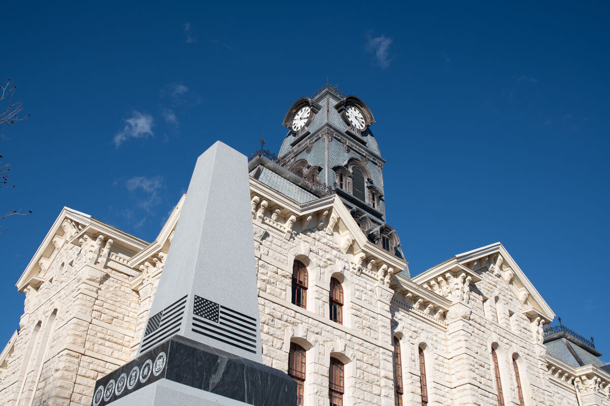
This picture was taken yesterday in downtown Granbury. The newly acquired grey monument is for our fallen soldiers, didn't get the whole monument in until I got on the ground, it's a much better photo, but decided to submit this one to see how you will handle it with all its angles. The monument can be in or out, not necessary for this challenge. If you prefer a .DNG file download here...
https://www.dropbox.com/scl/fi/a163ubm8t8w882lbdwqfp/Granbury-Cour-House-1.dng?rlkey=vih0chn0klq7fh5nk3saa2b81&dl=0
Feel free to download this image to your computer. Then you can edit it any way that you think is an improvement. Composites, black-and-white conversions, textures, sky swaps, inverted images, solarization, or whatever else you think are acceptable techniques for your edit. When you are finished, post your edit in this thread. Edits will be accepted until 9 pm Eastern time on Thursday. No edits will be accepted after that time, voting will begin then till Sunday evening. When you vote you will be voting for the one you like best based on your criteria, improved edit keeping it original, creativeness, or other factors.
Thank you for your efforts and participation.
Feb 4, 2024 22:15:55 #
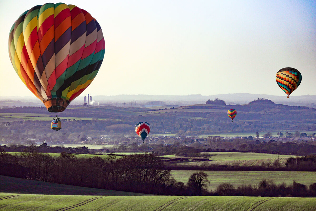
This week that is Jim-Pops giving the scene a festive look by adding all the hot air balloons.
Edit No. 7 Jim-Pops ....5 Votes
Edit No. 8 NJFrank .....4 Votes
Edit No. 9 NJFrank .....3 Votes
Edit No. 5 yssirk123 ...2 Votes
Edit No. 2 MattPhox ...1 Vote
Edit No. 3 Jim-Pops ...1 Vote
I'll have a new image for you to edit in the morning.
Edit No. 7 Jim-Pops ....5 Votes
Edit No. 8 NJFrank .....4 Votes
Edit No. 9 NJFrank .....3 Votes
Edit No. 5 yssirk123 ...2 Votes
Edit No. 2 MattPhox ...1 Vote
Edit No. 3 Jim-Pops ...1 Vote
I'll have a new image for you to edit in the morning.
WINNING EDIT
Feb 4, 2024 12:30:50 #
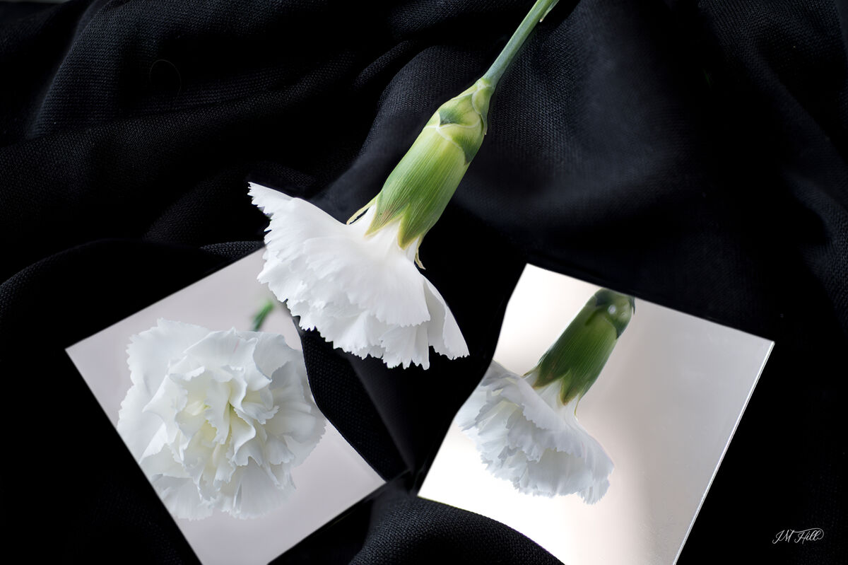
Using mirrors. Natural lighting. Focus stacking 9 images.
Feb 4, 2024 12:28:12 #
Thanks for all the comments. I have the love it, not much, and the in-between, very interesting. Messy set up probably won't try it again.
Something I say on YouTube had to give it a try.
Something I say on YouTube had to give it a try.
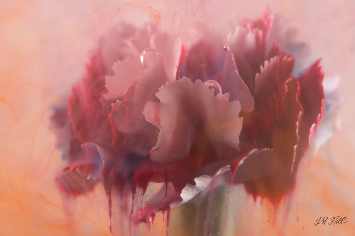
Feb 3, 2024 18:17:14 #
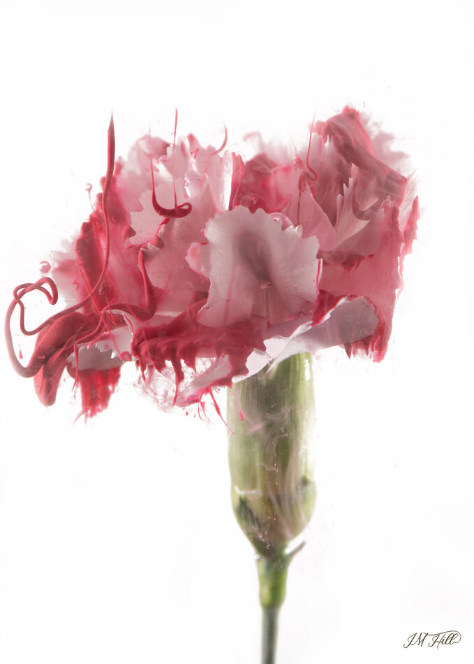
Not crazy about this but I gave it a try.
The white flower was placed in a cheap aquarium, filled with water, and then I dropped ink over the flower. The first image was at the beginning with just a few drops then cleaned up in Photoshop. The second image is with a bunch more ink that started floating around, no clean-up in Photoshop.
Stuck the flower stem in some modeling clay to keep it in place.
Feb 3, 2024 17:34:32 #
ebrunner wrote:
You got the light circle in the back to perfectly match the height of the hour glass. Tough to get all these elements to work together; but they do and the result is very impressive.
Erich
Erich
Thanks Erich. After three different tries, three different days I finally got one that was presentable.
Feb 1, 2024 21:31:35 #
** TIME TO VOTE **
What is your FAVORATE POST PRODUCTION IMAGE for this week's "MY IMAGE YOUR VIEW" competition? I'll post the results Sunday evening.
👉🏻 Anyone can vote. 👈 Tell us the one you like the best.
Click the link below. When the link opens it will automatically start running the pictures for 3 seconds each. To change the setting move your cursor to the lower left corner of the window, a menu opens and you can change settings.
As always, view the edits then return to leave a reply post using the matching number for the edit you think is best.
https://docs.google.com/presentation/d/e/2PACX-1vSj2eGlewkVD4GxMyDE6Pd0op4BQn_NxNb4wRP3e8pZ2QkuK0rpWeNOh_7KHk_WMVbdRopQVb1cCv52/pub?start=true&loop=true&delayms=3000
Jan 31, 2024 17:19:19 #
As I mentioned more than one entry will be fine. This week's challenge is very challenging with nothing in particular standing out. I added the balloons to change the bland mood to a festive one.

Jan 31, 2024 12:58:08 #
R.G. wrote:
The image has good depth. Not sure if it's because of the focus stacking or a small aperture. In any case the editing has worked.
Definitely the focus stacking. I tried without, that was a failure. The rock pile is fairly deep and the watch cover is some distance from the watch face.