Posts for: cbtsam
Feb 17, 2024 19:33:50 #
joecichjr wrote:
A phenomenal beauty 🥇🥇🥇
Thanks so much Joe
Feb 17, 2024 18:39:23 #
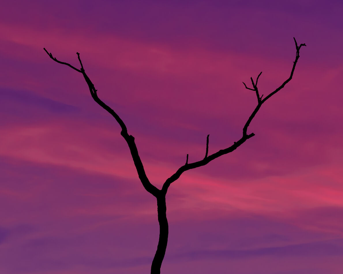
A couple of weeks ago, the weather turned remarkably warm, so we went down to Fort McHenry. One of the images I shot was of a bunch of trees without any leaves, silhouetted against the sky. I was particularly taken by a "gesture" a couple of branches made, as seen in the image here; it was a small bit of what my 120 mm could gather. I cut it out, enlarged it, and pasted it onto a sky I shot a couple of years ago. The sky was shot pretty early early near the end of 2022, the tree rather late. Feedback is more than welcome; indeed, it's why I'm posting.
Feb 14, 2024 18:46:41 #
Linda From Maine wrote:
If there is any quality loss with dng, surely it will be a non-issue for the hobbyist photographer who doesn't have advanced skills in composition, exposure or editing, and who doesn't intend to print gallery-quality (and size) images.
We know very little about the OP (minimal posting history), so suggesting a wide range of options (including free and easy) seems like a reasonable use of our time
We know very little about the OP (minimal posting history), so suggesting a wide range of options (including free and easy) seems like a reasonable use of our time
One indication of the loss of quality, or lack thereof, involved in converting to dng, might be indicated by the fact that the makers of HeliconFocus software, which I use for converting a stack of variably focused NEF images into a single focused stack image, uses the dng format for its output. My use of their system may not indicate much by way of quality, but the software's pretty solid reputation reputation might.
Feb 14, 2024 14:54:30 #
Linda From Maine wrote:
Thankfully, I haven't seen him suggest we buy cannons, just Canon 
Nor have I, though I have seen him fire them off pretty routinely.
Feb 11, 2024 16:27:14 #
Blenheim Orange wrote:
Do you peep?
Every chance I get! ... ... ... Oh, you meant pixels; well, then, not so often.

Feb 11, 2024 16:25:01 #
NJFrank wrote:
Perhaps Vertical shot. Than maybe the horizon being in the center would not so much of an issue to a judge.

Feb 6, 2024 10:18:55 #
Linda From Maine wrote:
Ah geeze, no pressure! 
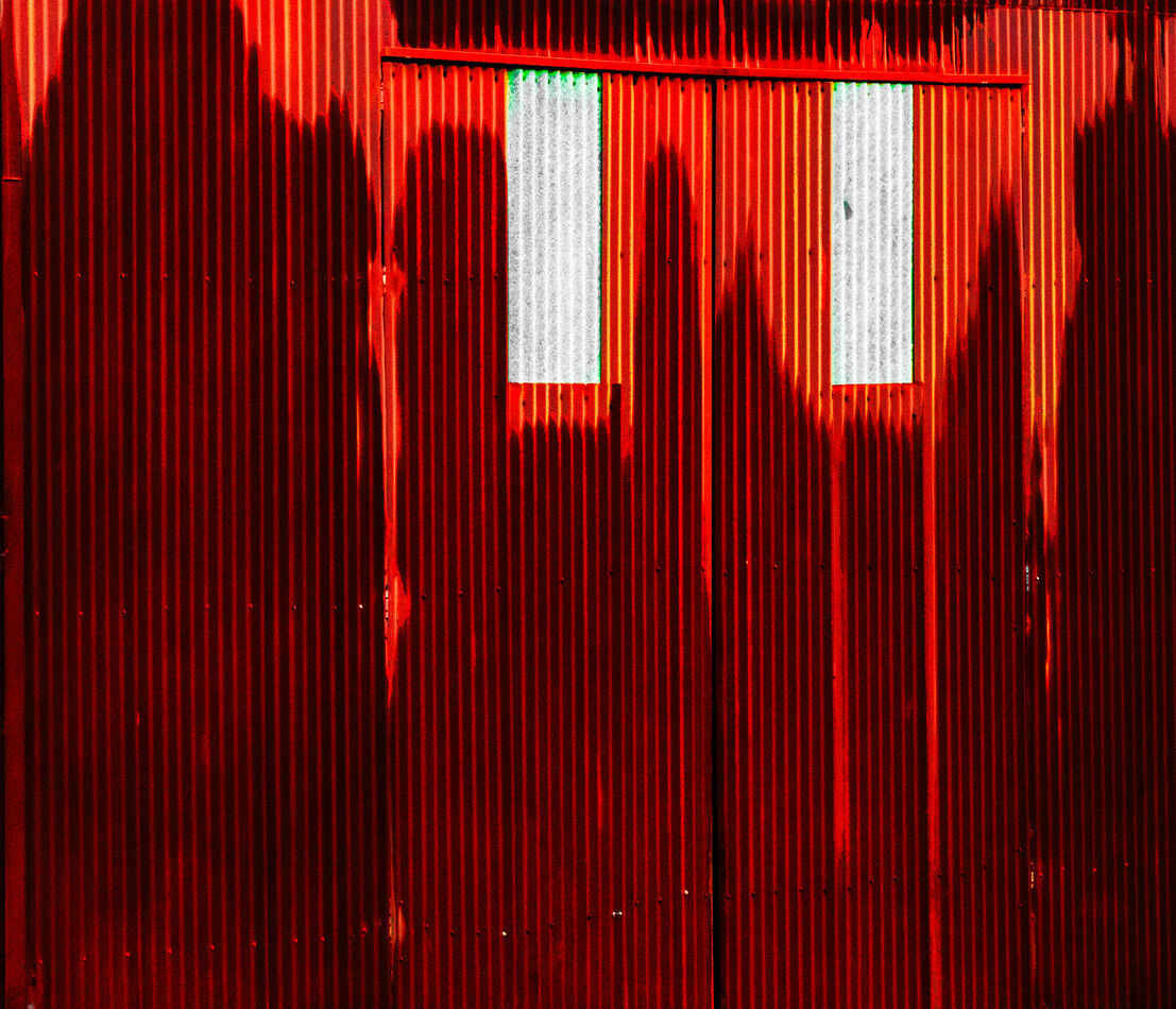
OK, I think I got it all. Instead of contrast, I used levels. I also thought it would be fun to share what I started with (after a couple of extreme slides during ACR editing).
Many thanks, Sam!
OK, I think I got it all. Instead of contrast, I used levels. I also thought it would be fun to share what I started with (after a couple of extreme slides during ACR editing).
Many thanks, Sam!
Wow! You really massaged that original!
I was thinking of something a trifle different from what you got. Here, I rather sloppily selected the shadowed areas, and then used a curves layer to hold the darker stripes constant and brighten the brighter stripes, so the stripping in the shadows popped more - maybe too much more. It may have been worth the effort, or it may not; since its your image, you'll have to decide.
Feb 5, 2024 14:15:42 #
Great eye, Linda. I love it. Of course, I always want to pick some nits. I agree that the green should go, or altered somewhat, since it just doesn't look real. Then there are some yellow spots I'd prefer spotted out, along with the white one on the lower left margin. Finally, I'd like to try more contrast in the shadows, so the red stripes stand out just a little bit more. And I would to emphasize that I am convinced it would be work the effort.
Jan 28, 2024 12:34:02 #
A trifle dimmer on my monitor than I'd prefer, but, overall, simply specTACular!
Jan 28, 2024 12:31:39 #
I tried a method similar to Linda's in Photoshop: Select>Select All, Select>Modify>Contract>500, Select>Inverse, Select>Modify>Feather>400, Curve>bring highlight down to 255:140. Try it; you might like it ... or not.
Jan 23, 2024 15:12:10 #
Its a lovely shot, Robert! I've tried to take similar shots, and I've run into some issues that are displayed in this image, although in much, much smaller doses than in mine.
Looking very closely, there are colors that seem out of place to me. One the bee's eye there's a constellation of colored dots that I imagine don't represent what was actually there. There are similar colors on the "knee" of the right front leg, at the base of the right wing, and in a streak along the upper abdomen. I have no idea why they're there, and I'd appreciate any edification anyone could provide me.
To be very clear, I mean no critique of Robert's excellent shot. I'm just seeking a little education for me.
Jan 23, 2024 15:04:16 #
Jan 22, 2024 19:10:59 #
DWU2 wrote:
I was hoping that by not posting it, the message wouldn't be rerouted to the lesser-viewed links section, but no. Here it is: https://texturelabs.org/
Much grass!
Jan 22, 2024 17:08:28 #
DWU2 wrote:
Another UHH member mentioned a site called Texture Labs. I checked it out - very impressive free collection of high quality textures. Very useful.
Perhaps you could honor us with the link?
Jan 22, 2024 16:48:38 #
R.G. wrote:
The concept of wabi sabi is so pervasive that it p... (show quote)
First, RG, thanks for your contributions to this discussion.
Now, when you contemplate an image that compellingly tells the story of impermanence and imperfection, and you allow yourself to be drawn into that story by that image, don't you have a shot at least of seeing interconnectedness in the image, and/or feeling connected to the subject(s) of that image, and thus living the interconnectedness of things? I offer this image as a possibility: