Posts for: selmslie
Apr 29, 2024 11:21:25 #
Longshadow wrote:
Again...
So glad I don't worry about all that stuff.!.!
I just use a large, small, or medium aperture for the effect I want, primarily on one lens mostly.
Small, large, or medium DOF, for whatever the lens does.
No sensor size worries either.
I just use the camera.
So glad I don't worry about all that stuff.!.!
I just use a large, small, or medium aperture for the effect I want, primarily on one lens mostly.
Small, large, or medium DOF, for whatever the lens does.
No sensor size worries either.
I just use the camera.
That’s the only approach that makes sense.
Apr 29, 2024 07:18:07 #
JD750 wrote:
There is probably some mathematical explanation for this, maybe someone here with optics knowledge can explain it. Or is it just a coincidence?
There is but it's based on the assumption that you don't crop the result during editing and that you are going to view it from a standard distance with normal eyesight.
Rather than drive yourself nuts with the math, just play with this depth of field calculator from Cambridge in Colour. Be sure to click on show advanced to see most of the contributing factors.
What they leave out is the effect of cropping on your computer (which changes the size of the circle of confusion) because there you can even change the aspect ratio.
It's all hardly worth the trouble to dwell on it.
Apr 29, 2024 07:01:19 #
Rongnongno wrote:
That works better.
Two responses from you and no objection about where this was posted?
Apr 28, 2024 15:01:23 #
wdross wrote:
Most of the time I agree with you. But you are not accurate this time. When I first got my Olympus OM-4ti, I only had linear polarizers. And in the manual, it said to use only circular polarizers. And with the linear polarizer, it caused visual variations in the viewfinder similar to morie patterns. As soon as I put on my new circular polarizer, those variations disappeared. …
We can’t really argue with direct experience.
There were a number of different methods used to accomplish metering and autofocus in SLR and DSLR cameras where mirrors and linear polarizers were incompatible. But once the mirror moved out of the way, there was no issue with the film or sensor.
Mirrorless cameras eliminate those problems.
Apr 28, 2024 13:56:43 #
rcarol wrote:
I have found that a linear polarizer is more effective than a circular polarizer. I have not found a single issue using a linear polarizer with any of the cameras that I own.

Apr 27, 2024 15:47:29 #
MJPerini wrote:
What you say about print size, resolution, viewing distance is correct, however in practice very few ‘viewers’ do that . Whatever the size of the image people tend to view it Much closer than the distance you suggest.
PPI and DPI are not the same thing.
PPI refers to the number of pixels used to display an image on a monitor. DPI refers to the number of ink dots used to paint an image on a medium like paper.
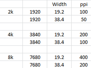
Common monitor resolutions are 1920 pixels (2k) and 3940 (4k). PPI is calculated by dividing the monitor pixel width by the width of the display in inches.
Based on normal visual acuity, 300ppi is considered the highest resolution that a human eye can perceive as sharp from about 10". From 15" it is 200ppi and from 20" it is 150ppi.
My eyes are old and I use readers because I chose to prioritize long distance vision when I had my cataracts removed.
I have two monitors that are about 24" wide. I can distinguish the separate pixels on the 2k monitor (82ppi) if I get close enough, but I can't work any closer than 15" from the screen. With the 4k monitor (157ppi) I can't really see the separate pixels from 15".
The arbitrary 300ppi standard viewed from 10" is conservative. It's also the basis for DOF calculations.
I doubt that any viewer is going to get within 10" of a print to judge whether it is sharp.
DPI is ink dots per inch. Printers use much higher dpi values to create a print. The Epson P900 has a maximum resolution of 5760 x 1440 dpi. It takes a lot of ink dots to represent the content of a single pixel. The multiple dots make it possible to achieve subtle colors.
The only way they come together is if you don't have enough ppi to generate a sharp image with the ink dots.
That ppi is inversely proportional to the distance from which the viewer is going to look at the image. But a printer used to create very large prints does not need as many ppi as a normal photographic printer. You can create a billboard sized print using a very low ppi so long as the viewer is not likely to get too close.
Hypothetical monitor resolutions
Apr 27, 2024 10:41:44 #
profbowman wrote:
As to printing, my sense is that one needs to experiment with dpi and desired size to "see" what is the best viewing situation--details seen at a given viewing distance. --Richard
Resolution needed for printing is pretty much a matter of proportions.
There is a consensus that 300ppi is the target to use when printing an 8x12" image that will be viewed from about 10-12" (25-30cm). That's about all that normal eyesight can resolve.
That works out about 8.44MP, maybe all you will ever really need. That's because a person with normal eyesight (or reading glasses) can't look at an 8x12" image from any closer than the normal viewing distance (about the width of the print) without developing eyestrain and a headache.
You print that same 8.44MP image at 8x12 feet and view it from 12 feet away and still see the same level of detail. Change feet to meters and it still works.
The bottom line is that any camera that can capture an image with more than 8.44MP can print any image size you need, so long as you don't crop the image below 8.44MP.
Incidentally, Harrisonburg, VA, is just north of Fort Defiance and the Augusta Military Academy. I was there for about a year in the early 1950s. We marched in a parade in Harrisonburg. I was happy to transfer to a more comfortable school in Miami. AMA now a museum, a pretty spooky place.
Apr 27, 2024 09:09:28 #
Artcameraman wrote:
I've been exporting from Capture One to Photoshop for printing when using my phase one studio equipment and for the life of me I don't remember why.
I can't imagine any reason to do that. There are a couple of good alternatives that are more straightforward.
I just export the image to a JPEG and use Epson Print Layout (simple and very capable) or Qimage Ultimate (more sophisticated but a little more difficult to use) to print it.
Apr 27, 2024 08:50:36 #
selmslie wrote:
But doubling down on the sharpness already baked into the image (I normally leave it at Capture One's default) may not be a good idea.
I tried several alternatives - No Output Sharpening, Output Sharpening for Screen, Output Sharpening for Print and Disable All. They all do something a little different. Output Sharpening for Screen works well when reducing the image size for viewing ...
I tried several alternatives - No Output Sharpening, Output Sharpening for Screen, Output Sharpening for Print and Disable All. They all do something a little different. Output Sharpening for Screen works well when reducing the image size for viewing ...
As I suspected, when it comes to printing, at least for the 7x10.5" print, the option that comes closest to what I am seeing in Capture One is 'No Output Sharpening'.
The ideal choice when exporting a reduced size for a display remains 'Output Sharpening for Screen'.
Apr 27, 2024 06:07:02 #
selmslie wrote:
But as the information is lost, so does is sharpness. And as more pixels are compiled into a single pixel, we should see a darkening of highlights, even specular highlights. They should not get brighter, but they do.
It's not just happening in Capture One.
It's not just happening in Capture One.
I have figured out what is happening in the two photo viewers. It relates to the comment above.
When I view the full image on my 2k display (23½" wide, 82ppi) with the Windows Photo Viewer or in Capture One, the complete image covers a width of about 17", about 1390 pixels out of the 1920 for the full screen. The numbers are a little different for the 4k display but the same thing happens.
In order to get 6000 image pixels down to 1390, it has to be downsized by 1390/6000 or more than four times in each dimension. Detail and sharpness is lost during this downsizing and the highlights are darkened. But the image will actually have about the same tonality and sharpness of a 17" wide print.
As I zoom into the image, the highlights appear to get brighter because there is less downsizing.
But zooming in also shows how a larger print would look. I can only make a 16x24" with my P900. A print that size would mean that anyone looking at the print will probably view it a normal viewing distance slightly greater than the distance at which I view my desktop monitor. For a larger print a normal viewing distance would render about the same character and apparent highlight brightness.
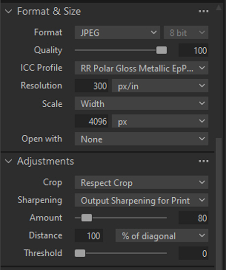
The Capture One export is different issue. During export it offers the option for additional adjustments (Lightroom might also offer this):
https://static.uglyhedgehog.com/upload/2024/4/26/450682-adjustments.jpg
But doubling down on the sharpness already baked into the image (I normally leave it at Capture One's default) may not be a good idea.
I tried several alternatives - No Output Sharpening, Output Sharpening for Screen, Output Sharpening for Print and Disable All. They all do something a little different. Output Sharpening for Screen works well when reducing the image size for viewing but Output Sharpening for Print does not work well for viewing.
It seems that the best alternative for printing is use the full image, JPEG or TIFF makes no difference. I will have to do some more prints to see if there is any difference between No Output Sharpening and Output Sharpening for Print.
Apr 26, 2024 17:09:29 #
profbowman wrote:
I was not espousing any particular method or filter to be used during resizing. I was demonstrating how downsizing from four-pixel groups to one-pixel groups will result in loss of information. ...
That is certainly true. And when you go beyond that to nine- or sixteen-pixel groups the loss will increase.
But as the information is lost, so does is sharpness. And as more pixels are compiled into a single pixels, we should see a darkening of highlights, even specular highlights. They should not get brighter, but they do.
It's not just happening in Capture One. It also happens in the Windows Photo Viewer on my Windows 10 desktop with two 2k monitors. It also happens on my other Windows 10 desktop with the 4k monitor on both the One Photo Viewer and the Windows Photo Viewer.
It may be something inherent in the digital image and display. And since the print is made of dots, not pixels, the printer is just passing on this phenomenon regardless of whether it's printing a TIFF, or a JPEG regardless of the level of compression.
Apr 26, 2024 15:37:31 #
MJPerini wrote:
If the Goal is a Print, the best large format pigment printers can print larger gamuts than your display (when sent as a 16b TIFF) which is good, but the display has a larger dynamic range than a paper print. So 'differences' abound in the process, controlling them for artistic intent is important
A B&W image does not have a gamut, just a tonal range from maximum black (0 for Zone 0) to maximum white (255 at 8-bit or 65535 at 16-bit for Zone X).
The Epson Print Layout program offers some additional control over the print but those settings cannot be conveniently saved like they are in Capture One, Lightroom, etc.
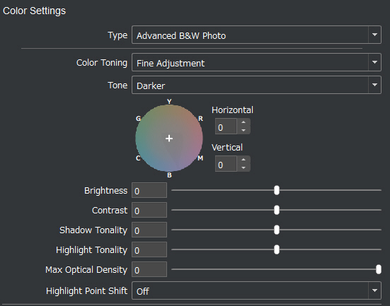
Color Setting dialog for the P900, the image can also be toned
Apr 26, 2024 15:19:37 #
ASTROBOO wrote:
I see a very minimal impact. Frequently I save images in PNG, relatively large files too large to email. I convert some to smaller JPG files that I can send but even in comparing them side by side on my PC I don't see much difference....?
Yes, there is not much difference but it's still enough to change the character of the image. If I had wanted the highlights to stand out, I would have made that happen within Capture One.
I can also see the same difference on my 4k monitor and on my iPhone.
I even tried exporting the image as a TIFF. Nothing visibly changed just the file size which was 70 megabytes for the 6024 wide image and 31 megabytes for the 4096 wide image.
I even printed the image with a Quality setting of 'Max Quality (Carbon Black)'. That just took a lot longer than 'Max Quality', but the print did not visibly change. Carbon Black might make a difference on a larger print but at 7x10.5".
The only solution seems to be to always print from the full-size image and only use the reduced size for sharing.
Apr 26, 2024 13:03:10 #
profbowman wrote:
Here is a simplified illustration, an 8 x 1 pixel image, showing this loss of information from the reduction in the number off pixels. --Richard
I wish it were that simple, but it's not. It's not even a question of sharpening or ICC profile in the Export dialog.
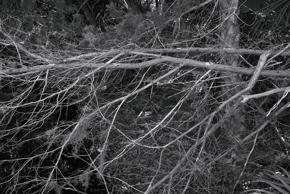
If you toggle between these two images, the highlights in the leaves are brighter in the in the reduced (4096 wide) version.
What's more, when I display either of them in the Windows Photo Viewer, I can increase the magnification by small increments (rather than going directly to 100%) and at the first increase, the highlights in the leaves get brighter.
If it were a simple matter of averaging of the pixel values, as you suggest, the highlights should get duller, not brighter.
Since this happens in the Photo Viewer as well as in the C1 Export step, there is something else happening that I can't explain.
Apr 26, 2024 09:34:05 #
selmslie wrote:
That's the crux of this subject, whether resizing [down] will result in a loss of detail that is reflected in the final result. The question is whether that becomes apparent in the final image.
I think that it does if fine detail is a significant feature of the original image. For some subjects, it is. For others it is not.
I think that it does if fine detail is a significant feature of the original image. For some subjects, it is. For others it is not.
That 4k rendition is an example of what might happen to a color image during the demosaicing stage.
Bayer array demosaicing entails combining a red, two green and a blue pixel (a 2x2 square) to make each RGB pixel. Each raw pixel is used four times so the end RGB result is almost exactly the same size as the original raw array. Since half of the raw pixels are green, a 24MP camera capture 12MP of green resolution interspersed with 6MP each of red and blue information. The demosaicing process has been estimated to reduce the sharpness of the image by about 50%. That is close to the loss that can be seen in the 4k image above.
But the B&W images I have been showing here were captured on a 24MP sensor with no Bayer array. They have been processed without going through the demosaicing step. Each pixel contains the luminosity value from a single raw pixel. I have compared the results from 24MP monochrome image to a 45.7MP image from a Z7, using the same lens, and both of them appear to be equally sharp.
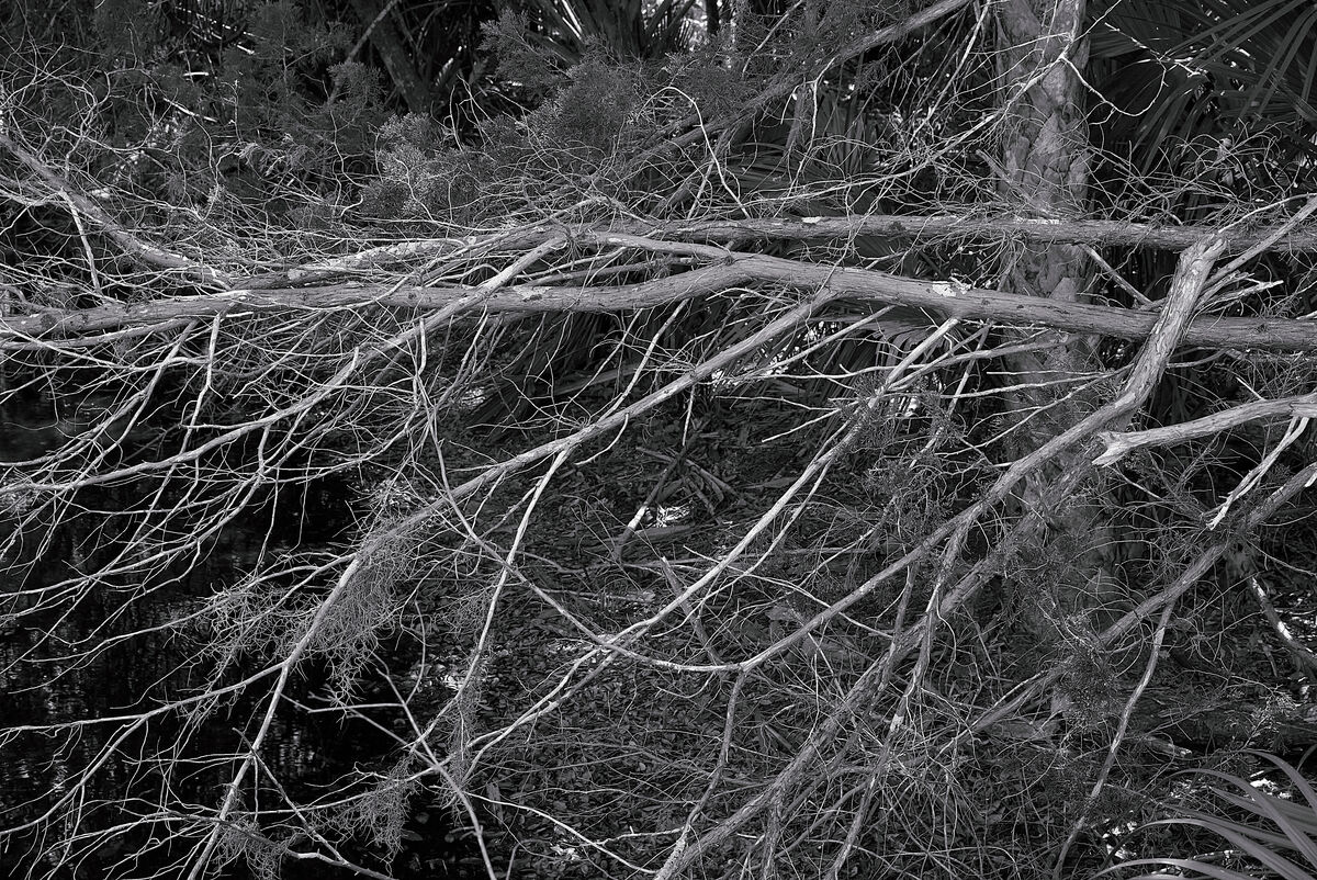
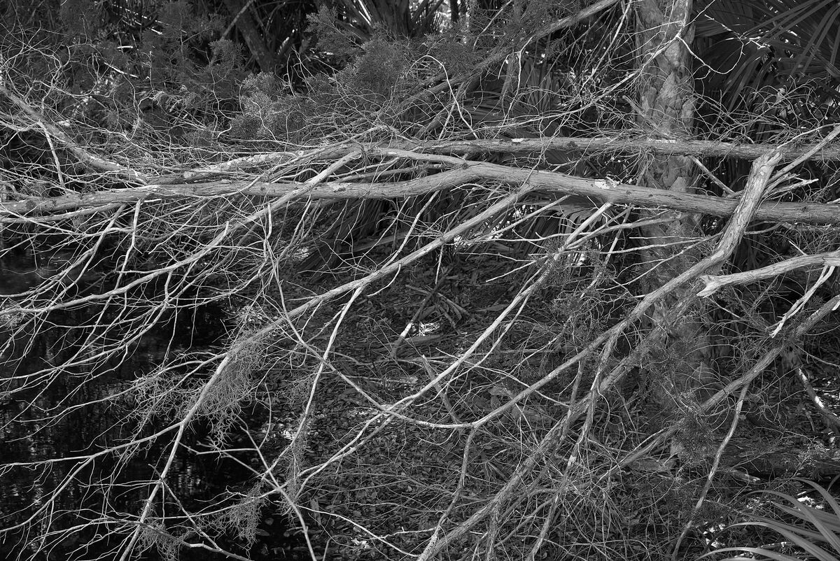
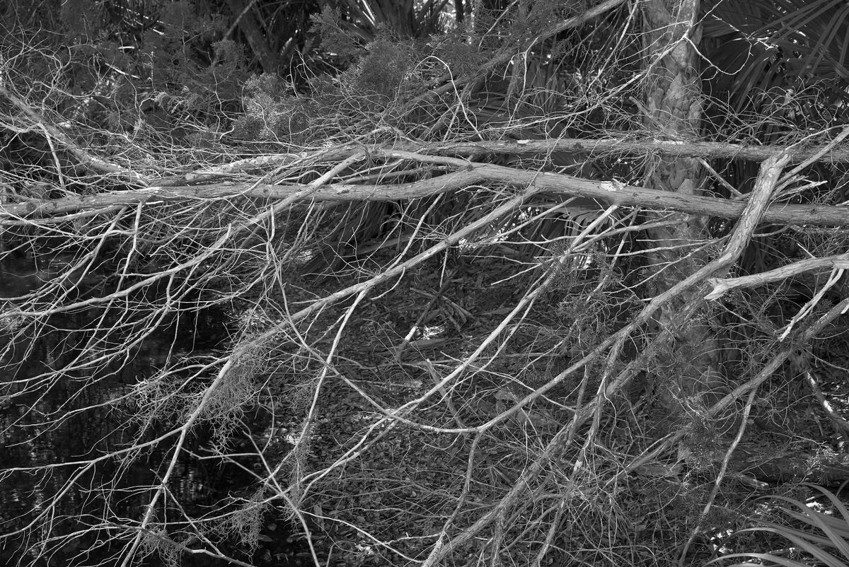
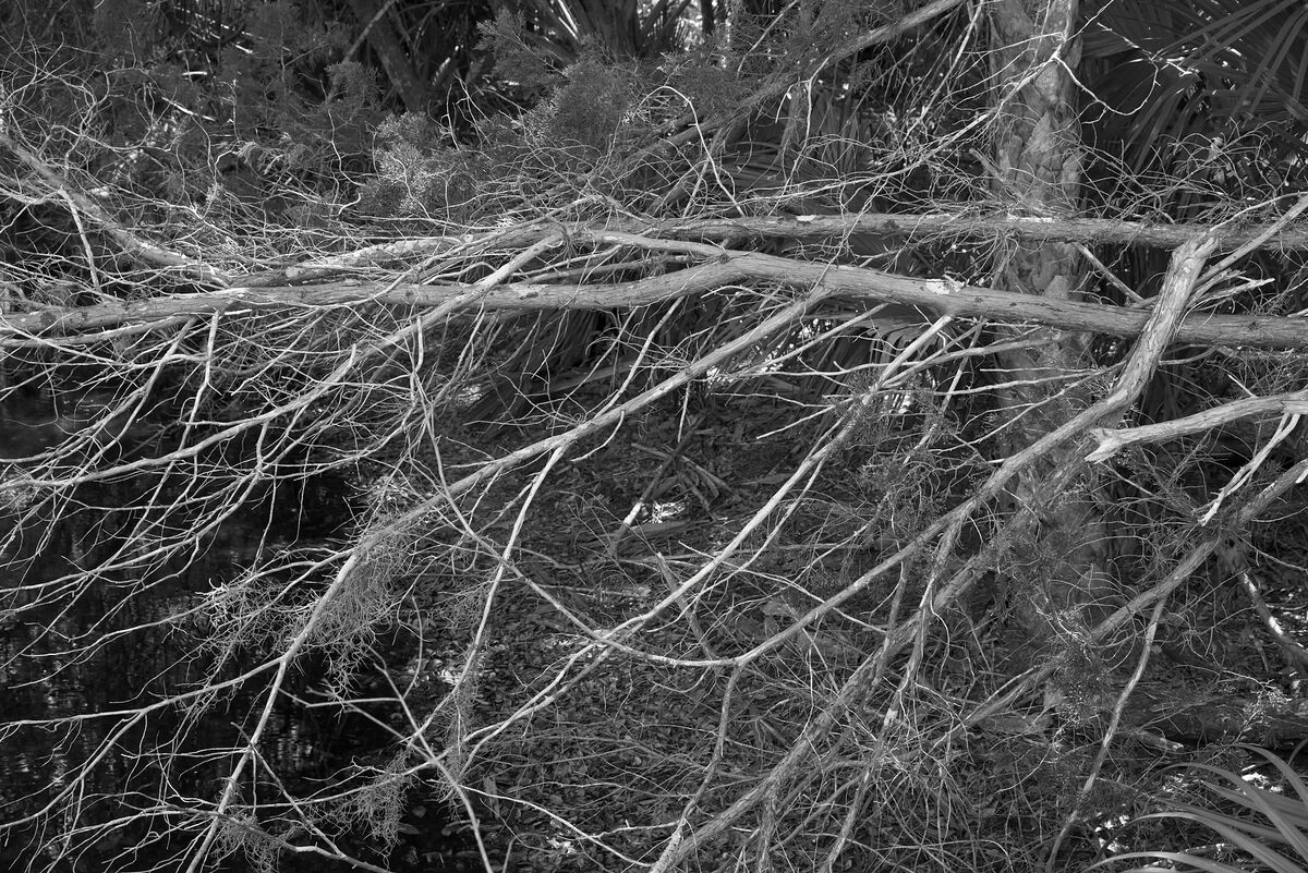
Below are four images that I printed at 7x10.5" on Red River Polar Gloss Metallic. As I run through the set, the sharpness changes are hard to see. What is easier to see is that the brightness of some of the highlights increases as the compression increases.
I could use the full size image to make a 14x21" print and it would look just right. I could make it even larger since the viewer would need to back away from the print. I won't because paper and ink are expensive.
The smaller sizes could be posted for display. They could be used for smaller prints, but it would do not harm to print from the larger version.
