Check out Professional and Advanced Portraiture section of our forum.
Posts for: dpackard67
Jan 1, 2014 11:08:06 #
traveler90712 wrote:
On the job, may mean the equipment would get knocked around during transportation and on site.
I would suggest a hard wheel case (by no means cheap), such as pelican cases (http://www.pelicancases.com/?gclid=CM6K88L53LsCFUjNOgod5DgAdwc). Other such cases are sold at B&H, Adorama, etc. (You might even be able to deduct it as a business expense.) :thumbup:
I would suggest a hard wheel case (by no means cheap), such as pelican cases (http://www.pelicancases.com/?gclid=CM6K88L53LsCFUjNOgod5DgAdwc). Other such cases are sold at B&H, Adorama, etc. (You might even be able to deduct it as a business expense.) :thumbup:
Ebay has some pretty resonable prices on pelican bags. On all camera bags actually....
Nov 22, 2013 01:43:52 #
You are very wise and knowledable. Yes I love photography and only dream of being a pro. But I do want to continue to learn and grow in photography. I love the challenge. Nothing is more rewarding than getting a really good photo. My passion is action and landscape photos but I do enjoy photos of live subjects. People, pets etc. It's kinda funny, I had cropped that photo after watching Valenzuela's video. I did have the foot bridge behind her, just not quite as much as the other. Thanks for your informational advise....
Guy Johnstone wrote:
For the most part portraits fall into two categori... (show quote)
Nov 21, 2013 12:34:09 #
Your 2 cents count... You also represent what the publics view point would be. Thank you also...
GPoyner wrote:
I agree with rapvich. For me, the walking away on the path is a bit overdone and the meaning is lost usually - ...the last picture might work if they where more near the end of the path and more path shown behind them....and no I'm not a professionaly either, just me two cents.
You are really doing a good job, just a bit of tweeks and you'll get it....Thanks GP
You are really doing a good job, just a bit of tweeks and you'll get it....Thanks GP
Check out Software and Computer Support for Photographers section of our forum.
Nov 21, 2013 12:32:36 #
No hard feelings... I too and not a pro by no means. Even though you are not a pro, you represent the public and this gives me an idea what the people I do photos for, would think of my photos. Thanks for your truthful opinions.
rpavich wrote:
I'm sorry I was so short....I was on my pad and couldn't type.
Well...remember, I'm not a pro..so...take what I say with a grain of salt..ok?
Photos of people walking away...ahh....not my deal. If others like them....then fine.
Also...the path seems to not be helping in my opinion...at least the way it is now...I look at them...then my eye continues right out of the left side of the frame.
Others might be able to give better advice...that's just me.
Nov 20, 2013 22:13:47 #
You think so? I tried to get the photo to look like they were walking down the path... instead of just a still photo.
The background is part of the picture, not just the kids...
The background is part of the picture, not just the kids...
rpavich wrote:
I'm going to say it also doesn't work for the same reason.
Nov 20, 2013 21:29:39 #
WOW! The work and training that went into that!!
Nov 20, 2013 20:39:19 #
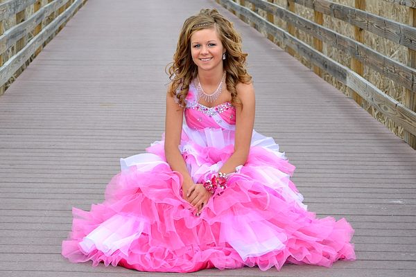
It's our local walking path and this is the photo we originally wanted.
rpavich wrote:
To me... yes.
The path not only leads my eye away from her but it doesn't add any info...why a bridge?
But remember...I'm a hobbyist...not a pro
The path not only leads my eye away from her but it doesn't add any info...why a bridge?
But remember...I'm a hobbyist...not a pro
More Prom

Check out Wedding Photography section of our forum.
Nov 20, 2013 20:00:00 #
Since we are talking about backgrounds, is the background too much in this photo also....
Prom
Nov 20, 2013 19:25:08 #
Thank you for your kindness. I really want to learn and take my photos from everyday pictures to really good photography! Again thanks!
rpavich wrote:
You are so very welcome!
And might I say it's refreshing to read such a positive reaction to a critique here on the 'hog.
If you need anything, just PM me.
And might I say it's refreshing to read such a positive reaction to a critique here on the 'hog.
If you need anything, just PM me.
Nov 20, 2013 13:52:08 #
I loved it! So much information just in this one video, can't wait to see the whole thing... I went back through the whole set of photos I took for my daughter. I found I did do some things correct. Background was my main enemy in a lot of the photos. The kids wanted the photos outside. We live is a small community and have very few choices to go. The jackets they had on was also not real flattering but it was only 19 degrees out that day and without them their coloring was really read and even a little blue. Thank you for pointing me in the right direction.
rpavich wrote:
We could sit here and list what's wrong and right ... (show quote)
Nov 19, 2013 19:51:25 #
Thanks for the alternative idea. I will also try this to the photo to see if it tones the cabin down some. The area to the right of the cabin - I did blur is to get rid of if, thinking that was too much.
Howard5252 wrote:
The logs behind and to the right of the photo offer too much competition to the subject. Cropping won't work but if you blur them it might help.
Nov 19, 2013 19:47:27 #
Thank you for the great info. I too like the log cabin, but I am taking everything everyone has to say seriously. This is how I am going to learn. I am going to take the photo and try everything everyone has suggested to see the difference from mine. again Thanks You.
Guy Johnstone wrote:
Personally I would like to see more of the rustic ... (show quote)
Nov 19, 2013 17:42:10 #
Never thought of that. Thanks for the tip. I will try it next time.
Bob Yankle wrote:
For future reference: a wedding photographer once taught me about taking pictures of a couple kissing. The trick is to take it just before their lips meet - lips are more natural looking, but the expression of anticipation is priceless.
Nov 19, 2013 17:41:11 #
No hard feelings, this is why I brought these photos to the forum. :-)
ebrunner wrote:
I'm reluctant to critique photos with an obvious e... (show quote)
Nov 19, 2013 17:08:36 #
Is this what you are talking about? I lost some of their bodies by cropping more. Do you think it still looks ok this way?
eddier wrote:
Crop #1 tighter - too much going on.
#2- the couple seems to get lost. Just the building ant text would make a good save the date pic
#2- the couple seems to get lost. Just the building ant text would make a good save the date pic
#1 photo cropped

Check out Traditional Street and Architectural Photography section of our forum.