Posts for: Chicflat
Feb 3, 2020 11:56:04 #
Ms. Krack, thanks. I try these, but so often they fall short of my hopes. Your point that I continue to explore these opportunities is useful. Thank you.
Feb 3, 2020 11:53:38 #
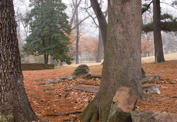
Hcmcdole, I have a number of parks, some near at hand. I "mine' them often, but sometimes they seem to become repetitious shots. You are right to continue exploring them. Differences can be its own topic.
Feb 3, 2020 11:49:15 #
Grahame, yours is a really good idea, but, no, I haven't to take up a project. Really good idea in that it also just gets one to move.
Feb 2, 2020 18:58:35 #
I do much less photography in the winter. The light, the cold, the lack of color and so much more stifle the urge/ I still want to enjoy getting a good shot. Part of my problem is that what to shoot is always an issue. Where I live there is little at this time of year to grab mt attention. No Florida lush, green vegetation and no snow cover -we get maybe four snowfalls a year that usually last at best three days - many days of bland sky, and repetitiousness of the few subjects with much interest make for spare times.
Below are a few shots that I have taken this year or in the last couple of years. What I would like to know is whether you face the same doldrums and if so what catches your eye. Please feel free to show your work. Comments are welcome, since I did extend the invitation already, and thank uou.
Below are a few shots that I have taken this year or in the last couple of years. What I would like to know is whether you face the same doldrums and if so what catches your eye. Please feel free to show your work. Comments are welcome, since I did extend the invitation already, and thank uou.
Jan 31, 2020 12:18:43 #
bbrowner wrote:
Here is another SILENT photo posting. That means… no comments, no captions, no titles… only photos.
Todays subject is… FACES
If you have a photo that fits the subject… please share and post one or more, with no text other than the subject of the day… FACES.
Also… feel free to initiate a new posting with an accompanying photo using the same SILENT format.
I hope you enjoy silent photos.
Barry
Todays subject is… FACES
If you have a photo that fits the subject… please share and post one or more, with no text other than the subject of the day… FACES.
Also… feel free to initiate a new posting with an accompanying photo using the same SILENT format.
I hope you enjoy silent photos.
Barry

Dec 7, 2019 13:50:13 #
DaveJ wrote:
Visited STL Zoo last week and enjoyed some indoor photography. Kind of a variety of different subjects, with somewhat trying for interesting eyes. All thru wire or glass.
I've been there. really good work since the lighting is difficult there.
Nov 5, 2019 10:59:25 #
kpmac wrote:
They soon will all be gone. Please view the downloads.
I really like the last one. Having somewhat blunt feelings, I usually don't respond to images with emotion. However, this photo with the petals curling slightly in the season's changing air while facing the setting sun, evoke a sense of a peaceful ending. Well done.
Oct 28, 2019 11:16:19 #
angler wrote:
.... with even a hint of a rainbow as well.Photographed this mornng. 
I really like the shadow in the foreground of #2. Often shadows seem to me to be problematic in a composition, but the timing of the capture gives a subtle emphasis to the wall. I am wowed by the rhythm of the rainbow and the curve of the wall. Re,arkable and beautiful photo. Congratulatioons!
Oct 9, 2019 11:58:18 #
Sep 27, 2019 21:40:08 #
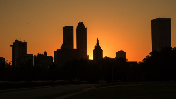
Sep 27, 2019 20:41:56 #
I took this shot this evening about 1 mile from downtown. It is not the this image I wanted but I knew even as I took it that I was going to want it. The color in the sky is accurate, so I was sure it would make a beautiful contrast. Honestly, These sorts of images usually don't appeal to me, but after getting this image I expect to more fully appreciate the images of others. C&C welcome and thank you for looking.
Aug 10, 2019 08:32:49 #
tomad wrote:
This is a wide open question and I hope I get lots... (show quote)
It depends on how much time you want seeing America or just driving. I frankly try to avoid the interstates, since they all look like pavement cut through a forty-foot wide mowed lawn. Find good state highways or federal routes that allow you to pull over. They also are part of the America the real America that has Americans inhabiting it.
Aug 1, 2019 16:26:02 #
Heather Iles wrote:
Quite right. Thank you Stephan G.
I have learned a lot from CHG_CANON on this thread.
Some members must realise that we are not all at the same level of photography and members, me included, look and learn instead of always asking questions and be told "why didn't you look that up" or "that question was asked before". If we knew we would not ask.
Ditto. His explanations always are to the point and instrin practical and useful ways beyond most others. CHG_CANON is among my favorites.
Aug 1, 2019 16:23:38 #
clickety wrote:
This has me totally confused, would you please elaborate.
I tried adjusting my settings to get a good exposure. The bright sun was giving me a lot of difficulty. At first I set the aperture at f8; the shot was totally underexposed. When I tried to change the time to cut the light it necessitated also changing the aperture, thus getting thee f4 setting. I tried adjusting the iso also, but I could not get a better exposure by any of those changes that I could see.
Jul 31, 2019 17:04:00 #
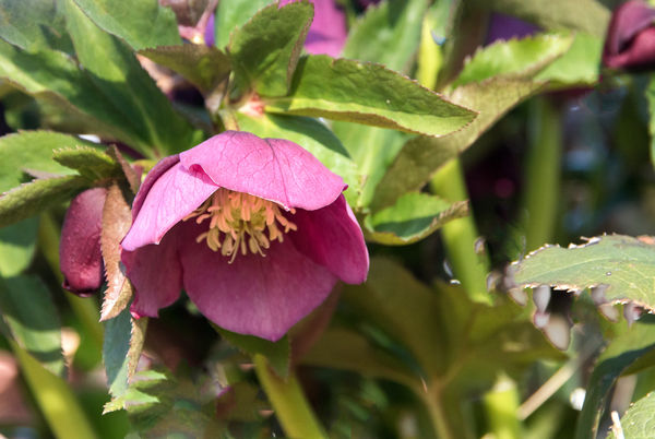
artBob wrote:
It's fine as is. I would prefer a bit more saturation or tonal contrast of the main blossom, but subtlety and softness may be what you were after.
You actually have several purples in the background. These, being related in color to the pink/purple main blossom, follow the compositional rule of "Unity with Variety." They tie in with the main blossom, but are not so powerful as to upstage it.
You actually have several purples in the background. These, being related in color to the pink/purple main blossom, follow the compositional rule of "Unity with Variety." They tie in with the main blossom, but are not so powerful as to upstage it.
I am wary of saturation because I am afraid of over-cooking an image. I probably don't use it where I could because of that diffidence, so what you say may be an area of consideration for me as a more active choice when editing. As to tonal contrast, This is a set of skills Iam still working to improve, so I can only say thank you for your suggestion; I will continue to try to improve in that area. Thank you for your note on the compositional aspect of the image. You saw what I thought was part of my objective, though as I said in my opening and what I think CHG CANON indicated is that what I got is open to question. Thank you for your help.