Posts for: MMC
Dec 6, 2018 23:16:27 #
fourg1b2006 wrote:
The second one is so much more pleasing to look at.
Thanks.
Dec 6, 2018 23:15:55 #
Blair Shaw Jr wrote:
Wow....did you ever. I love the improvements and hope to be as good someday in the future if I can. Thanks for showing me that things can be made better with a little effort in the right places.
Thanks for looking and your kind words.
Dec 6, 2018 23:10:30 #
StanMac wrote:
Very nice PP result of a well taken photograph!
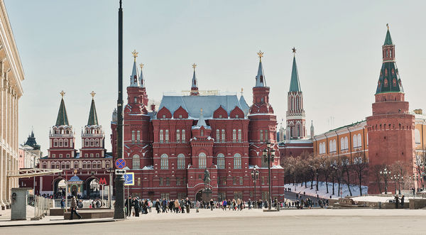
I personally despise aerial power and communication cables due to their visual pollution. There are many appealing cityscapes that you can’t appreciate due to the excessive accumulation of distracting power/communications cables. PaintShop Pro has a linear scratch elimination tool that works wonders on them though.
Stan
Thank you.
Dec 6, 2018 23:06:10 #
Bultaco wrote:
Excellent job and a LOT of patience.
Thanks.
Dec 6, 2018 23:05:30 #
cdayton wrote:
Nice job. Been there, done that a few times. Sometimes there is no way to avoid those pesky wires.
Thank you.
Dec 6, 2018 23:04:48 #

Dec 6, 2018 07:52:20 #
Jerry G wrote:
Very nice, well done.
Thank you Jerry.
Dec 6, 2018 07:51:42 #
Bill Gordon wrote:
I would crop out the light building on the left ma... (show quote)
Thanks for looking and your opinion. I do not know how to remove pole from this picture except cropping. If you know please do it.
Dec 6, 2018 00:57:56 #
MichaelEBM wrote:
Beautiful job. Your patience has been rewarded with that finished product. My preference: the desaturated version. It is still animated and colorful, but, in my opinion, more realistic.
Thank you for looking, your compliments and your opinion.
Dec 5, 2018 22:34:09 #
seco66 wrote:
Thank you, MMC! I will try to add the original to this reply. I can't recall the exact steps I used...I just manipulated the sliders until I ended up with what you see :)
Thank you for posting the original.
Dec 5, 2018 17:14:57 #
lesdmd wrote:
I am sorry for truing to fix your picture without permission.My son and grandson. I would like to have a couple of prints made and would appreciate advice on a source that can respect the square formatting and provide whatever type of paper you recommend. I'm guessing that I would like to see the print on a matte finish "art" paper that reinforces the soft warm feel of the portrait.
Any other advice will be appreciated.
Any other advice will be appreciated.

Dec 5, 2018 15:44:39 #
photophile wrote:
Good results.
Thanks.
Dec 5, 2018 15:44:12 #
lesdmd wrote:
I honestly don't mean to rain on the parade; but I actually prefer the wires in the photo. They add a certain honesty and fit my expectation of what a less than modern Moscow looks like.
The bricks on the building look a little oversaturated. If that is how you remember them, or would like to remember them, they are good.
I admire your tenacity doing all that editing.
The bricks on the building look a little oversaturated. If that is how you remember them, or would like to remember them, they are good.
I admire your tenacity doing all that editing.
Thank you for looking and your opinion. I did this job to check my patience and check if I can do this job or not. Which one is more realistic? It is up to you. I desaturated this picture for you. Do you like it better.
Dec 5, 2018 12:06:55 #
df61743 wrote:
Well done! I'll bet some of that was a little tedious. Out of curiosity, how long did it take you to finish it?
Dick
Dick
Thank you for your compliments. I do not know how long did it take. I did it a few days, sometimes a couple of hours sometimes 15-20 minutes.
Dec 5, 2018 12:01:50 #
Wuligal wrote:
The result is worth the effort. Well done.
Thanks.