Posts for: Rongnongno
May 2, 2024 15:25:03 #
DaveyDitzer wrote:
.../... Have any of you experienced this outcome?
Depends on your PP skills.
May 2, 2024 00:25:57 #
May 1, 2024 16:02:39 #
New way to flip the bird if you ask me.
Two sets are composites that have been flipped.
► Foreground is different between the two sets.
► The bird has been added on each set.
► The first image of both sets has then been flipped.
What is the flipping point of this?
Two sets are composites that have been flipped.
► Foreground is different between the two sets.
► The bird has been added on each set.
► The first image of both sets has then been flipped.
What is the flipping point of this?
May 1, 2024 12:16:15 #
MikeLH wrote:
Is there a way to add your own skies to a picture in PS Elements 2024. I have found ways to do that in earlier versions, but they do not seem to work in the latest version.
Thanks, Mike
Thanks, Mike
I do not use PSE, but this might work if it is similar to PS CC.
Prepare the workspace
Base layer (where you want to replace the sky)
Sky layer
Solution #1
Use 'Blend if' on the sky layer to adjust for lower layer (base layer).
Blend if on background slider (light) if sky is lighter
Blend if on sky layer (dark) if sky is darker
Do not forget to use the split arrows to feather the selection. (Alt-click on the pointing arrow)
Solutions #2 & #3
Setup
Duplicate base layer.
Move the newly created layer on top of the sky layer, make sure this the layer you are editing.
Solution #2
Use select color to create a selection in the existing sky, press delete.
Solution #3
Use the background eraser tool to delete the existing sky, press delete.
All three solutions can use masking to prevent bleeding; the sky being visible where it should not be.
May 1, 2024 02:33:56 #
Reuss Griffiths wrote:
It's not your treatments, it's the image itself. Just not enough to capture the viewer's eye, so not that many people will bother looking in to see more no matter how you treat it.
I'll admit it is not for everyone's taste.
Thank you for being honest in your opinion.
Apr 30, 2024 14:06:49 #
Yup, soon to be sold as tuna jumping in front of a boat like that...
Apr 30, 2024 13:55:22 #
Jimmy T wrote:
Ron, I really like challenges like this. May I ple... (show quote)


This is not a challenge from me, but a request for help.
Apr 30, 2024 13:18:39 #
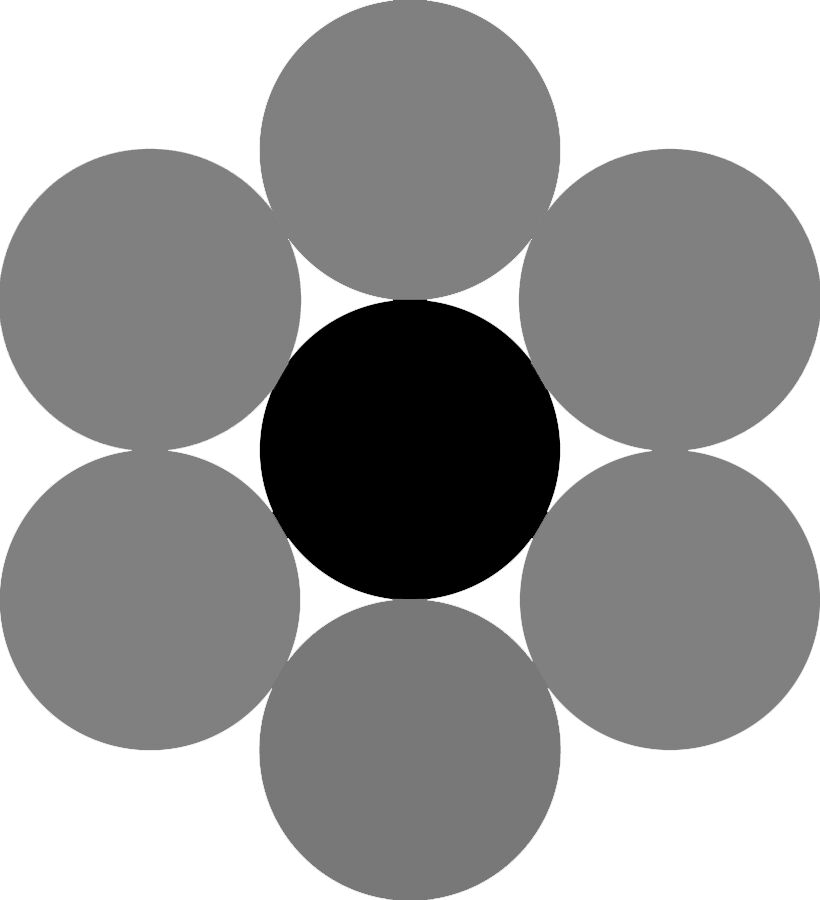
Saturation use as a mean to create a B&W image is worthless. Doing that prevents you to adjust the B&W value of your colors.
Here is the small demonstration and at the end a PSD file for you to play with.
Here is the small demonstration and at the end a PSD file for you to play with.
Color
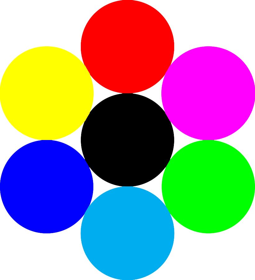
Desaturation: all colors are the same neutral shade of grey.
B&W: all colors have their own luminance (grey) value that you can play invidually with.
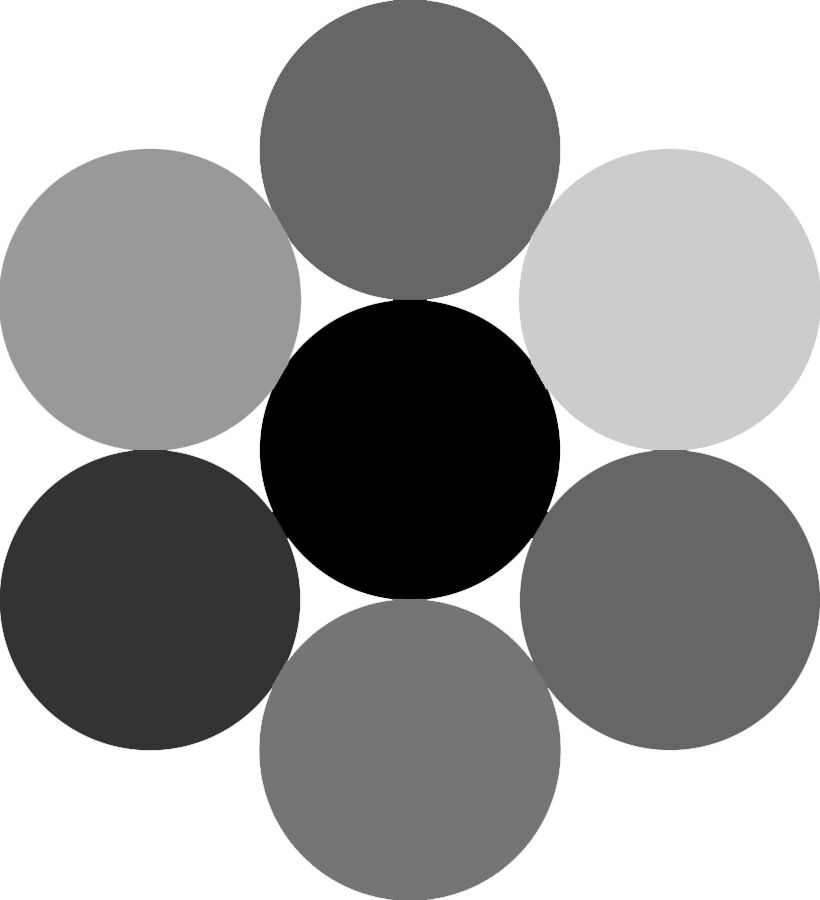
PSD file. You have all you need to play.
Attached file:
(Download)
Apr 30, 2024 01:01:09 #
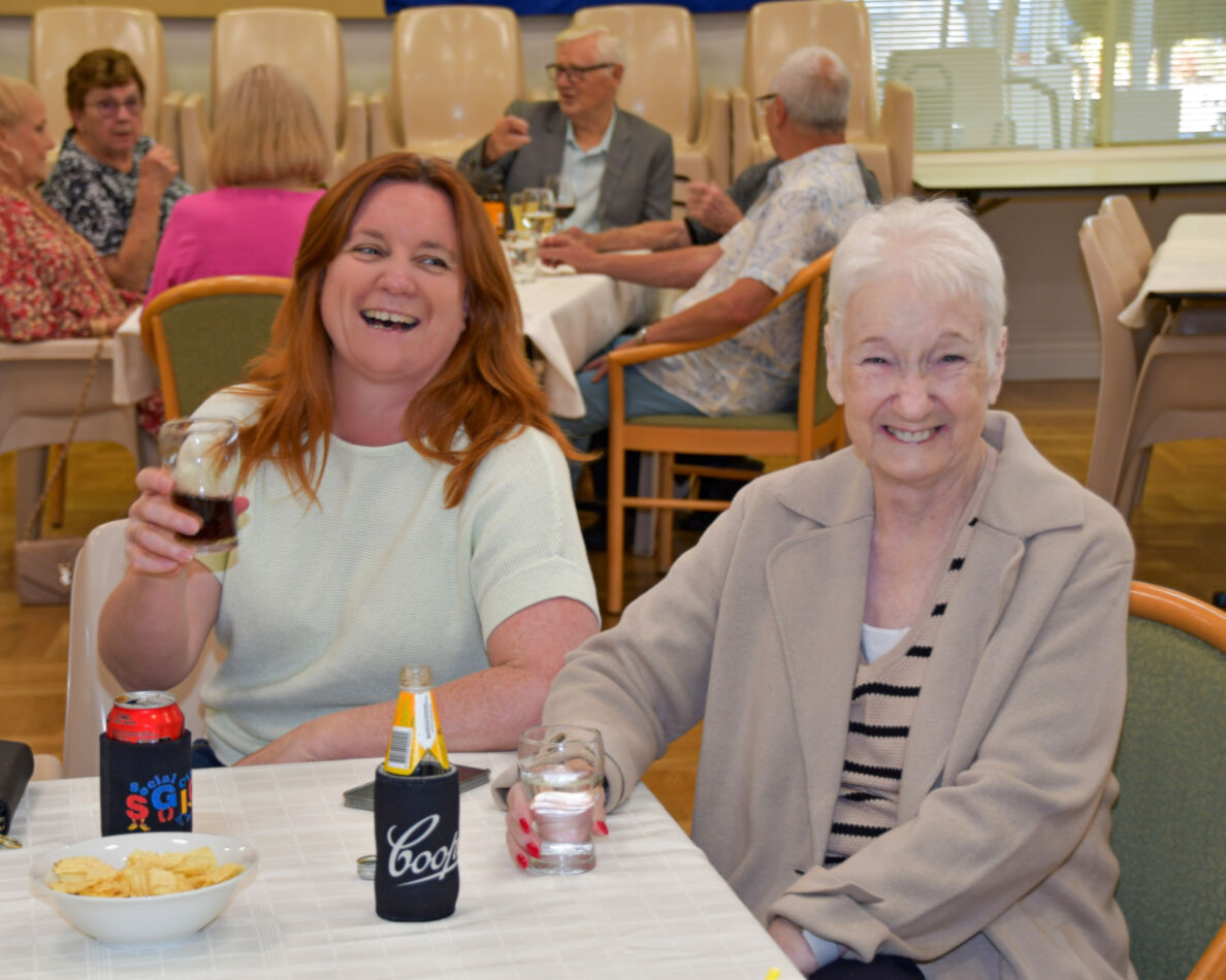
SX2002 wrote:
Hi Guys,
The girl on the right is our dear friend really ill with cancer, The girl on the left is her daughter.
She has a natural red "glow", can anyone make her face look better without being so red..?
I want to print the pic and give it to them but figure a less red face would look better.
Cheers,
Ron.
The girl on the right is our dear friend really ill with cancer, The girl on the left is her daughter.
She has a natural red "glow", can anyone make her face look better without being so red..?
I want to print the pic and give it to them but figure a less red face would look better.
Cheers,
Ron.
I made the cardinal sin of not checking the highpass layer back on.
Apr 29, 2024 11:14:29 #
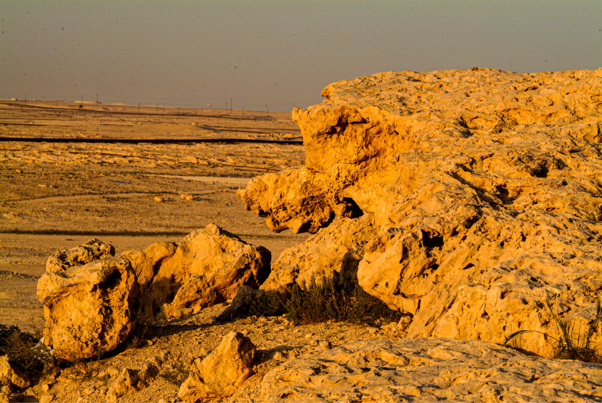
Felixgrundy wrote:
Without the horizon, the rock outcrop needs something to put it into context with rest of picture. Maybe just the geologist in me.
I could not find a clean replacement for the oil field's mess.
Apr 29, 2024 10:25:39 #
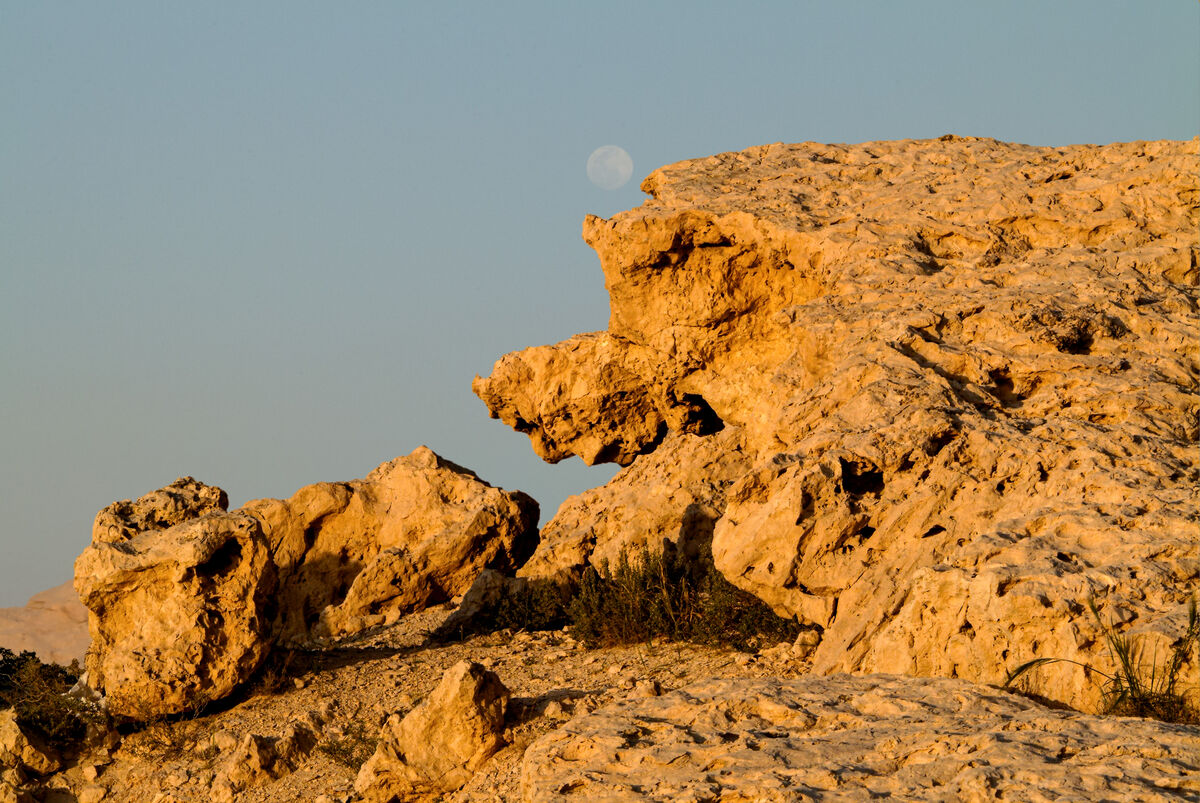
Felixgrundy wrote:
Nice shot with moon, but foreground needs anchoring for me. .../...
What do you mean?
Apr 29, 2024 10:01:13 #
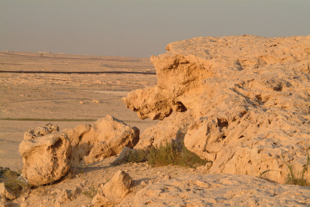
March, 2003, Bahrain.
'Golden hour' in the desert.
The middle image is the one I want feedback on.
'Golden hour' in the desert.
The middle image is the one I want feedback on.
Apr 29, 2024 09:46:00 #
Caribou wrote:
I think the edited version is the best. I like the grass. In fact, I assumed it was the subject. It catches the light nicely. I find the blurred foreground distracting but I can't see any way to crop it.
► You missed this post...
► The blurred background is what makes the image. If it was an open sky, the grass would not stand out.
Apr 28, 2024 22:48:35 #
Going seamlessly from full page to a smartphone...
Apr 28, 2024 22:38:47 #