Posts for: Linda From Maine
May 1, 2024 09:40:30 #
NJFrank wrote:
Did you mean to quote R.G.'s? The second I posted is just a larger file size of the OP.I prefer this one. The subtle change gives it a bit more contrast. The title fits it well.
Thanks very much for viewing and commenting, Frank.
May 1, 2024 09:39:13 #
May 1, 2024 09:38:03 #
May 1, 2024 06:40:29 #
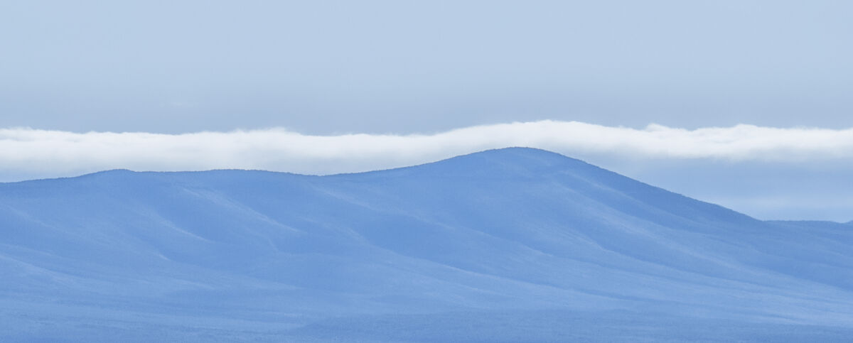
Excellent! Not only a clear sky to show the billowing steam more clearly, but a very interesting profile of building shapes all crowded together...and the crop rows too!!
May 1, 2024 06:35:37 #
Delightful creation! Your wife looks like an adventurous, charming lady.
Was this created all within Photoshop?
Was this created all within Photoshop?
May 1, 2024 06:28:40 #
PhotoMono123 wrote:
I'm delighted by your response, Don. Thank you so much!Oh my! I just saw the heading "Silent Scenes."
Embarrassed as I am, this only strengthens my like of the empty swings. You just look at it and wonder, "Where are the children? Where is the laughter, the shouts of glee?"
Playgrounds are noisy, happy places. When they are empty, their silence can be deafening. Your wonderful image has captured this beautifully.
The theme was "Silence," but I liked my slightly embellished title better for this UHH thread

With regards to whether one should - or needs to - include a descriptive title, I think the below (shot in same area for same theme) needs my image title, "Waiting."
 Waiting by Linda Shorey, on Flickr
.
May 1, 2024 06:27:03 #
TheShoe wrote:
I'm grateful for your feedback and reaction. Thanks very much!Your first cut conveys the silence of the playground without kids very well. The color version does not. This darker version seems almost sinister.
May 1, 2024 06:25:20 #
NikonGal wrote:
Many thanks Bev!You do very creative things with ordinary elements. I like this image, it's earthy colors, and adding the softening touch. I never would have guessed you rotated it. Appreciate listing your workflow. I agree about using a different layer for each filter. Many a time I've had to go back and readjust something.
Apr 30, 2024 17:32:26 #
tradio wrote:
That is lovely to know, thanks so much.Great image. It seems to have a calming effect on me.
Apr 30, 2024 17:31:04 #
John Lawrence wrote:
Thanks so much, John!I find the first image very appealing. Kept me looking.
Apr 30, 2024 14:11:14 #
Curmudgeon wrote:
Thank you, Jack! For about a year I've been really enjoying the challenge of seeing objects in a different way, stepping outside the comfortable and familiar. Even when I fail, the reward of having tried is there.Beautiful Linda. Your artist's eye continues to amaze me. I would never have recognized that as a potential shot. A little about your work flow please
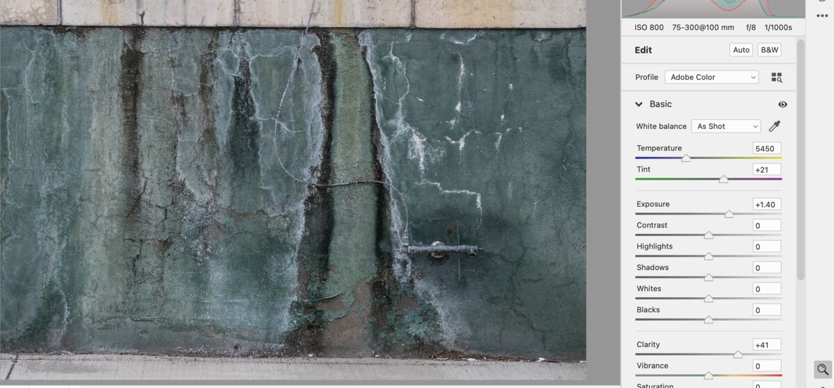
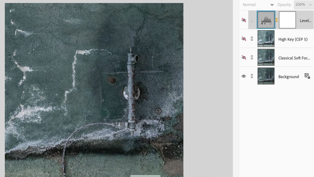
Here is the original image uncropped, and before rotating. Note that I upped the clarity, but then in PS Elements went with Nik Color Efex Classical Soft Focus, and then back into Color Efex for one of the High Key presets. Finally, a dab of levels adjustment for tonal separation.
I never apply more than one filter at a time, because it's much easier to adjust or delete when each is on a separate layer, as well as to selectively apply the effect to areas of the photo via layer masks.
Your interest is much appreciated.
Apr 30, 2024 13:46:46 #
John Lawrence wrote:
Many thanks for your time and interest, John!I liked #1 because of the interesting use of layers. I also liked #3 for the sad story it tells.
John
John
Apr 30, 2024 13:45:55 #
R.G. wrote:
I like your aspect better than mine. I like the hint of sunlight and details. I didn't reproduce what you did with the colour, but the look is more or less similar. It depends what you mean by "calming". It doesn't have to smack of sensory deprivation.
.
.
There is a glow that's difficult to view, along with the clouds being a little too white for my taste. As always, eyesight and monitors can affect.
Your input is very much appreciated!
Apr 30, 2024 12:30:09 #
Or use this slightly larger jpg (it's the "full" size once all the cropping was done).
Apr 30, 2024 11:54:36 #
R.G. wrote:
I envisioned simple and soft as being more calming, but am interested in what you have in mind, R.G.Without actually experimenting with the image I get the impression that maybe a touch of contrast might help. Simple doesn't have to equal bland or flat.
The Olympus raw file is attached. And yes, that's the one I started with
 Some of my editing included a horizontal stretch.
Thanks!