Check out Close Up Photography section of our forum.
What is flat B&W?
Feb 3, 2019 09:41:35 #

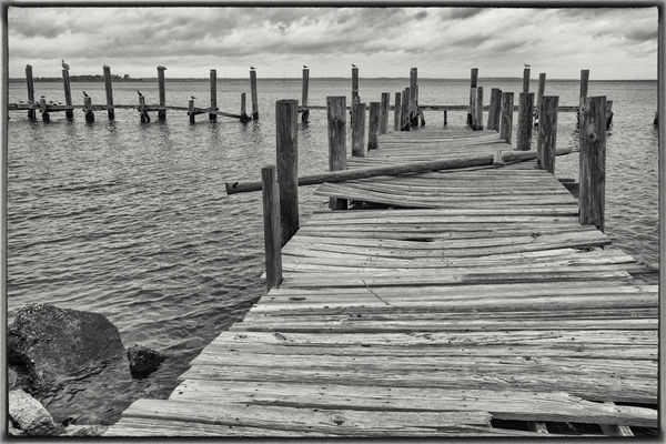
When i first went colorblind, (  ) i posted a B&W here and was told that it seemed flat . . . i'm tweaking things much more now, and i think i get the definition, but i'm still a little unsteady about it. Is there a good definition of flat as it applies to B&W photography, or is it more intuitive - you either 'get it' or you don't? Here's another that i recently drained the color out of. Thoughts?
Marylea
) i posted a B&W here and was told that it seemed flat . . . i'm tweaking things much more now, and i think i get the definition, but i'm still a little unsteady about it. Is there a good definition of flat as it applies to B&W photography, or is it more intuitive - you either 'get it' or you don't? Here's another that i recently drained the color out of. Thoughts?Marylea
Feb 3, 2019 10:03:03 #

Interesting perspective but I like it. It might be a bit rickety if one walk out on it lol!
melueth wrote:
When i first went colorblind, ( ) i posted a B&W here and was told that it seemed flat . . . i'm tweaking things much more now, and i think i get the definition, but i'm still a little unsteady about it. Is there a good definition of flat as it applies to B&W photography, or is it more intuitive - you either 'get it' or you don't? Here's another that i recently drained the color out of. Thoughts?
Marylea
) i posted a B&W here and was told that it seemed flat . . . i'm tweaking things much more now, and i think i get the definition, but i'm still a little unsteady about it. Is there a good definition of flat as it applies to B&W photography, or is it more intuitive - you either 'get it' or you don't? Here's another that i recently drained the color out of. Thoughts?Marylea
Feb 3, 2019 10:04:30 #

I'm not sure what the experts might think, but I really like this one, nice texture and detail, an interesting and peaceful scene.
Check out Video for DSLR and Point and Shoot Cameras section of our forum.
Feb 3, 2019 10:13:14 #

This looks great, but doing B&W conversions is more than just "draining the color out".  I tend to prefer a high contrast, but I know that's a personal preference. You might consider some / all of the following:
a. Clone out the post that touches the edge of the frame on the upper right side.
b. Increase the 'white' of the image just slightly so the clouds seem brighter.
c. Increase the 'black' of the image just slightly so the grain of the wood shows better.
d. Evaluate the overall brightness of the image, where maybe +0.10 will help the image 'pop', depending on the results of b & c.
e. Consider the white balance, something that seems illogical for B&W. But, if you lower the yellow (lower the temp toward blue), the image becomes more black, white and grey. Changing the temp might accomplish ideas b-d, or may further enhance. Experiment and have a look.
I tend to prefer a high contrast, but I know that's a personal preference. You might consider some / all of the following:a. Clone out the post that touches the edge of the frame on the upper right side.
b. Increase the 'white' of the image just slightly so the clouds seem brighter.
c. Increase the 'black' of the image just slightly so the grain of the wood shows better.
d. Evaluate the overall brightness of the image, where maybe +0.10 will help the image 'pop', depending on the results of b & c.
e. Consider the white balance, something that seems illogical for B&W. But, if you lower the yellow (lower the temp toward blue), the image becomes more black, white and grey. Changing the temp might accomplish ideas b-d, or may further enhance. Experiment and have a look.
Feb 3, 2019 10:13:18 #

Feb 3, 2019 10:17:34 #
RichardSM wrote:
Interesting perspective but I like it. It might be a bit rickety if one walk out on it lol!
Yes - i stayed off this one!! Thanks for your comment, Richard!
Feb 3, 2019 10:18:12 #
Bushpilot wrote:
I'm not sure what the experts might think, but I really like this one, nice texture and detail, an interesting and peaceful scene.
Thank you Bushpilot! Still learning!
ML
Check out Astronomical Photography Forum section of our forum.
Feb 3, 2019 10:22:09 #
CHG_CANON wrote:
This looks great, but doing B&W conversions is... (show quote)
Thanks for the pointers, Paul - i will definitely try these out. BTW - the draining of color comment was a joke. I took this one into NIK Silver Efex and tweaked a lot of things, including contrast, highlights, and brightness. I am not happy with the wood grain as it stands right now either, so i'm going back in with your tips. Didn't even notice that little post to the upper right - yes! It's got to go! I'm going back in . . . Thanks again!
Marylea
Feb 3, 2019 11:02:21 #

Just a comment following Paul's excellent advice. With b/w its often necessary to clip the lights and darks to make it happen, and doing so, with this really nice shot, does the trick.
Feb 3, 2019 11:09:23 #

Instead of the word "flat", my preference is the expression "wishy-washy", which of course explains everything  .
.
As is usually the case it's a question of degree. For some people the whole point of moving to B&W is to bring out the visual drama in a scene. The main way to do that is to add contrast, and for some people it doesn't take much contrast, but for others it needs to be ramped up considerably. There's no right and wrong, but at the same time the words "suitable" and "appropriate" and "tasteful" don't lose their meaning in that scenario.
With just about any adjustment you can think of there will be a point beyond which the effect starts to look excessive for one reason or another, and overcooking is one of the most common mistakes in PP, especially for beginners. Some might argue that it's always a matter of personal preference, but if someone's preferences leave them in a group of 1 they need to consider if perhaps their preferences (i.e. tastes) could do with a bit of refining. Yes I know - it is all relative and it is a matter of taste, but if someone's adjustments look more like mistakes than improvements it's time for them to do a re-assessment of what they want to achieve.
Pushing adjustments is something that can be done for effect, but it's only in specific instances that we want specific effects. What we are discussing here is general guidelines for producing an outcome that achieves the purpose of converting to B&W in the first place.
Any beginner's tastes will be undeveloped compared to those of an afficionado and there's no shame in learning from those who have more experience and skill. The simple fact is good editing produces good results and it's possible for editing to produce results that nobody is going to consider good. I'm going to hazard a guess that nobody wants that second outcome. So maybe it's an oversimplification to say "It's all relative and therefore all outcomes are legitimate".
So are we agreed that some outcomes are desirable while some are not so desirable? So now we can consider what a desirable outcome is (and how to achieve it)....
A common result of adding contrast is that the darks can become too solid and too predominant, so you need to be able to take steps to mitigate that outcome. And the same thing applies to the highlights. One way to do that is to use the Brightness, Whites, Highlights, Shadows and Blacks sliders. However, some prefer the Curves tool. The Clarity tool can be used to add vividness but its effects can quickly become extreme and difficult or impossible to mitigate, so it needs to be used with a light hand, and typically towards the end of the workflow. Sharpening can also be used to increase vividness, but it too can be overdone, and it needs to be done alongside denoise.
Where contrast is concerned, the luminosity spectrum goes from pure black to pure white with all shades of grey in between. That spectrum covers all of the tonal possibilities so we have to work within its limitations. One implication of that is that there's always a limit to how much contrast can be implemented in a B&W conversion, so sometimes we have to choose where on the luminosity spectrum to put the most contrast. Adding contrast basically means stretching the distribution of darks and brights, and since the spectrum is limited, there's always a limit to how much the tonal distribution can be stretched. What we can do is stretch specific parts of the spectrum, which will result in an increase in contrast in that particular part of the spectrum.
Put more simply, once the tonal distribution has been stretched to its limits you can add extra contrast in the darks or the mid-tones or the brights (but at the expense of contrast in the other parts of the spectrum). Where you place the extra contrast on the spectrum is the PP editor's choice, as is the choice of location for the extra contrast. That is part of the creative expression that a PP editor has at their disposal. To that we can add the choice of overall brightness and the overall distribution of brightness/darkness.
. As is usually the case it's a question of degree. For some people the whole point of moving to B&W is to bring out the visual drama in a scene. The main way to do that is to add contrast, and for some people it doesn't take much contrast, but for others it needs to be ramped up considerably. There's no right and wrong, but at the same time the words "suitable" and "appropriate" and "tasteful" don't lose their meaning in that scenario.
With just about any adjustment you can think of there will be a point beyond which the effect starts to look excessive for one reason or another, and overcooking is one of the most common mistakes in PP, especially for beginners. Some might argue that it's always a matter of personal preference, but if someone's preferences leave them in a group of 1 they need to consider if perhaps their preferences (i.e. tastes) could do with a bit of refining. Yes I know - it is all relative and it is a matter of taste, but if someone's adjustments look more like mistakes than improvements it's time for them to do a re-assessment of what they want to achieve.
Pushing adjustments is something that can be done for effect, but it's only in specific instances that we want specific effects. What we are discussing here is general guidelines for producing an outcome that achieves the purpose of converting to B&W in the first place.
Any beginner's tastes will be undeveloped compared to those of an afficionado and there's no shame in learning from those who have more experience and skill. The simple fact is good editing produces good results and it's possible for editing to produce results that nobody is going to consider good. I'm going to hazard a guess that nobody wants that second outcome. So maybe it's an oversimplification to say "It's all relative and therefore all outcomes are legitimate".
So are we agreed that some outcomes are desirable while some are not so desirable? So now we can consider what a desirable outcome is (and how to achieve it)....
A common result of adding contrast is that the darks can become too solid and too predominant, so you need to be able to take steps to mitigate that outcome. And the same thing applies to the highlights. One way to do that is to use the Brightness, Whites, Highlights, Shadows and Blacks sliders. However, some prefer the Curves tool. The Clarity tool can be used to add vividness but its effects can quickly become extreme and difficult or impossible to mitigate, so it needs to be used with a light hand, and typically towards the end of the workflow. Sharpening can also be used to increase vividness, but it too can be overdone, and it needs to be done alongside denoise.
Where contrast is concerned, the luminosity spectrum goes from pure black to pure white with all shades of grey in between. That spectrum covers all of the tonal possibilities so we have to work within its limitations. One implication of that is that there's always a limit to how much contrast can be implemented in a B&W conversion, so sometimes we have to choose where on the luminosity spectrum to put the most contrast. Adding contrast basically means stretching the distribution of darks and brights, and since the spectrum is limited, there's always a limit to how much the tonal distribution can be stretched. What we can do is stretch specific parts of the spectrum, which will result in an increase in contrast in that particular part of the spectrum.
Put more simply, once the tonal distribution has been stretched to its limits you can add extra contrast in the darks or the mid-tones or the brights (but at the expense of contrast in the other parts of the spectrum). Where you place the extra contrast on the spectrum is the PP editor's choice, as is the choice of location for the extra contrast. That is part of the creative expression that a PP editor has at their disposal. To that we can add the choice of overall brightness and the overall distribution of brightness/darkness.
Feb 3, 2019 11:49:38 #

Marylea, I think your composition is wonderful. I'm immediately drawn into the scene, and I love the b&w idea. Ch_Canon and R.G. have given more excellent information re editing for b&w than I recall seeing previously on UHH in one place. I can't wait to try their ideas myself!
A question for R.G. re this statement "Where you place the extra contrast is the PP editor's choice." I'm thinking dodge and burn. Is that what you had in mind?
Dodge (lightening) and burn (darkening), which can be achieved a couple of different ways (like everything in pp), is used to manipulate small areas selectively. This is often done to help draw our eye through the scene or to bring attention to a specific area or element (or the reverse). UHH user Graham Smith is a master of both subtle and obvious manipulations of that type.
Check out Black and White Photography section of our forum.
Feb 3, 2019 12:03:51 #
melueth wrote:
When i first went colorblind, ( ) i posted a B&W here and was told that it seemed flat . . . i'm tweaking things much more now, and i think i get the definition, but i'm still a little unsteady about it. Is there a good definition of flat as it applies to B&W photography, or is it more intuitive - you either 'get it' or you don't? Here's another that i recently drained the color out of. Thoughts?
Marylea
) i posted a B&W here and was told that it seemed flat . . . i'm tweaking things much more now, and i think i get the definition, but i'm still a little unsteady about it. Is there a good definition of flat as it applies to B&W photography, or is it more intuitive - you either 'get it' or you don't? Here's another that i recently drained the color out of. Thoughts?Marylea
Great shot, Marylea. Don't know who said, and in what context, that one of your B&W images seemed "flat". Current photographers (and audiences) generally seem to prefer bold, super-saturated, "in your face" colors. Subtlety and muted colors are out. So it's reasonable to expect them to also prefer strong visual impact in B&W?
Feb 3, 2019 12:09:03 #
Linda From Maine wrote:
...A question for R.G. re this statement "Where you place the extra contrast is the PP editor's choice." I'm thinking dodge and burn. Is that what you had in mind?....
I was thinking of situations where the tonal distribution is busy and stretched to its limits. You can add contrast to, say, the darks, but it will be at the expense of contrast in the mid-tones and the brights. So the PP editor has to choose what he/she wants to enhance and what can be compromised.
In addition to that, as you say, dodge and burn can be added selectively to specific areas. The same can be done with contrast. In both cases the purpose is to direct the viewer's attention using brightness and/or contrast.
Feb 3, 2019 12:12:23 #
Feb 3, 2019 12:14:01 #
If you want to reply, then register here. Registration is free and your account is created instantly, so you can post right away.
Check out Close Up Photography section of our forum.