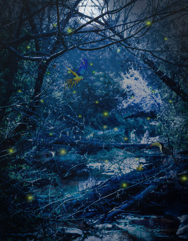
Moonlight Serenade In Blue
Jan 28, 2019 18:40:05 #
kenievans
Loc: Dallas
I don't know that Beethoven would be inspired by my fanciful moonlight but I can hear the frogs croaking. Your comments are most welcome.
Jan 28, 2019 20:52:45 #

kenievans wrote:
I don't know that Beethoven would be inspired by my fanciful moonlight but I can hear the frogs croaking. Your comments are most welcome.
Glen Miller may be inspired! :-) I like except I lose any detail in top half. My eyes had a hard time finding a ‘starting place’, if that makes sense.
https://youtu.be/8TB_8H23EDI
Jan 28, 2019 21:46:34 #
kenievans
Loc: Dallas
brucewells wrote:
Glen Miller may be inspired! :-) I like except I lose any detail in top half. My eyes had a hard time finding a ‘starting place’, if that makes sense.
https://youtu.be/8TB_8H23EDI
https://youtu.be/8TB_8H23EDI
You know I thought about it and I understand and agree. It's a good background. It needs something by the white tree. A focal point, a subject. Thank you so much for your comments.
Jan 28, 2019 21:56:06 #
kenievans wrote:
You know I thought about it and I understand and agree. It's a good background. It needs something by the white tree. A focal point, a subject. Thank you so much for your comments.
Yes, and my first run at it would be to see if I could make the existing logs/stumps/branches do that job. But, pay me no mind! Establish your vision and the edits will come automatically. Have fun!
Jan 29, 2019 07:40:20 #

And I saw the frog as I journeyed through your fantasy  That did require zooming in, though, so I don't know if for web viewing you would want to consider your audience, their devices and eyesight - and perhaps compose a scene specifically with those restrictions in mind? On the regular download, there is an engaging combination of serenity and fantasy, but subtle details are difficult to see.
That did require zooming in, though, so I don't know if for web viewing you would want to consider your audience, their devices and eyesight - and perhaps compose a scene specifically with those restrictions in mind? On the regular download, there is an engaging combination of serenity and fantasy, but subtle details are difficult to see.Jan 29, 2019 12:54:30 #

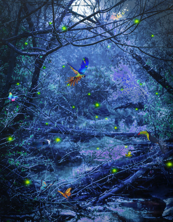
You have a great imagination! I liked this so much, I brought out the areas that I though added to your "magical moonlight" feeling, which sometimes meant toning down some areas.
Jan 29, 2019 13:06:14 #
Keni, I really like the majority of what you've done here. I don't care for the toucan, the frog and the B&G macaw. They seem out of place from both a contextual and a luminance/chroma perspective.
Jan 29, 2019 15:06:48 #

artBob wrote:
You have a great imagination! I liked this so much, I brought out the areas that I though added to your "magical moonlight" feeling, which sometimes meant toning down some areas.
This is very similar to what I was going to suggest. It might help Kenni if you mention some of what you did. For example, did it involve brightening yellow using the HSL tool?
Jan 29, 2019 15:43:52 #
R.G. wrote:
This is very similar to what I was going to suggest. It might help Kenni if you mention some of what you did. For example, did it involve brightening yellow using the HSL tool?
As I recall, I desaturated the blue because it didn't seem "moonlightish." I burned and saturated the critters. I took out the pinkish color of the middle blob (tree branch) and all other similar tones, painted them with brush set to Lighter Color, then dodged some lights into those areas. The moon still needed to be brought out, so I burned med tones around it. Finally, the critters were still to unsaturated, so I selected them and used Curves to increase the tonal range.
At least, that's what I THINK I did.
Jan 29, 2019 18:54:46 #
kenievans
Loc: Dallas
Linda From Maine wrote:
And I saw the frog as I journeyed through your fantasy That did require zooming in, though, so I don't know if for web viewing you would want to consider your audience, their devices and eyesight - and perhaps compose a scene specifically with those restrictions in mind? On the regular download, there is an engaging combination of serenity and fantasy, but subtle details are difficult to see.
That did require zooming in, though, so I don't know if for web viewing you would want to consider your audience, their devices and eyesight - and perhaps compose a scene specifically with those restrictions in mind? On the regular download, there is an engaging combination of serenity and fantasy, but subtle details are difficult to see.Linda I wanted something that had impact when you first looked at it but had the smaller surprise details as you looked around. Something for the big view folks and something for the pixel peepers.

I think I am even going to go back and add some butterflies in little places.
Jan 29, 2019 18:58:44 #
kenievans
Loc: Dallas
artBob wrote:
You have a great imagination! I liked this so much, I brought out the areas that I though added to your "magical moonlight" feeling, which sometimes meant toning down some areas.
Bob I like your idea. I did tone down the yellow "fireflys" and the colorful birds because I thought they contrasted to much with the blue but seeing it pop in yours, I like it better. I definitely think toning down the white tree and the water highlights made the difference though I probably wouldn't go with the color you used. I''m glad you liked it.
Jan 29, 2019 19:06:13 #
kenievans
Loc: Dallas
DaveC1 wrote:
Keni, I really like the majority of what you've done here. I don't care for the toucan, the frog and the B&G macaw. They seem out of place from both a contextual and a luminance/chroma perspective.
Dave thank you for commenting. I do value your opinion. It is supposed to be a fantasy piece so I wasn't concerned about context. I do agree that those things need some additional work. I tried to blend them in rather than let them stand out and I think that was a mistake. They should be eye catching and help move you around the image.
Jan 29, 2019 19:07:08 #
kenievans
Loc: Dallas
R.G. wrote:
This is very similar to what I was going to suggest. It might help Kenni if you mention some of what you did. For example, did it involve brightening yellow using the HSL tool?
Thanks R.G.! It did help for Bob to explain what he did.
Jan 29, 2019 20:18:30 #
Jan 29, 2019 21:46:03 #
kenievans wrote:
Ok here are my adjustments. I think it is starting to get there.
Yes! Your edits brought structure to the image, in my opinion. Much more appealing.
If you want to reply, then register here. Registration is free and your account is created instantly, so you can post right away.