Storm on the Beach-Color & B&W
Jan 13, 2019 17:16:00 #

Beautiful, dramatic shots, Bmac. Love them both with a slight preference for color.
Jan 13, 2019 17:25:56 #

Dixiegirl wrote:
Beautiful, dramatic shots, Bmac. Love them both with a slight preference for color.
Thanks Donna, always appreciate you stopping by.

Jan 13, 2019 18:17:18 #

I should have said this earlier. If you want to continue working on this image in mono mode you may find using a gradient to hold the sky & upper land as is and lower the hightlights around where the sand is between the rocks in the forground. I found that technique difficult to learn but if you do it’s worth it. Others may have other methods they prefer. BW isn’t easy when starting out with it. If I had much hair I’d have pulled it out over this. Good luck.
Jan 13, 2019 18:29:32 #
pesfls wrote:
I should have said this earlier. If you want to continue working on this image in mono mode you may find using a gradient to hold the sky & upper land as is and lower the hightlights around where the sand is between the rocks in the forground. I found that technique difficult to learn but if you do it’s worth it. Others may have other methods they prefer. BW isn’t easy when starting out with it. If I had much hair I’d have pulled it out over this. Good luck.
Thanks for this additional advice and I understand what you mean. But here is my dilemma, do you think this image is worth the additional work?
Jan 13, 2019 20:57:29 #
Bmac wrote:
Thanks for this additional advice and I understand what you mean. But here is my dilemma, do you think this image is worth the additional work?
I do, if you like high contrast with deep blacks in mono images. I think your shot has real potential to be made more “energetic.” Here’s a couple examples of what I like. Just understand this is just me and others may disagree. Very much a personal thing that’s totally up to you. Regardless have fun.
Probably the best mono guy on UHH to communicate with about such things is Bob Malarz. He’s the real deal. I’m a novitiate at bw conversion.
Jan 13, 2019 23:19:11 #
pesfls wrote:
I do, if you like high contrast with deep blacks in mono images. I think your shot has real potential to be made more “energetic.” Here’s a couple examples of what I like. Just understand this is just me and others may disagree. Very much a personal thing that’s totally up to you. Regardless have fun.
Probably the best mono guy on UHH to communicate with about such things is Bob Malarz. He’s the real deal. I’m a novitiate at bw conversion.
Probably the best mono guy on UHH to communicate with about such things is Bob Malarz. He’s the real deal. I’m a novitiate at bw conversion.
I like your images posted here and I agree with you concerning Bob Malarz.

Jan 14, 2019 06:46:48 #

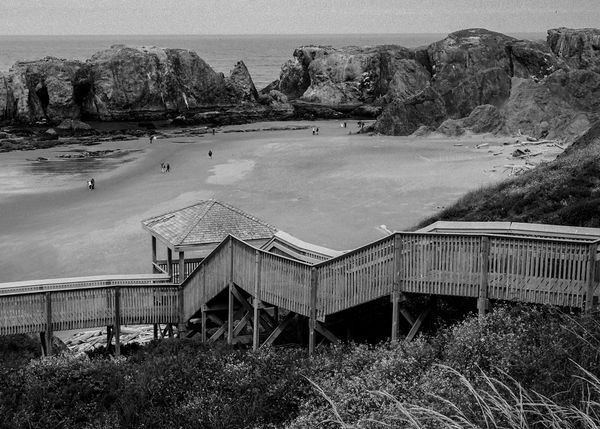
My choice in this one would lean to the B&W...the clouds being the stand out point for me, very ominous looking...what makes it hard with this shot for either B&W or color is the sameness in color in big areas of the shot, and not a lot of contrast...it's a good shot, good composition, but color and contrast just aren't present in this area...things that would make a difference would be..brightly colored buildings in the back to draw your eye through the shot,,variety of colors through the rocks to make your eyes wander through the rocks, none of this is in your control, it just wasn't there...I think you got about as good a shot as was possible there!!....( just my opinion...which is totally useless  )
)
)Jan 14, 2019 07:31:32 #

Jan 14, 2019 07:46:06 #

Jan 14, 2019 08:32:05 #
Jan 14, 2019 09:14:03 #

Bmac wrote:
Photographed on a beach in Wading River NY. The water body is the Long Island Sound. Select download for additional resolution.
Critique, comments and suggestions always welcomed. Thanks.
Critique, comments and suggestions always welcomed. Thanks.
I think BOTH pictures are filled with foreboding! And I like the color one best.
Jan 14, 2019 09:55:44 #
uncldave
Loc: Mahopac, NY
I really like them both equally--the black & white for its starkness and foreboding, and the color for the texture of the rocks.
Jan 14, 2019 10:16:44 #

I went back and forth on this one. Finally decided on the color. Why? the color shot reveals that it is beach scene, the B&W one doesn't look like a beach, it could be a sand field. BTW, love that part of the Island. Farm country, vineyards. It "Feels" different than other parts . Most of the people living on the Island are unaware of the "North Fork". Is the Tomcat (F-14) still on display at the old Calverton Navy air station?
Jan 14, 2019 12:08:55 #

Jan 14, 2019 12:09:20 #
rlaugh wrote:
My choice in this one would lean to the B&W...... (show quote)
Thanks for taking the time for this analysis. All your points are valid and well taken, thank you.
If you want to reply, then register here. Registration is free and your account is created instantly, so you can post right away.