Question about Monitor color calibration
Apr 13, 2018 13:52:00 #

michaelgem wrote:
Good question. Totally neutral (no tint to the yel... (show quote)
👍👍 Good answer. I still have my IES handbook - used to be a member, but let it drop when I stopped doing lighting design. Are you still a member?
Apr 13, 2018 19:39:50 #

I don't know why but I do know that 6500 is to cool for accurate printing. Calibrate your monitor to 5,800.
Apr 13, 2018 19:56:51 #
TriX wrote:
ðð Good answer. I still have my IES handbook - used to be a member, but let it drop when I stopped doing lighting design. Are you still a member?
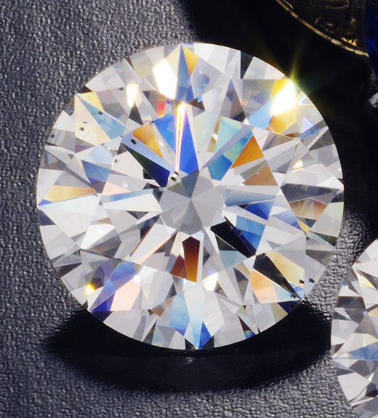
Thanks for verification and backup from a man who was a member of The Illuminating Engineering Society (IES) indicating creds superior to those of this communications engineer, semi-pro photographer, and gemologist-appraiser. All these fields of endeavor caused me to become very aware and knowledgeable about lighting and its complex interaction with objects in nature, especially the world of gemstones and diamonds.
To elaborate on my last comment: Since your eyes auto white balance to the ambient incident light, the monitor should be adjusted to that ambient color temperature, so that your brain sees colors in the monitor the same as surrounding colors in the room (i.e. correctly).
Say you have photographed a slightly-bluish green emerald from the famous Muzo mine in Columbia. You have the image up in photoshop to fine tune the bluish green hue of the stone. You are in a room with 4100K fluorescent lighting, while your monitor is calibrated for the cooler slightly bluish 6500K of the OP. With eyes adjusted (white-balanced) to the warmer, more yellowish 4100K, the observer may well see the green of the emerald image on the monitor as slightly bluish green matching how the emerald looks in his hand. The image may actually be green or even yellowish-green on a monitor calibrated properly to a neutral 5000-5500K and observed on the monitor by someone in a neutral lighting environment.
I understand this is complex, especially as we see color relative to surrounding colors, and our brain is constantly "auto-white balancing" to the ambient lighting almost instantly as our gaze shifts. This auto white balancing is why we see colors close to correctly in nature despite the lighting going from the yellowish low color temperature in early morning and late afternoon to the high bluish color temperature from the clear blue sky of northern daylight. This property of human visual perception is called "color constancy" and our evolving species would have been confused and in jeopardy without it.
Apr 13, 2018 20:31:42 #

michaelgem wrote:
Thanks for verification and backup from a man who ... (show quote)
Ah well a very enlightening reply.
Indeed I have puzzled as to how my brain shows me white paper in flourscent light. Yes the brain knows it’s suppose to be white.
But if I take a picture of that paper in flourscent light (using daylight WB) the picture looks green to me.
Apr 13, 2018 21:36:27 #

a6k wrote:
My Spyder5Pro and some of the software that's buil... (show quote)
Because a 6500K white point on a monitor comes close to a 5000K light box used for viewing prints. The why doesn’t matter to me — just that it works, and has since I put ICC color management systems into a pro lab.
Other useful starting points:
Gamma 2.1 or 2.2 (test)
Black point = 0.5 candelas per square meter
White Point >85, <120 cd/m^2
Match print viewing intensity to monitor intensity AFTER setting the monitor (do NOT use monitor brightness to match print viewing intensity).
Keep your computer desktop and your real desktop and walls as neutral gray as possible. Labs use Munsell N8 paint. Lighting in the *room* should be soft, dim, 5000K, and subdued/diffused. Use a high CRI 5000K source in your print viewing box.
Apr 13, 2018 22:27:58 #
a6k wrote:
I really do enjoy UHH but I have to agree with the critics who point out how often the replies are off-point. Most of the above is off-point. I don't really want to know how anyone is calibrating or not calibrating his or her monitor. Opinions are not what I seek. I asked a question that I thought was simple and was prefaced with sufficient data. If there is an answer I expect it to be grounded in technology, not opinion nor the opinion that color management is just personal preference.
I couldn’t agree more but it seems like most UHH members are like the/ dare I say our government. And how quickly and easily do you think you’re going to change their mind Or point of view lol. And yes I said most so go ahead and start beating me up. But don’t forget to take a good look in the mirror before you respond.
Apr 14, 2018 20:17:09 #
a6k wrote:
I really do enjoy UHH but I have to agree with the critics who point out how often the replies are off-point. Most of the above is off-point. I don't really want to know how anyone is calibrating or not calibrating his or her monitor. Opinions are not what I seek. I asked a question that I thought was simple and was prefaced with sufficient data. If there is an answer I expect it to be grounded in technology, not opinion nor the opinion that color management is just personal preference.
Yeah, but how do we help people who keep asking the wrong questions? The answer is to steer them back on course, we have to move away from the path they’re on, slowly enough but jarringly enough that the smart ones follow...
If you want to reply, then register here. Registration is free and your account is created instantly, so you can post right away.