Question on composition
Apr 4, 2018 13:40:59 #

I take multiple shots of the same scene with slight variations in composition, I then struggle to choose one to print.
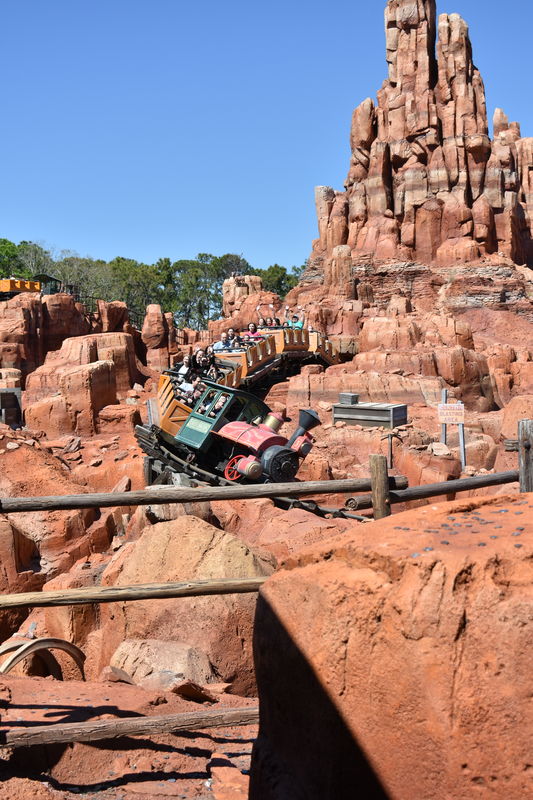
I'm posting three pictures I recently shot at Disney World. I would like to ask for comments you may have on composition,
good or bad and what you think might improve the pictures. These are all of the same scene, comparisons between them
would be helpful. Thank you for your thoughts.
I'm posting three pictures I recently shot at Disney World. I would like to ask for comments you may have on composition,
good or bad and what you think might improve the pictures. These are all of the same scene, comparisons between them
would be helpful. Thank you for your thoughts.

Apr 4, 2018 13:47:50 #
I'm not fond of the 'chopped off' mountain.
I prefer more of the train as in #3 rather than #2.
I think slightly closer to the railing, and catching the train so the railing doesn't 'cut through' the locomotive would be even better.
IMHO of course!
I prefer more of the train as in #3 rather than #2.
I think slightly closer to the railing, and catching the train so the railing doesn't 'cut through' the locomotive would be even better.
IMHO of course!
Apr 4, 2018 13:48:31 #

1: top clipped
2
1 top clipped
2 missed "s" curve on train
3 best of the three but train obscured by fence
if u can't redo clone out the top of 1 a little to blue sky
2
1 top clipped
2 missed "s" curve on train
3 best of the three but train obscured by fence
if u can't redo clone out the top of 1 a little to blue sky
Apr 4, 2018 13:48:50 #
twowindsbear wrote:
I'm not fond of the 'chopped off' mountain.
I prefer more of the train as in #3 rather than #2.
I think slightly closer to the railing, and catching the train so the railing doesn't 'cut through' the locomotive would be even better, more like the position of the train in pic #1
Ooops! This should have been an edit to my first post, not a reply to it!
IMHO of course!
Apr 4, 2018 13:50:10 #

The first image has the top has the mountain cut off. All three have a distracting fence in the foreground with the bottom having the interesting engine hidden by the boring fence. The middle has the best potential if you'll apply more work to the image:
1. Crop closer and remove the fence.
2. Clone-out the box to the right of the engine.
3. Consider cloning-out the cars on the left going in the opposite direction, if that second train wasn't remove the cropping step (#1) that removed the fence.
4. Add some red / saturation to the color of the rocks. They seem a big drab / grey.
5. Lighten the blue of the sky slightly to match the sky in image 1.
Hopefully, the woman with her hands raised in the 2nd image is the purpose of this exercise as she's clearly captured and viewing the middle image at 100% shows the opportunities to harvest a good image from this initial version. Maybe the people in the final cars from image 1 are your target? That would be the only purpose to continue to use the first image as a candidate.
Apr 4, 2018 14:10:51 #
Looks like commenters were pretty well agreeing. I don't think I'd crop out the fence but walking a little closer and shooting over the fence would be good.
Apr 4, 2018 14:14:29 #

Jerry G wrote:
I take multiple shots of the same scene with slight variations in composition, I then struggle to choose one to print.
I'm posting three pictures I recently shot at Disney World. I would like to ask for comments you may have on composition,
good or bad and what you think might improve the pictures. These are all of the same scene, comparisons between them
would be helpful. Thank you for your thoughts.
I'm posting three pictures I recently shot at Disney World. I would like to ask for comments you may have on composition,
good or bad and what you think might improve the pictures. These are all of the same scene, comparisons between them
would be helpful. Thank you for your thoughts.
I would go with the third image since it includes the whole "mountain".
Apr 4, 2018 14:19:16 #
Apr 4, 2018 14:49:45 #
I like #2.
Gives me a sense of something about to happen... Like going around the bend...
Gives me a sense of something about to happen... Like going around the bend...
Apr 4, 2018 14:51:20 #

I'm in agreement with those who say 3 is the better of the bunch, for the same reasons. However, anyone suggesting fixing this in processing doesn't understand, or accept, the necessity of getting things correct at the time of making the exposure.
--Bob
--Bob
Jerry G wrote:
I take multiple shots of the same scene with slight variations in composition, I then struggle to choose one to print.
I'm posting three pictures I recently shot at Disney World. I would like to ask for comments you may have on composition,
good or bad and what you think might improve the pictures. These are all of the same scene, comparisons between them
would be helpful. Thank you for your thoughts.
I'm posting three pictures I recently shot at Disney World. I would like to ask for comments you may have on composition,
good or bad and what you think might improve the pictures. These are all of the same scene, comparisons between them
would be helpful. Thank you for your thoughts.
Apr 4, 2018 14:52:16 #
bertloomis
Loc: Fort Worth, Texas
I don't much care for #1: too much foreground and the engine is more or less in the center of the photo. I prefer #3 the most. Engine is closer than in number 2 and you have that whole train-full of people in the photo.
Apr 4, 2018 15:11:50 #

Exactly what I was thinking. #3
twowindsbear wrote:
I'm not fond of the 'chopped off' mountain.
I prefer more of the train as in #3 rather than #2.
I think slightly closer to the railing, and catching the train so the railing doesn't 'cut through' the locomotive would be even better.
IMHO of course!
I prefer more of the train as in #3 rather than #2.
I think slightly closer to the railing, and catching the train so the railing doesn't 'cut through' the locomotive would be even better.
IMHO of course!
Apr 4, 2018 16:21:06 #
1) There is no "subject". Nothing pops out as they are all the same hue.
2) The top of the mountain is a problem. I call it "Decapitation". Don't do it. If you cropped it off lower down it would be fine. Don't decapitate people either.
3) The fence is a distraction. That is why #3 loses. As the train engine is a subject, hiding it behind a fence detracts from the shot.
4) The fence also effects the focusing.
5) My suggestion on a rescue would be to take #2 and crop the bottom and top to a 2x3 ratio. Your focus will still be off but it will give you the best of a bad bunch.
Apr 4, 2018 16:30:08 #
Jerry G wrote:
I take multiple shots of the same scene with slight variations in composition, I then struggle to choose one to print.
I'm posting three pictures I recently shot at Disney World. I would like to ask for comments you may have on composition,
good or bad and what you think might improve the pictures. These are all of the same scene, comparisons between them
would be helpful. Thank you for your thoughts.
I'm posting three pictures I recently shot at Disney World. I would like to ask for comments you may have on composition,
good or bad and what you think might improve the pictures. These are all of the same scene, comparisons between them
would be helpful. Thank you for your thoughts.
My suggested fix for #2 This is just my suggestion, not a mandate or anything.

Apr 4, 2018 17:07:40 #

Before you can answer the question, you have to decide what the photo is "about." For me, neither sky nor mountain are that important. So, I cropped the pic until the coaster created a good composition, in this case a good spiral (green line) into the center of interest. The focal point is also the hub of a radial composition (red lines).

If you want to reply, then register here. Registration is free and your account is created instantly, so you can post right away.