Faces of The Civil War Part II
Jul 21, 2012 13:45:52 #
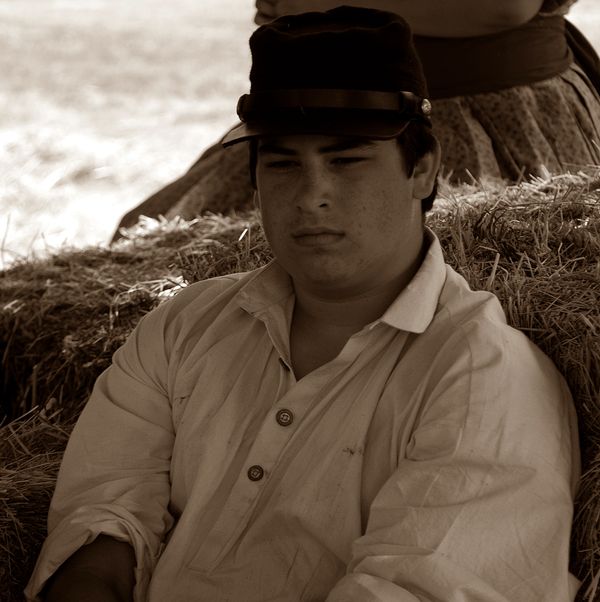
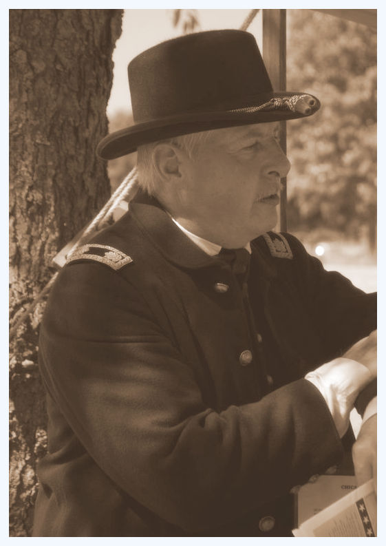
On the advice of several commenters it was reccomended that I take off the aged look and stay with a sepia tone. So here goes. Please comment as you see fit any and all suggestions are welcome. I normally do not enhance most of my work so this is virgin territory for me!
Jul 21, 2012 14:33:47 #
Jul 21, 2012 14:50:22 #

Jul 21, 2012 14:54:41 #

Jul 21, 2012 14:58:16 #

You'll find that everyone has an opinion and, as it relates to their personal experience of your work... their opinions are all valid. *wink*
I haven't seen the others, but I like these just fine!
The sepia tone adds some sense of age... maybe a little PP grain will make them feel a bit more weathered and authentic... but what's important is what YOU think of them, first and foremost!
I haven't seen the others, but I like these just fine!
The sepia tone adds some sense of age... maybe a little PP grain will make them feel a bit more weathered and authentic... but what's important is what YOU think of them, first and foremost!
Jul 21, 2012 15:33:55 #
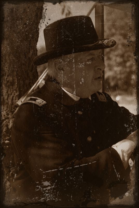
I tried to add some oomph by aging it some. Let me know what you think. I really like it looks almost like tintype. I look forward to your opinion.
Union Signal Officer
Jul 21, 2012 15:39:03 #
Raider Fan wrote:
I tried to add some oomph by aging it some. Let me know what you think. I really like it looks almost like tintype. I look forward to your opinion.
_____________________________
THIS I REALLY like!
VERY authentic-looking!
(And I know a specific group on Flickr dedicated to PRECISELY this kind of photography... you'd be in good company!)
Well rendered! :thumbup:
Jul 21, 2012 22:00:12 #
Jul 22, 2012 07:36:44 #

Don't like the scratches, I feel the photo looks aged with the sepia as is, and its a great photo too, but didn't like the distraction of scratches.
Would realllly like to see the photo as is, without them.
Well done, thanks for showing.
Would realllly like to see the photo as is, without them.
Well done, thanks for showing.
Jul 22, 2012 12:31:27 #
Raider Fan wrote:
On the advice of several commenters it was reccomended that I take off the aged look and stay with a sepia tone. So here goes. Please comment as you see fit any and all suggestions are welcome. I normally do not enhance most of my work so this is virgin territory for me!
I would have liked to see a little more background to tell that these are the faces of the civil war reenactments. Like show a cannon or some soldiers in the background. Had it not been for the 1994 Northridge earthquake, i could have shown you what i believe would have enhanced your work. I lost over 50,000 slides and negatives to that quake. I was only 3 miles from the epicenter. And yes i do like the aging of the union officer very much. it looks like the real deal.
Jul 22, 2012 14:59:57 #
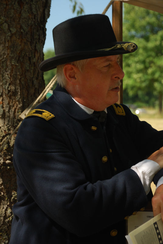
Here is the unadulterated versions of this photo as you requested.
Union Signal Officer
Jul 22, 2012 15:52:15 #
Isn't it funny; we spend lots of time discussing how to and then doing the editing out of scratches, etc. from our old photographs.
Jul 22, 2012 15:59:36 #
Raider Fan wrote:
Here is the unadulterated versions of this photo as you requested.
that's great but in sepia, would definately look old.
I prefer this version. Great photo !! :thumbup:
Jul 22, 2012 23:03:59 #
Jul 22, 2012 23:29:46 #
The photo with the scratches really has the feel. There were some photographs from 1908 (??) posted here the other day. Could fit right in.
Could have fooled me.
Could have fooled me.
If you want to reply, then register here. Registration is free and your account is created instantly, so you can post right away.