The Stairway
Feb 4, 2018 13:45:22 #


Feb 4, 2018 13:49:08 #

Feb 4, 2018 13:50:22 #

I'm with northmaple, the first one is quite nice.
--Bob
--Bob
dgrim23 wrote:
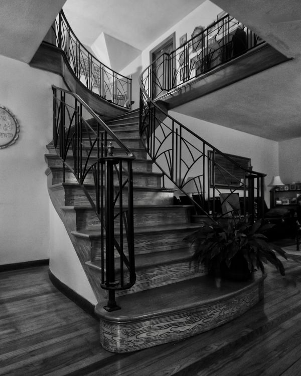
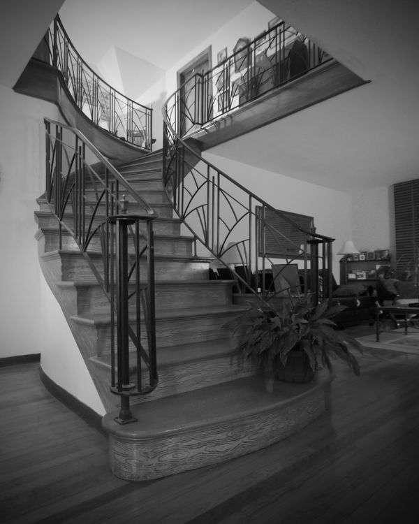
Help me on the photos of which one is the most usable. All comments welcomed.
Feb 4, 2018 13:56:02 #

Feb 4, 2018 13:59:04 #

I'm a little bothered by the object (clock?) cut in half on the wall in the first one, left side. But then, what do I know.
I love image 2 and 3! Interesting subject.
I love image 2 and 3! Interesting subject.
Feb 4, 2018 14:05:21 #

Feb 4, 2018 14:05:21 #
#2, but up your red spectrum a touch.
#3, add a touch more contrast.
I agree that the clock in #1 is distracting.
#3, add a touch more contrast.
I agree that the clock in #1 is distracting.
Feb 4, 2018 14:40:58 #
#1 is more dramatic. #2 is just another color image. I agree with Joe Blow, you should clone out the clock in #1.
Feb 4, 2018 14:40:59 #
#1 is more dramatic. #2 is just another color image. I agree with Joe Blow (that's the second time today), you should clone out the clock in #1.
Feb 4, 2018 14:43:18 #

northmaple wrote:
First one, in B/W
First one in Black and White. Great Tonal Range.
Feb 4, 2018 14:44:06 #

Feb 4, 2018 15:36:52 #
Usable for what purpose? House showing, #2. Wall hanging art work, #3. Agree with comments on #1. All said and done, great shots!
Feb 4, 2018 16:50:25 #

Depends on what effect you're striving for. The first one is very moody, #2 would be great as an advertisement, and #3 is a modern looking B&W - all are quite nice.
Feb 4, 2018 16:56:59 #

dgrim23 wrote:
Help me on the photos of which one is the most usable. All comments welcomed.
I like 1 the most, it shows the grain of the wood and highlights the attractive railings more.
Feb 5, 2018 07:09:12 #

If you want to reply, then register here. Registration is free and your account is created instantly, so you can post right away.