Check out Wedding Photography section of our forum.
Water over stones
Jun 25, 2017 12:01:19 #

Linda From Maine wrote:
This looks great, Frank! What jumps out at me is how much better (and more appropriate) the cool blue tones work than warmer yellows and reds. Much appreciated!
Once again thanks for the opportunity and glad you liked it.
Jun 25, 2017 12:39:26 #

Linda From Maine wrote:
I like it, I don't like it. Please provide detaile... (show quote)
 (one of my own problems, I think, is the stones are too numerous and small). If you have tried similar subject, please post here so I can learn!
 I agree with your first sentence. My first reaction is what am I looking at here, what is the subject what is the story? Is it trying to be minimalist? I fear that it fails there. If the subject is the light... hmmmm. I like the effect in the lower right of the frame, about 1/4 of the way in from the right, and 1/4 way up from the bottom. If there was a lot more of that effect I think it could be a great abstract.
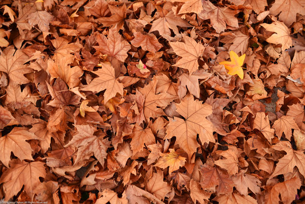
I do recall trying a similar theme, shooting a group of leaves, which is similar to the stones. When I shot the leaves, my vision was a simple fall scene, with one leaf standing out, but the result was not what I envisioned. It's definitely not going in my portfolio. Ok, I will post it below.
A question for you is when you took the shot, what was you vision for it?
Jun 25, 2017 12:54:21 #

JD750 wrote:
I agree with your first sentence. My first reacti... (show quote)
Thanks so much for your thoughtful comments, JD, and for offering an example of patterns. Yes, I was attracted to the light and shadows playing over the rocks, but I didn't think it through far enough.
Here is one edit from the section I think you noticed (using a Chromebook app called befunky), and with the blue tones I liked so much from NJFrank's edit. A more abstract look may be best for this shot, though I'm going to see if it can be used as a texture, too, especially if blurred. I appreciate your time and interest!

Check out Software and Computer Support for Photographers section of our forum.
Jun 25, 2017 13:12:35 #
Linda From Maine wrote:
Thanks so much for your thoughtful comments, JD, a... (show quote)
Your welcome.
Yep that's the part I was referring to. In this image it is centered top to bottom, and slightly left of the middle. It could very well be used as a texture.
Jun 25, 2017 14:42:50 #

Linda From Maine wrote:
I like it, I don't like it. Please provide detaile... (show quote)
I like this as an abstract or as a quirky nature photo, even though it's a little confusing until you read the posts and find out more about what you were dealing with. I also like the cropped blue version.
If preserving the streaming plants and the sense of waterflow, you might try cropping from the right, and using dodge and burn approaches to emphasize that flow coming up from the lower left and swirling rightward then back leftward. I think moving towards colors that bring out the blues/greens, which we mentally associate with water, would help aqua-fy the scene a bit too. An interesting one that I may wish to play with when I get caught up.
Jun 25, 2017 14:52:36 #

Linda From Maine wrote:
This looks great, Frank! What jumps out at me is how much better (and more appropriate) the cool blue tones work than warmer yellows and reds. Much appreciated!
Great eye, Linda!
I've not seen this effect capitalized upon in this manner...and I love the other posts of variations using the same reticulated refrefraction effect.
In my experience, this is the height of pattern originality!
I can see this as covering a wall!
Dave
Jun 25, 2017 15:01:05 #
NJFrank wrote:
Linda thank you for the opportunity to play with your image. This was a quickly. I did like the colors of the stones and the bubble so I played with them. This is by no means a "finished" product but just to give you an idea of what I was thinking.
Wow!
The color temperature and contrast changes really affect the mood of the effect!
This takes my childhood fascination with the effect that ripples have on sunlight reaching the bottom of a swimming pool to a whole different level, complexity, and intensity...I experience an increased ... urgency.. in directing the travels of my gaze throughout the image.
I might have used the term before..."engrossing"...but it deserves repeating!
Dave
Check out Panorama section of our forum.
Jun 26, 2017 06:30:53 #

I find the image as is confusing. Can't really pinpoint whether it's too many pebbles or the ripple effect over the top. And the dead or dying pond plant doesn't help me either. I did something similar in the Tetons on our big holiday many years back with a polariser at varying degrees of effectiveness.
But I like the pattern. I think it might be worth cropping to the left and getting rid of the plant, and then defocusing (or shoot it again (out of focus) to provide a good background for almost anything else.
But I like the pattern. I think it might be worth cropping to the left and getting rid of the plant, and then defocusing (or shoot it again (out of focus) to provide a good background for almost anything else.
Jun 26, 2017 06:39:48 #

Jun 26, 2017 07:15:09 #
minniev wrote:
I like this as an abstract or as a quirky nature p... (show quote)
Thank you, Minnie! Dodge and burn to emphasize the flow is a super idea. I'd be delighted to see an edit of your own at some point. Let me know if you want the dng.
Jun 26, 2017 07:16:43 #
Uuglypher wrote:
Great eye, Linda!
I've not seen this effect capitalized upon in this manner...and I love the other posts of variations using the same reticulated refrefraction effect.
In my experience, this is the height of pattern originality!
I can see this as covering a wall!
Dave
I've not seen this effect capitalized upon in this manner...and I love the other posts of variations using the same reticulated refrefraction effect.
In my experience, this is the height of pattern originality!
I can see this as covering a wall!
Dave
Thanks again, Dave. Much appreciated!
Check out Black and White Photography section of our forum.
Jun 26, 2017 07:18:46 #
John N wrote:
I find the image as is confusing. Can't really pi... (show quote)
Thanks for taking the time to view and comment, John. There are a few edits further into the thread, if you get a chance to check them out. NJFrank had a great idea about color and JD750 found an interesting bit within I isolated. I'll try as a texture or background soon. Appreciate your time!
Jun 26, 2017 07:20:26 #
ozdude wrote:
Sorry Linda I am but a simple man. I don't get it.
No worries, Mark
 Thank you for commenting!
Jun 26, 2017 09:51:59 #

Yes. I shoot stuff like this, so I understand it. I like the grasses for "grounding" the image, but I don't particularly like those grasses. Maybe if they were more whispy? I love the stones and it's clear to me that they are underwater because they have that "look." But they are all the same size, shape, colour. I'd like to see one really large stone, I think, that would sort of anchor the image somehow. (And then, you wouldn't need the grasses?) But that might belong to a perfect world, and we have to shoot what is and make it beautiful, right?
Anyway, I've said a lot and said nothing. Sorry, Linda, I guess I'm no help. But I think you're headed in an interesting direction and I would definitely pursue this - whether by working the image or by reworking the location.
Anyway, I've said a lot and said nothing. Sorry, Linda, I guess I'm no help. But I think you're headed in an interesting direction and I would definitely pursue this - whether by working the image or by reworking the location.
Jun 26, 2017 10:12:32 #
AzPicLady wrote:
Yes. I shoot stuff like this, so I understand it.... (show quote)
Thanks so much for your time, Kathy. A bigger stone to anchor would be well worth looking for. I confess to having only taken two shots of this subject as my mind was on the avalanche lilies along the same road edge (Mt Rainier National Park). Lesson learned...if I remember, lol.
If you want to reply, then register here. Registration is free and your account is created instantly, so you can post right away.