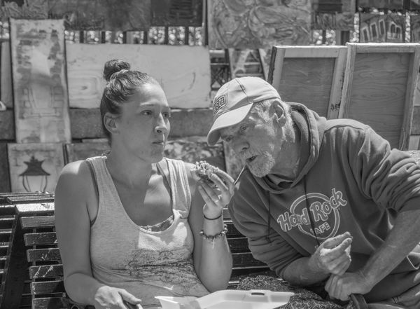
That's a good looking
Apr 29, 2017 15:00:55 #

sandwich.
Taken at New Orleans French Quarter Fest - 2017
The guy was blitzed!!!
Don
Taken at New Orleans French Quarter Fest - 2017
The guy was blitzed!!!
Don
Apr 29, 2017 20:20:06 #
Apr 30, 2017 00:04:45 #

Voss wrote:
Good photo, Don. You caught them at the right moment. Would suggest a little more contrast.
Agreed. Nice shot but it needs some contrast.
Apr 30, 2017 15:22:21 #

Apr 30, 2017 16:40:09 #
PAR4DCR wrote:
Better??
Better, but not quite what I envisioned. I played with it a bit, and if you don't mind, I can send it over.
Apr 30, 2017 17:14:37 #
Apr 30, 2017 18:01:45 #
Voss wrote:
Better, but not quite what I envisioned. I played with it a bit, and if you don't mind, I can send it over.
Can we all see it? and can you tell us what you did?
: )
Natalie
Apr 30, 2017 18:47:37 #
Voss should post it here Natalie and all of us should be able to see it. I am also very interested in what he did.
Don
Don
Apr 30, 2017 21:39:28 #
PAR4DCR wrote:
Voss should post it here Natalie and all of us should be able to see it. I am also very interested in what he did.
Don
Don
OK. Here it is. Basically, I just used the "contrast" adjustment on my editor to increase the contrast. It didn't take it quite as far as I wanted, so I used the Silver Efex Pro2 program in the Nik Collection (the Nik Collection is a freebie), to make slight increases to the whites and the blacks. (To a small degree, they can be adjusted separately in Nik.)
Generally speaking, for B&W photos, if something in the photo is definitely black (e.g. the space between the slats on the bench), and something is definitely white (e.g. the styrofoam), then the greys will also look much better.
If you find this to have too much contrast, you can of course stop sooner. Actually, every time I increased the contrast a bit, I liked it better. I even increased it a bit more before posting this.

Apr 30, 2017 22:39:25 #
Voss wrote:
OK. Here it is. Basically, I just used the "... (show quote)
Many thanks for sharing the image and your process : )
May 1, 2017 08:22:54 #
AZNikon
Loc: Mesa, AZ
PAR4DCR wrote:
sandwich.
Taken at New Orleans French Quarter Fest - 2017
The guy was blitzed!!!
Don
Taken at New Orleans French Quarter Fest - 2017
The guy was blitzed!!!
Don
Shades of David Hasselhoff's drunken cheeseburger video...
May 1, 2017 19:24:46 #
Thanks for your detailed description Voss. Presently all I have is Lightroom 5.7. I guess I could play with the paint brush along with the contrast slider.
Don
Don
May 2, 2017 07:35:43 #
PAR4DCR wrote:
Thanks for your detailed description Voss. Presently all I have is Lightroom 5.7. I guess I could play with the paint brush along with the contrast slider.
Don
Don
Your contrast slider will probably do the job for you. What I did in Nik was a very small part of it, and probably unnecessary. And that really is a good photo.
May 3, 2017 15:41:01 #
PAR4DCR wrote:
Thanks for your detailed description Voss. Presently all I have is Lightroom 5.7. I guess I could play with the paint brush along with the contrast slider.
Don
Don
Lightroom should work for you. I use Luminar and I just use the Black & White template and tweak with the contrast, blacks, whites or shadow slider until I get it looking like I want.
If you want to reply, then register here. Registration is free and your account is created instantly, so you can post right away.