'CameraMan'
Mar 19, 2017 17:30:59 #
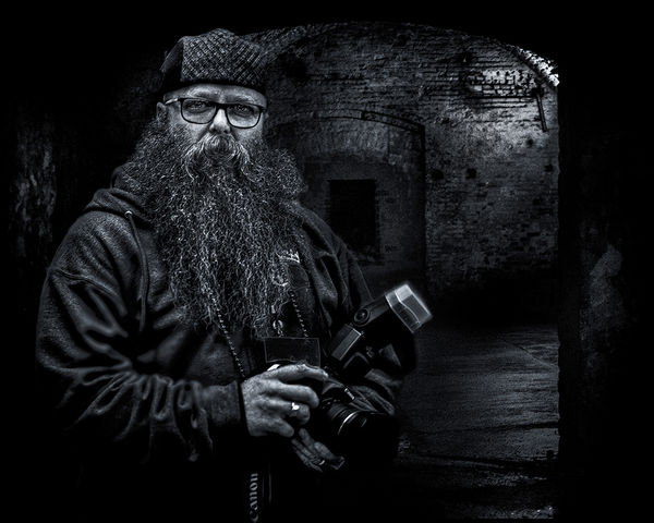
A composite inside an old abandoned brewery in Cincinnati. The subject was from the Beard Barons Competition. FYC
Mar 19, 2017 17:51:13 #
Dave Chinn wrote:
A composite inside an old abandoned brewery in Cincinnati. The subject was from the Beard Barons Competition. FYC
This one is really a success I think. I also like the "glow" of the flash hood. Very nice.
Erich
Mar 19, 2017 18:31:24 #

So many things to like about this image, and his hands in particular! Nice!!!
Mar 19, 2017 18:33:45 #
Frank2013
Loc: San Antonio, TX. & Milwaukee, WI.
Wonderfull image Mr. Chinn…if I were to nitpick, loose the camera strap bottom….catches the eye and adds no value to the mood of the image.
Mar 19, 2017 19:06:55 #

Intriguing! A kindly wizard about to enter the caverns to photograph...ghosts, bats, wine bottles?  Love it, Dave!
Love it, Dave!Mar 19, 2017 20:15:39 #
ebrunner wrote:
This one is really a success I think. I also like the "glow" of the flash hood. Very nice.
Erich
Erich
Thanks Erich !!! This one went together with hardly any issues. Seems the background flowed/blended together quite well. I appreciate your comments.
Dave
Mar 19, 2017 20:18:24 #
Treepusher wrote:
So many things to like about this image, and his hands in particular! Nice!!!
Thanks Randy !!! He (Todd) too liked this image. Your comments are much appreciated.
Dave
Mar 19, 2017 20:33:04 #
Frank2013 wrote:
Wonderfull image Mr. Chinn…if I were to nitpick, loose the camera strap bottom….catches the eye and adds no value to the mood of the image.
Thanks Frank !!! The camera strap doesn't bother me and I'm sure Todd doesn't mind. You know how those Canon owners are? Proud of their equipment as I would be as well. I appreciate you commenting with your feedback.
Dave
Mar 19, 2017 20:35:37 #
Linda From Maine wrote:
Intriguing! A kindly wizard about to enter the caverns to photograph...ghosts, bats, wine bottles? Love it, Dave!
Love it, Dave!Thanks Linda !!! I felt the background was near perfect for him. Everything blended together quite nicely IMO.
Dave
Mar 20, 2017 06:21:21 #

Dave Chinn wrote:
A composite inside an old abandoned brewery in Cincinnati. The subject was from the Beard Barons Competition. FYC
That's a nice composite that works really well Dave - but, I know I'm alone on this, that flash unit needs some attention, because it gets too much (attention) from the viewer. Stands out like a sore thumb. Elsewise, a masterful composition in your signature style.
Mar 20, 2017 08:15:22 #
Dave Chinn wrote:
A composite inside an old abandoned brewery in Cincinnati. The subject was from the Beard Barons Competition. FYC
Hi Dave,
You know, the eyes move right to the brightest spot in an image. Hence, I would definitely tone down his ring on his camera left hand and also the upper right corner with the brighter semi-cirular run of bricks (I think), especially in the download. Great you have no reflection in his glasses, but I find the back wall somewhat grainy or noisy in the download as well?
I do like the composition, but I think you are capable of better processing in his beard and his facial texture. Also, as I look at the download more and more, I also believe it would be much better and less of a distraction if his on camera flash diffuser was a little less bright. Of course, these comments are personal opinions and just being honest, and may not be in agreement with your thoughts and desires for the image.

Best Regards,
Tom
Mar 20, 2017 13:58:26 #

Really nice work, Dave. Lots of retained detail, leading to a very visually interesting photograph. I can imagine the amount of work presented in this finished product. The composite worked very well in this case and the composition is very nice and balanced.
--Bob
--Bob
Dave Chinn wrote:
A composite inside an old abandoned brewery in Cincinnati. The subject was from the Beard Barons Competition. FYC
Mar 20, 2017 21:14:39 #
magnetoman wrote:
That's a nice composite that works really well Dave - but, I know I'm alone on this, that flash unit needs some attention, because it gets too much (attention) from the viewer. Stands out like a sore thumb. Elsewise, a masterful composition in your signature style.
Thanks Dave !!! I understand your concerns with this image, but my thoughts were to have some attention focused towards the camera/flash based on the title and knowing the subject (just a little) would appreciate the fact his camera/flash seems balanced within the image. I suppose it could be toned down some, but I personally wouldn't go far. I appreciate your comments and will keep those in mind in the future.
Dave
Mar 20, 2017 21:37:54 #
trc wrote:
Hi Dave, br br You know, the eyes move right to t... (show quote)
Thanks for your feedback Tom. Yes, I agree the eyes move right to the brightest spot. However, for me, my eyes go right towards the subject, then wanders off to view and inspect the other elements of the image. The ring does not bother me, but yes, it could stand to be toned down. The bright area in the upper right is part of my light source, which is actually a light on the wall in the next room. I wanted to keep the light somewhat bright to have some separation between the subject and background. Since this is a composite I wanted it to be realistic as possible. The grain, to me, is at a minimal, IMO, and doesn't have any impact one way or the other. It may even be from a grunge layer. However, your comments keeps me informed on what to look out for and whether I should change directions?
Dave
Mar 20, 2017 21:45:36 #
rmalarz wrote:
Really nice work, Dave. Lots of retained detail, leading to a very visually interesting photograph. I can imagine the amount of work presented in this finished product. The composite worked very well in this case and the composition is very nice and balanced.
--Bob
--Bob
Thanks Bob !!! I appreciate your opinion and comments. The background was a near perfect match with the subject, IMO. I have had some, where the white balance, lighting and shadows didn't match up, only to create chaos within.
Dave
If you want to reply, then register here. Registration is free and your account is created instantly, so you can post right away.