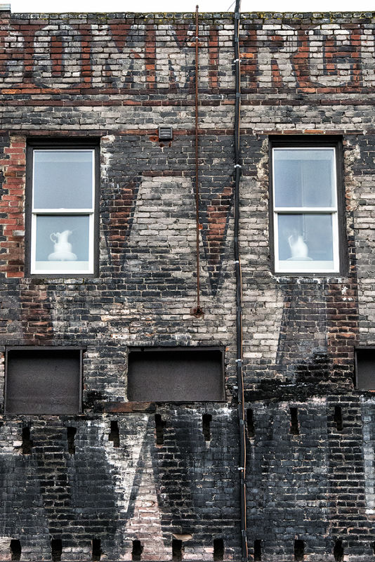
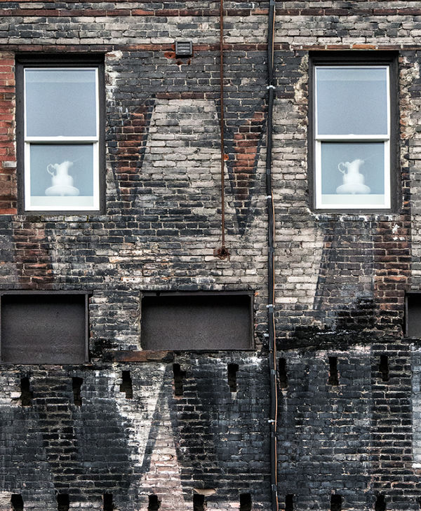
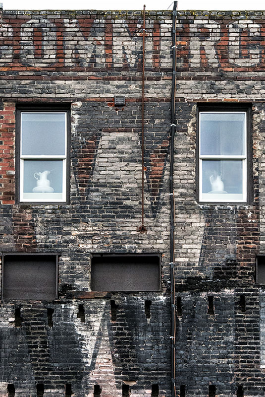
Vase in a window
Mar 16, 2017 18:19:50 #

Lots of fun trying to twist and tug these into some semblance of "straight," with my limited skill and limited tools for perspective correction (PS Elements) + the reality of the building's lines. Anyone wishing to work on that is most welcome!
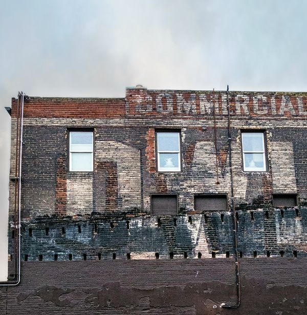
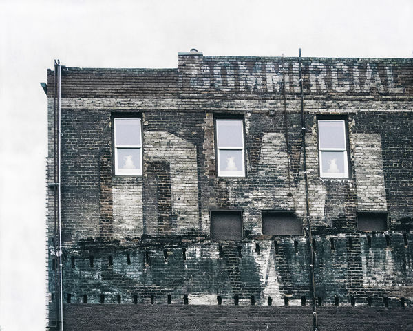
I was interested in the contrast of the rough textures and patterns of the building against the smooth finish and lines of the vases. Normally I don't like "straight on," but the attached building on left (banished and vanished in pp) does not add to the mood.
Feedback, edits and suggestions for a reshoot welcomed. Thanks much! (#2 and #3 are from the same original. You will see in #3 I also did some "interior decorating" )
)
I was interested in the contrast of the rough textures and patterns of the building against the smooth finish and lines of the vases. Normally I don't like "straight on," but the attached building on left (banished and vanished in pp) does not add to the mood.
Feedback, edits and suggestions for a reshoot welcomed. Thanks much! (#2 and #3 are from the same original. You will see in #3 I also did some "interior decorating"
)
Mar 16, 2017 20:02:53 #

I think there is more than a perspective problem going on with this old building. Maybe termites or carpenter ants are at work or the results of a shaking earth.
Nice work on replacing the window and adding the vases.
How much are the vases in the window, I wonder if the vases are for sale. I better buy three in case I break one, then I'll still have a pair.
I'll be watching to see how the group copes with the problem
Nice work on replacing the window and adding the vases.
How much are the vases in the window, I wonder if the vases are for sale. I better buy three in case I break one, then I'll still have a pair.
I'll be watching to see how the group copes with the problem
Mar 16, 2017 20:08:54 #
SoHillGuy wrote:
I think there is more than a perspective problem going on with this old building. Maybe termites or carpenter ants are at work or the results of a shaking earth.
Nice work on replacing the window and adding the vases.
How much are the vases in the window, I wonder if the vases are for sale. I better buy three in case I break one, then I'll still have a pair.
I'll be watching to see how the group copes with the problem
Nice work on replacing the window and adding the vases.
How much are the vases in the window, I wonder if the vases are for sale. I better buy three in case I break one, then I'll still have a pair.
I'll be watching to see how the group copes with the problem
Is this an example of "stream of consciousness?"

Thanks for the compliment on window replacement, Gaylord; rectangles are about the most I can handle (the vase came in the window
)Mar 16, 2017 20:40:37 #
Mar 17, 2017 06:26:00 #
Linda From Maine wrote:
Lots of fun trying to twist and tug these into som... (show quote)
Linda,
I love the building and the different 'textures' of the brick and siding of the old building. However, I honestly can't say much for the vase(s)!
I also think the 2nd & 3rd images would be much more impressive and add soooo much more to the overall image(s) if there was some detail and blue color and contrast to the sky. I believe you could achieve that by selectively turning down the highlights slider and increase the Dehaze slider in ACR (especially if you took the picture in RAW format), or selectively turn down the brightness and adjust the contrast in PS. I really do like the brick building - Great!
Best Regards,
Tom
Mar 17, 2017 07:35:58 #

I'm slow, but getting a lot better at straightening out images. You can get reasonably good results from Elements (I'm on 10) and that's what I used here. Forgive me if I'm teaching you to suck eggs but here is how I do it.
1) Straighten picture horizontally. There are several different 'lines' going on here so I chose the most prominent feature and used the white frame at the top of the windows. Do this at 100% or full width.
2) USE the cropping tool to check perspective. You can go for the whole picture but I used the windows again and drew a crop box around those. Both were 'leaning in', more on the right than the left which suggests the camera was not perpendicular nor square on to the building. But not far out! DO NOT CROP!
3) Image, Transform, DISTORT - allows you to 'pull' each side individually. (Working in 100% or full width will allow for smaller adjustments.) Here I moved the left outwards a little, and the right approx. twice as much. O.K. and check with the crop tool again. If satisfied, crop the image to remove the white areas or use one of the later 'smart' fills. If not satisfied repeat step 2. The UNDO button can be your friend here.
4) When it comes to texture I like VIVEZA on the NIK suite. I just gave it a slight boost, about 10%, but from what I've seen you're far better than me at this so you be the judge.
Perhaps on reflection I would have cropped a little more of the left to place the windows centrally.
When I downloaded your image I only got a 900kb image? Is this normal, or should I do something else to get the full image, assuming the full image was more than 900kb.
Mar 17, 2017 08:57:19 #

I'm all about an initial impact of an image, and this one gave me a lot more than a moment's pause! I love the contrasts in here: the quaint,delicate white vases that found a resting place in an industrial,rough, unattractive building. the building's bricks and mortar are in various states of repair and looks like there might have been a fire at one time? or at least a lot of soot and color changes. As John mentioned,you are not far off plumb, and I'd attribute that to age and settling of the building's foundation. It is well worn. It seems to have a face that whispers,"help me..."
Mar 17, 2017 09:25:34 #
SoHillGuy wrote:
I must like the vases.
Thank you, Gaylord. I knew you wouldn't be able to resist dabbling
If I were to use the pic with just two windows, I think I'd have the vases both facing inward, though that might be too predictable. Maybe with red poppies?Mar 17, 2017 09:28:18 #
trc wrote:
Linda, br br I love the building and the differen... (show quote)
Thanks so much for your feedback, Tom. The only color you see in the sky is from an added texture because it was featureless gray. One issue is that the wall is north-facing. Any bright day and the building is in deep shadow. I might have to make a note to go in late afternoon in June when the sun might be shining on it from the northwest.
Your comments, and my reality, make this one a candidate for a different sky replacement methinks
I appreciate your time and input!
Mar 17, 2017 09:35:30 #
StevenG
Loc: Long Island, NY
Linda From Maine wrote:
Lots of fun trying to twist and tug these into som... (show quote)
Linda, I really like the first shot. I do like the textures. But more so I like the somewhat unexpected placement of vases in the windows of an old commercial building. For me it's this contrasting element that makes the picture.
Mar 17, 2017 09:37:38 #
John N wrote:
I'm slow, but getting a lot better at straightenin... (show quote)
Thank you, John. It looks super! Several great tips here - which I've already printed out to try and will let you know if I run into problems. Most interesting to know about doing the distort from enlarged view.
File size - I always re-size for posting. When it's a vertical, I try to make it not exceed 1100 px tall; otherwise folks might have to scroll too much. If landscape orientation, I make between 1300 and 1500 px wide usually. So the file sizes rarely exceed 1.5 mb.
Of course if someone is going to spend a lot of time editing someone else's shot, attaching the original to a pm (or dropbox) would be best, but most often we're just giving suggestions and showing general ideas rather than making something print-worthy.
Again, many thanks for your interest and time! I'll be back after I've tried those steps in Elements.
Mar 17, 2017 09:39:18 #
carlysue wrote:
I'm all about an initial impact of an image, and t... (show quote)
I'm so grateful for your eloquent comments about how the photos affected you. Thank you, Carla!
Mar 17, 2017 09:41:08 #
StevenG wrote:
Linda, I really like the first shot. I do like the textures. But more so I like the somewhat unexpected placement of vases in the windows of an old commercial building. For me it's this contrasting element that makes the picture.
Thank you so much, Steven! Wouldn't it be interesting to see if they made the apartment ultra-modern? Or like the gorgeous converted warehouses and lofts we see in HGTV shows, with stainless steel kitchens against exposed brick outer walls. I'm very pleased you enjoyed.
Mar 17, 2017 09:42:04 #
Linda From Maine wrote:
Is this an example of "stream of consciousness?"
Thanks for the compliment on window replacement, Gaylord; rectangles are about the most I can handle (the vase came in the window)
Thanks for the compliment on window replacement, Gaylord; rectangles are about the most I can handle (the vase came in the window
)I'm a far cry from William James or Virginia Wolfe, but if there is a resemblance I may bust some buttons.
Mar 17, 2017 10:31:24 #

I always struggle with getting perspectives correct on large buildings. Paticularly where you have to point the camera up to get them all in. It seems like I never get it right. I have learned, though, that being a little off is sometimes more pleasing than being dead on with perspective. Long sentence to say nothing about your image. a very interesting building! Lots of lines that don't agree with each other here!
If you want to reply, then register here. Registration is free and your account is created instantly, so you can post right away.