Does someone know the "rule of thumb" for PP'ing, when the printing is on canvas?
Nov 30, 2016 13:01:14 #

Hello;
I am looking for instructions on how a digital photo should be presented when getting it printed on canvas. My work seems to look fine on my computer, and the pixel size (as much as I know) is correct for the enlargement size. However when I send it in to the printing company, most of the time it comes back too flat, too light, and not as sharp as I thought it should be. Then when I make the PP'ing more contrasty, darker and the file bigger, it comes back TOO dark, and/or TOO contrasty, AND the image doesn't seem to be any sharper?
I have been told that the correct way is to invest in screen calibrating equipment, and work with the printing company on getting my and their parameters alike. Right now I can't afford to buy any more equipment. I just need to know how I can get some more consistent results.. Thanks.
Nov 30, 2016 13:28:42 #

You've been told correctly regarding monitor calibration. I can appreciate not wanting to spend the $130-$150 (they're often on sale) on a Datacolor Spyder5 pro or Colormunki calibration system, but you can waste that much pretty quickly on bad prints, especially if you're having prints done on canvas. The way to fix this is: (1) calibrate the monitor (perhaps you could borrow a calibrator from another photographer in the areas - only takes a few minutes), (2) Download the ICC profile from your printing company or for your printer/paper combination if you're doing your own, and (3) soft proof the image using that profile and make any needed adjustments before sending it to be printed. I wish there were an easier (and cheaper) way, but I don't know one. Good luck.
Nov 30, 2016 13:31:45 #
Printing on canvas makes ALL images look flatter than they really are and subdues details and is a product of physics. So, if you want bright details, print glossy.
OTOH, I do think there are now variations of canvas printing whereby you can specify a matte or glossy treatment of the canvas.
OTOH, I do think there are now variations of canvas printing whereby you can specify a matte or glossy treatment of the canvas.
Nov 30, 2016 14:18:12 #
TheDman
Loc: USA
Each image has its best medium. I only print photos on canvas that I want to have a soft, less sharp, less saturated feel, because that's what canvas is going to do. If you're looking for pop and zing you're printing in the wrong material. Try a glossy metal print.
Nov 30, 2016 22:38:19 #
Plus, you have 'metallic canvas' now, looks pretty cool.
Dec 1, 2016 06:10:04 #
buddah17 wrote:
Hello; br I am looking for instructions on how a d... (show quote)
Photography is expensive!!!!
Dec 1, 2016 06:35:10 #

buddah17 wrote:
Hello; br I am looking for instructions on how a d... (show quote)
Simple. profile your display. It sounds like the brightness is way up, like maybe 120 cda/m^2 or higher. To have a better match between your print and the screen version, it should probably be better to use 80 cda/m^2.
Also, get a printer profile from the lab, and use it to soft proof your image on the computer. This will help you with any colors that are off or out of gamut.
If you can't justify the cost of the equipment you need to get this right, then spend the money to let the lab make the corrections for you. Eventually you will realize that it is far cheaper to get a profiling tool. As far as your thread title, there is no rule of thumb. And what you've been told by me and others applies to all printing, not just canvas.
Dec 1, 2016 06:58:15 #

warrior wrote:
Photography is expensive!!!!
Hey there Warrior! Remember the days of tossing a $20 bill for a roll of good film with developing and double prints? I sometimes had 20 rolls of exposed film in the freezer waiting on some spare cash flow!
Dec 1, 2016 07:26:02 #
Dec 1, 2016 08:43:51 #
Canvas is a wonderful print medium for a soft / gentle look and feel. I have been using canvas exclusively for a series that I call abstracts of nature and the effect is very nice. I have printed wildlife shots up to 40x60 with a nice soft, painterly quality love by my clients. There are several printers who offer steep discounts that are great for experimenting with the medium.
Dec 1, 2016 08:53:46 #

Lorendn wrote:
Canvas is a wonderful print medium for a soft / gentle look and feel. I have been using canvas exclusively for a series that I call abstracts of nature and the effect is very nice. I have printed wildlife shots up to 40x60 with a nice soft, painterly quality love by my clients. There are several printers who offer steep discounts that are great for experimenting with the medium.
Would you post some of this work? And share the links to the printers?
Thanks!
Dec 1, 2016 09:12:43 #
Calibration is important and the Spyder 5 works very well. The included (downloaded) software prompts for periodic recalibration of monitor to correct for drift over time. B&H has the Spyder 5 on sale at significant discount on a regular basis. Sign up for their emails. I saw it included on one of this week's sale emails. Right now they seem to be announcing new sales almost daily.
Dec 1, 2016 11:08:46 #

buddah17 wrote:
Hello; br I am looking for instructions on how a d... (show quote)
The simple answer is that without a calibrated monitor and the lab's printing profile installed in your operating system so you can use it as a proofing profile, you WILL NOT get consistent results.
Monitor calibration kits start around $100 and will SAVE you a lot more than that over time in wasted lab bills, wasted materials, and disappointments. It IS possible to have what-you-see-is-what-you-get color on your monitor! It takes time, self-education, patience, and understanding to get there, but it is worth it.
I have a calibrated iMac. I use a Spyder5Pro kit to calibrate it before each important editing session. I use Epson printers with their paper profiles installed in my system. I proof with Lightroom or Photoshop, and the paper profile used as the proofing profile. When I send out for lab prints, I use the lab's profile for the paper I'm ordering. My prints are predictable!
Things to ask yourself, based on the five years I ran the color correction department of a pro lab:
• Are you working in a VERY dimly lit room, with absolutely NO glare onto your monitor? (a single 9-watt, 5000°K CFL, bounced off the ceiling behind the monitor, is about right!)
• Is your computer operating system desktop medium to dark gray? (NO bright colors or background images)
• Are the desks, chairs, walls, and floor of the area chosen for medium neutral gray tones? (Munsell N8 paint is expensive, but completely neutral...) (In reality, most of us settle for an area without glaring colored objects or furnishings. Do not wear brightly colored shirts while adjusting color.)
• Are you using a hardware and software calibration kit for your monitor? (It is IMPOSSIBLE to calibrate and profile a monitor correctly, without a colorimeter or spectrophotometer and software solution!)
• Is the monitor black point set to about 0.5 cd/m^2 (candelas per square meter)?
• Is the monitor white point set between 80 to 120 cd/m^2? (We used 105 cd/m^2 in the lab.) (THIS WILL SEEM DIM.)
• Is the monitor color temperature between 5800°K and 6500°K? (Follow your calibration kit's recommendation)
• Is the monitor profile installed in your operating system?
• Are your (and your lab's) printer/paper combination profiles installed in your operating system? (You would normally use a UNIQUE profile for every combination of printer and paper in use.)
• Have you enabled color management PROPERLY in all your post-processing applications?
• Have you taken steps to ensure that your output is not DOUBLE-profiled? (i.e.; Don't let Photoshop apply a profile, while your printer driver is applying the SAME profile! Manage color from one or the other.)
• Are you viewing prints in an industry standard manner? (5000°K fluorescent light, 91+ CRI, at about the same brightness on the print surface as your monitor?)
• Have you studiously avoided tweaking your monitor FOR ANY REASON after you calibrate and profile it, except to RE-calibrate and RE-profile it?
• Are you lucky enough to have reasonably color-accurate vision? (Avoid excessive caffeine? Avoid lack of sleep? Avoid recent exposure to extremely bright light (daylight)? Avoid adjusting color under stress? Avoid adjusting color if pregnant?
• Are you saving files for your lab in the CORRECT COLOR SPACE? (Most labs default to sRGB, but can use another color space IF YOU TELL THEM WHAT YOU ARE USING. Consult your lab to learn their favorite file formats and ICC color space!)
I'm sure I left out a few tidbits here, but these questions can steer you onto the right path. I hope you bite the bullet and do it right. Life is too short to guess about good color.
Dec 1, 2016 12:24:27 #
In-lightened wrote:
Would you post some of this work? And share the links to the printers?
Thanks!
Thanks!
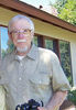
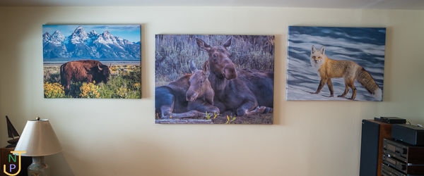
Here is a shot of my office wall and a couple of the images I have used for the very large canvas prints - on soft wildlife shot and one abstract shot of a gumbo limbo tree.
Sorry the images themselves would not attach.
Dec 1, 2016 12:26:54 #
In-lightened wrote:
Would you post some of this work? And share the links to the printers?
Thanks!
Thanks!
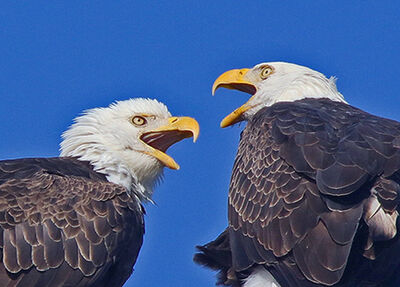
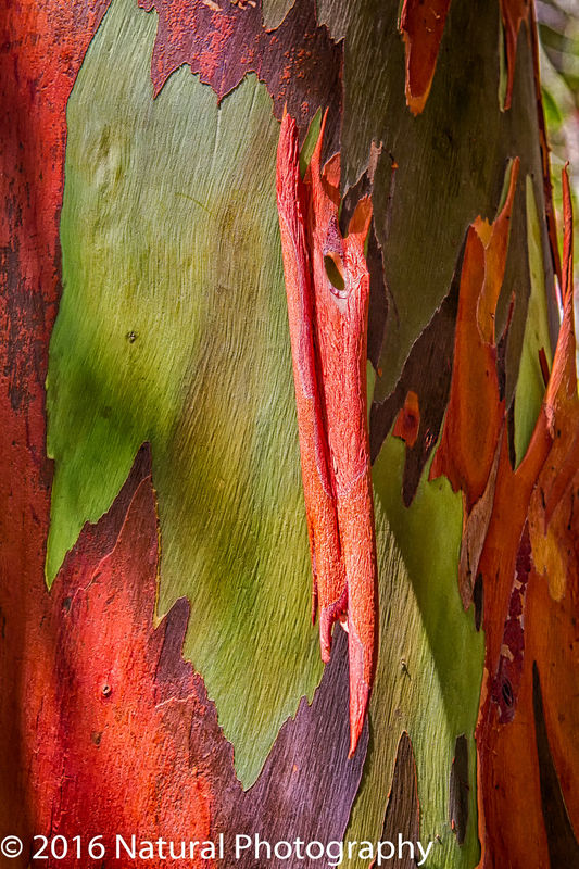
Several sites will print on canvas. Attached is an example of an image printed by CanvasDiscount.com
If you want to reply, then register here. Registration is free and your account is created instantly, so you can post right away.