Portrait compositing- Fine Art Edits
Oct 23, 2016 11:55:01 #

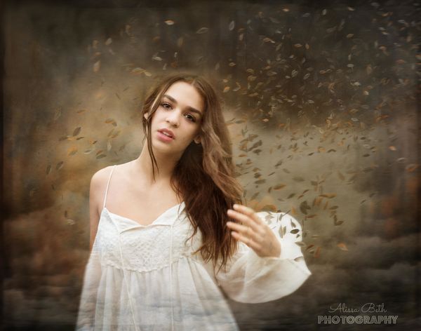
I have been continually learning and growing. I just did a shoot with one of my favorite "models' with the hope of learning to create some more etheral, fine art type photoart. My favorite influences are Jessica Drossin and Brooke Shaden. I am nowhere near their level, but it is good to have goals and a way to try to express myself.
I know this won't be everyone's favorite as it is a particular style and not straight photography. However, I wanted to share a few that I am working on.
I know this won't be everyone's favorite as it is a particular style and not straight photography. However, I wanted to share a few that I am working on.


Oct 23, 2016 11:59:47 #

Wow, these are beautiful, but the last one is my definite favorite! Well done!
Oct 23, 2016 12:01:32 #

Oct 23, 2016 12:09:31 #

All 3 are particularly beautiful images. Excellent work and a beautiful model!
Oct 23, 2016 12:52:27 #
Thank you! That was the first one that I did in this series. I am usually all about high contrast and bold color, so in this one I decided to try out a more desaturated look to change the feel of the work. Glad you like it. THanks for the feedback.
Coolcameragirl wrote:
Wow, these are beautiful, but the last one is my definite favorite! Well done!
Oct 23, 2016 12:52:48 #
THank you so very much!
Bushpilot wrote:
All 3 are particularly beautiful images. Excellent work and a beautiful model!
Oct 23, 2016 12:53:26 #
Thank you so much! Yes, can you believe she is only 14 years old! Crazy right!! I am lucky, she is my very close friends daughter.
Wahawk wrote:
Very nice set! I especially like 1 & 3. Very beautiful model and excellent work!
Oct 23, 2016 13:28:25 #
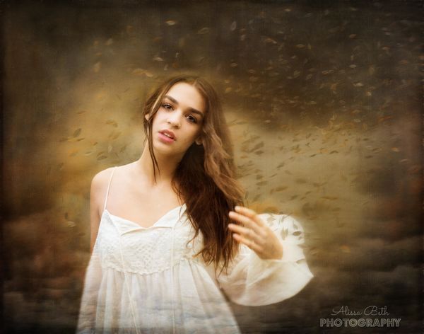
I decided to blend the leaves in a bit more in this photo and change the edit slightly via some constructive suggestions on Facebook. I think I like this version better now.
Oct 23, 2016 13:32:19 #

These are great. I would agree with the trek to the leaves to make them a bit less prominent. My only comment would be that I think if you ould warm up her face in #3 to match #2 it would help. That one is a bit cool (blue) and I think a warmer tone would be better.
Oct 23, 2016 13:36:52 #
Thanks! Does she look a little vampire-ish in that one? I was kinda playing around with that idea..sort of a dark feel. Now that I am looking I see that if I am going to go for the less warm look on her face, I should also desaturate her body a bit more too...hmm. But I will warm it up a little just to see how it looks too. I am really glad you like them though. Hope all is well with you! :)
CaptainC wrote:
These are great. I would agree with the trek to the leaves to make them a bit less prominent. My only comment would be that I think if you ould warm up her face in #3 to match #2 it would help. That one is a bit cool (blue) and I think a warmer tone would be better.
Oct 23, 2016 14:10:49 #

I'm not sure where you are learning your processing of this type. But it is certainly a worthy endeavor. I too would love to learn how to process in this fashion.
Really beautiful work.
Really beautiful work.
Oct 23, 2016 14:17:13 #
Thank you! I am learning from a number of places. I watch youtube videos had subscribed to Photographer's Unleashed where she posts many videos on compositing. I have also been studying the art of the artists that I admire the most and have even been lucky enough to find some of their processing on youtube (brooke shaden, ellen mcdermott). In addition, I have been taking painting classes to help me to understand color and art better. Lastly, It is such a learning process where I am just starting to learn how to blend my ideas and create them in photoshop.
ptcanon3ti wrote:
I'm not sure where you are learning your processing of this type. But it is certainly a worthy endeavor. I too would love to learn how to process in this fashion.
Really beautiful work.
Really beautiful work.
Oct 23, 2016 22:57:06 #
Excellent set.
Here's what I would do.
Remove the leaf from the hair in one. It's a focus mismatch with your depth
Remove the leaves from the arm in two.
Remove the leaves from hair in three.
It is common practice to help tie a composite background to the foreground by putting something in front of your subject. Leaves are very hard to do this technique.
I like the soft tone and am particularly fond of the color pallete and tone to complement your models expression . I do agree with the coolness differnce that Cliff mentioned. Although I do think this image might be better using an alternate tone. Expression and tone go together like bacon and eggs. Softer toned images like the ones here go really well with more serious or unusual expression.
Really liked looking at these images.
You did very well here.
Oct 23, 2016 23:06:52 #
Thank you for giving me some excellent advice and feedback. It is most appreciated. When you were referring to the third one I do agree with the coolness differnce that Cliff mentioned. Although I do think this image might be better using an alternate tone."- did you mean that I should try a warmer tone on her face or keep it cool? That was the first one in the series and everytime I look back on it now I feel like it is not quite as polished as the other two and I want to go back and work on it. I will try taking out the leaves that you suggested too.
Thanks!
I think back to a few years ago when I posted my first portraits and they were of a kid against a red tree in the background and I thought I did such a great job putting him there! You pointed out one of the most important things to me, keeping the background less distracting and you also taught me to think about the color palate. I have been taking painting classes and trying to study up on those artists that I admire, so I am feeling pretty proud of these as I could never have done them a few years ago. But the process is daunting and I feel like I have SOOO much to learn. Baby steps.. I know :) Therefore, your help is always appreciated...Cliffs too! :)
PalePictures wrote:
Excellent set. br Here's what I would do. br Remov... (show quote)
Oct 23, 2016 23:42:31 #
When you get into color tone it's more than just light and more than just coolness. Lisa Holloway and Jessica Drossin tones are quite similar. Warm soft tones. Jessica sells action packs.(i won them in a contest at viewbug that she was the judge) that give images her feel. Karina Kiel on 500 picks uses warm soft earth tones that are more contrasty but complements her images well. Scott black takes artistic use of color to the next level. The third image is a great shot to experiment with your processing to break out of the box of the other two. I would suggest you play with yellowish tones and applying them in a new yet undiscovered way in Photoshop.. One way might be by taking an average color of one of your images (you can do that in Photoshop) shifting the color slightly and cycling through the blend modes at varying opacity. You can also break down Jessica's actions (if you have them) Joey L has a few excellent videos on using curves with color to give a cinematic feel. Color(aka tone) and expression is typically the last two things to master as a portrait photographer. Having them complement each other is the final step in developing a recognizable style.
When doing processing it's almost always better to do a hundred small things than a few big ones. This even applies to color. That's how Jessica can sell her actions. You can use combinations of different plugins to help you get to a style that will be uniquely yours.
When I started my black and white journey I started with silver EFEX. I just couldn't get to where I wanted to be using a plugin. My point is that you are at a level with your photography that just needs PS edits to get you there. Your expressions of the models are spot on.
Now I've got to go back and read to make sure I actually answered your question!
If you want to reply, then register here. Registration is free and your account is created instantly, so you can post right away.