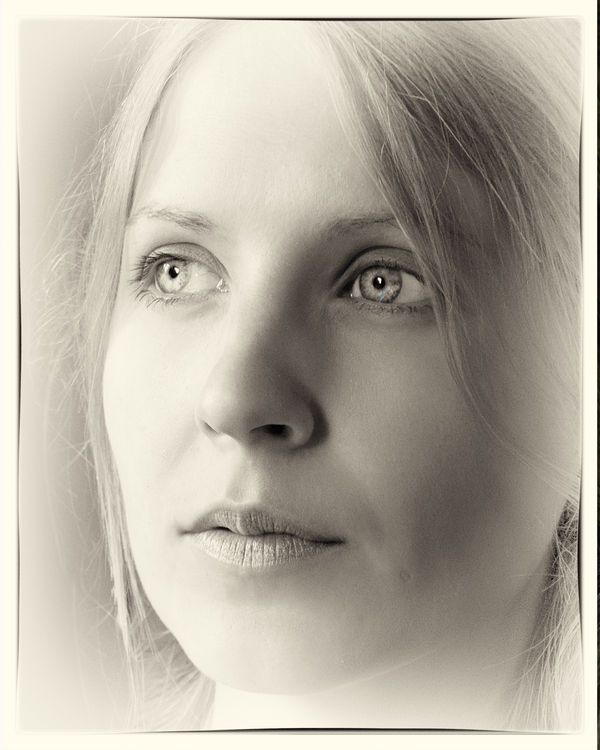
My Daughter in law
Nov 2, 2015 11:28:56 #

I do not normally do portraits, but was pleased with this one... Any critique welcome..
Nov 2, 2015 11:37:27 #

Nov 2, 2015 11:41:23 #

nanaval wrote:
I do not normally do portraits, but was pleased with this one... Any critique welcome..
I am not a fan of vignetting but I still like it
Nov 2, 2015 11:44:11 #

:thumbup: :thumbup: :thumbup: Pretty subject and the photography is not bad either. Just kidding it looks great to these untrained eyes.
Nov 2, 2015 11:46:46 #

Nov 2, 2015 12:03:27 #

Nov 2, 2015 12:05:06 #

nanaval wrote:
I do not normally do portraits, but was pleased with this one... Any critique welcome..
Nice high-key. Framing ever so slightly too tight. I'd like to see the top of her head and both sides. But good exposure in any case. Looks like a good "B&W film" image.
Nov 2, 2015 12:24:33 #

I like it, especially the "soft" tone of it. The one critique I offer is for her eyes. Lightening them up with some clarity added is nice, but it appears a bit too much increased exposure was added here. Her eyes appear almost too pale, and in the process, lost some definition in clarity. Also, there's a remnant of a blue streak in her left eye. Otherwise, I say well done. I dig it.
Nov 2, 2015 12:35:16 #

I really like this one, especially the close crop, the softness, and the detail in the eyes with those nice catchlights. Displaying this as a monochrome is a definite plus.
Nov 2, 2015 12:39:51 #

Nov 2, 2015 12:41:03 #

Nov 2, 2015 12:42:08 #

nanaval wrote:
I do not normally do portraits, but was pleased with this one... Any critique welcome..
On the assumption that you are sincere in wanting critique:
It is a great shot, pensive, lot's of emotional depth. All my comments are what I would do differently, but it is your photograph.
-I would use less vignetting, especially on the shadowed right (her left). It is fine on her right.
-There are two lights visible in the right eye. This is confusing to the viewer. Catchlights are an emulation of the sun. The catchlight on the left eye is a bit too centered. Both of these are unnatural. The model for using catchlights is the sun. Only one of these in our planetary system. LOL
-I would have let her chin print, but I would also have kept the top of her head.
This is a great example of split lighting. Aside from the catchlights it is almost perfectly executed.
YMMV
Nov 2, 2015 12:44:59 #

nanaval wrote:
I do not normally do portraits, but was pleased with this one... Any critique welcome..
Very nicely done. You have the eyes tack sharp and that is always a key to face portraits. As for composition that is up to you. I think the lighting may have produced a bit of flatness to the over all image but based on what you have done I would suggest you keep doing more portraits as you are starting off very well.
Nov 2, 2015 12:55:35 #

Nov 2, 2015 15:44:46 #

nanaval wrote:
I do not normally do portraits, but was pleased with this one... Any critique welcome..
Beautiful! Nice job!!!
If you want to reply, then register here. Registration is free and your account is created instantly, so you can post right away.