Circa 1865 Buildings and Walls
Jun 28, 2015 09:12:22 #

Best viewed in download.
Comments welcomed!
Comments welcomed!
Jun 28, 2015 09:14:09 #
Snap Shot wrote:
Best viewed in download.
Comments welcomed!
Comments welcomed!
I like those squiggly lines.
Jun 28, 2015 09:19:57 #
Jun 28, 2015 09:34:34 #

Snap Shot wrote:
Best viewed in download.
Comments welcomed!
Comments welcomed!
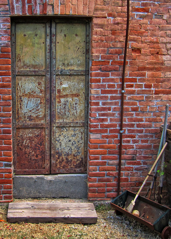
#2: I love the texture you achieved in this shot. Love the lines, colors, and light. But mostly the texture. That's what really caught my attention. I like the story that I can imagine. A shuttered window with the sweeping remnants of what had been there.
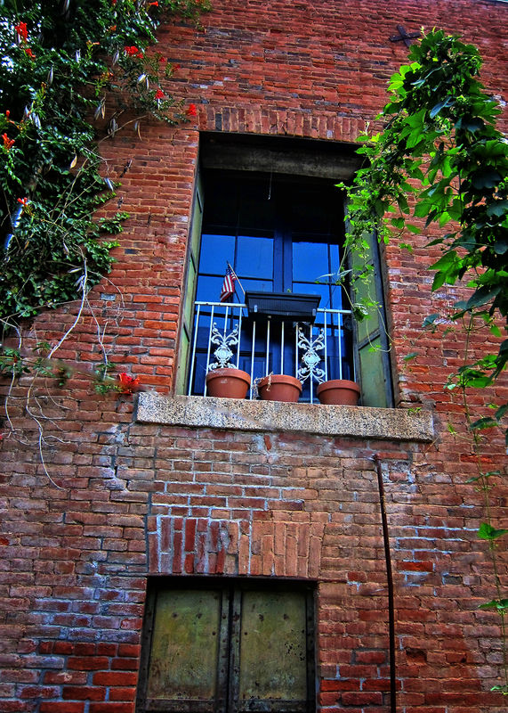
#3: Having seen #2, I don't think the addition of the upstairs windows adds to the photo. If you wanted a contrast, I would have cut the extraneous parts of the photo to concentrate just on the windows. If you wanted to capture the beautiful vines and contrast them to the empty pots, I would have cut the bottom window. What is eye-catching to me is that the vine on the right side of the photo looks 3-D - amazing!!!
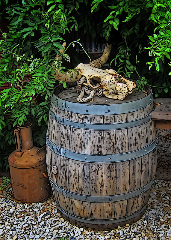
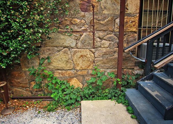
#5: Oh my, but the texture of that wall is something to behold!!!! Again, I also love the colors, the light, the lines. I don't know why you have the stuff on the ground on the left side of the photo. I don't think it's strong enough to be part of the frame. And, since we (i.e., I) don't know what the metal thing is since it's not shown completely, it's a distraction to me. I would have cut it out and some of the vine on the left, using the vine as a frame and keeping the center of attention on the wall and the "architecture" of the other objects in the photo. Despite all the above, I love this photo!!!!
Jun 28, 2015 09:37:09 #
Snap Shot wrote:
Best viewed in download.
Comments welcomed!
Comments welcomed!
Didn't see #6 before. Sorry.
It's perfect! Love your eye and your pp!!
Jun 28, 2015 09:45:41 #

Edie, that metal thing is an ashtray.
ediesaul wrote:
#2: I love the texture you achieved in this shot.... (show quote)
Jun 28, 2015 09:46:26 #
Jun 28, 2015 09:50:19 #
Thanks so much for your critique! You've given me much to absorb and I really appreciate your time and effort in helping me make better compositions.
I'm redoing several photos as per your suggestions and agree 100%!
I just didn't think through the p.p. a much as I should have.
Thank you so much!!!
I'm redoing several photos as per your suggestions and agree 100%!
I just didn't think through the p.p. a much as I should have.
Thank you so much!!!
Jun 28, 2015 09:51:32 #
Jun 28, 2015 22:45:04 #

Jun 29, 2015 00:32:01 #
rlaugh wrote:
Fine set, love the simplicity of #2!
Thanks Bob! This was a great place for photos!
Jun 29, 2015 18:40:27 #

Jun 29, 2015 19:47:32 #
DickC wrote:
Love the rusty doors in #2!! :D :D
Thanks for commenting Dick! It was a place filled with great shots!
If you want to reply, then register here. Registration is free and your account is created instantly, so you can post right away.