new photographer who loves the outdoors
Apr 2, 2012 14:39:20 #

Apr 2, 2012 22:28:59 #

Hi Lewis.
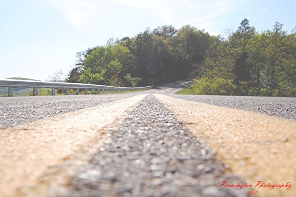
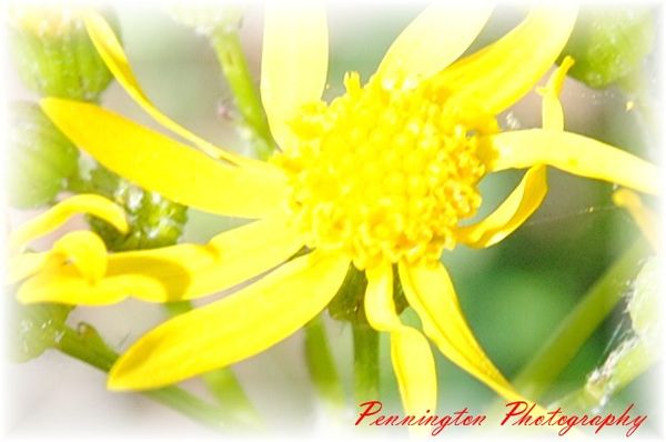
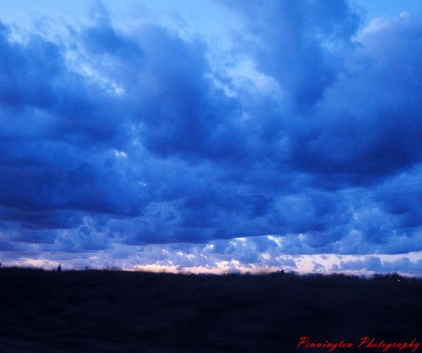
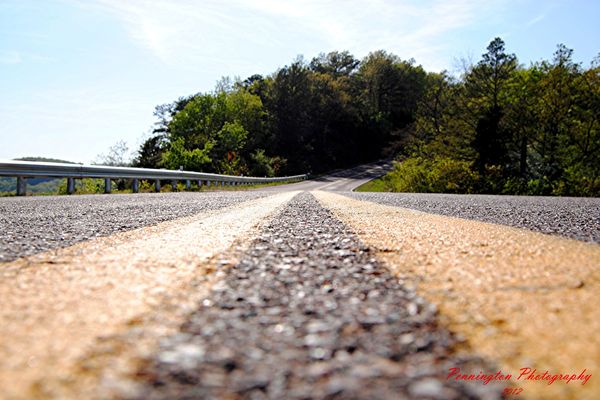
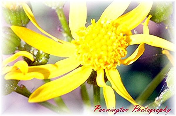
Welcome to the site! Love the first one. Needs a little more contrast and some sturation to boost the clors. The second one is over exposed, and the focus looks soft. 3 is very nice. Love the clouds and the look you got.
This site moves real fast. Some of your post will get lost in the hurd. But keep showing us your stuff! The folks here are a great bunch!!
Erv
Apr 2, 2012 23:28:05 #
thank you for the advise, i really do mean it. yea been looking at this site for awhile and been listing to all the great ideas on here.
Apr 3, 2012 07:17:46 #
Welcome to the forum, Lewis.
I think the first is a little over exposed as well. Might be improved by darkening everything a tiny bit, and also what Erv said.
2nd one way over exposed to the point the center of the flower is blown out.
Like the color of the 3rd - is that from setting the white balance wrong or from post processing? Good effect!
Apr 3, 2012 11:21:09 #
lewis p wrote:
i was needing some in put on a few pics that i have taken any comments will do
:mrgreen: Welcome
Apr 3, 2012 21:46:09 #

Apr 3, 2012 22:57:16 #
thank you i agreed with evr i went back and did some changes on my comp. and it really made a difference.oh and the 3 pic was off set on the balance. was just kinda of messing around with some new soft ware it got.
Apr 4, 2012 06:27:46 #
Apr 4, 2012 06:53:12 #

Apr 4, 2012 19:47:55 #
Apr 4, 2012 19:48:56 #
Apr 4, 2012 20:15:34 #

Welcome.
I like the second posting of the first picture. It shows good texture and leads your eyes somewhere.
I like the second posting of the first picture. It shows good texture and leads your eyes somewhere.
If you want to reply, then register here. Registration is free and your account is created instantly, so you can post right away.