Check out People Photography section of our forum.
Help with color photo
Jan 29, 2015 09:50:14 #
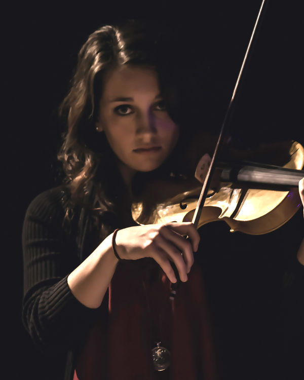
I've been having trouble determining good vs bad when it comes to color. I realize this is somewhat a personal choice but don't know what is good and what is not. I've been working on photos for our church musicians. Could you tell me which of these is better and why?


Jan 29, 2015 09:53:44 #

Jan 29, 2015 09:53:58 #

countrygirl146 wrote:
I've been having trouble determining good vs bad when it comes to color. I realize this is somewhat a personal choice but don't know what is good and what is not. I've been working on photos for our church musicians. Could you tell me which of these is better and why?
Top one is better in my opinion , the bottom one is way to yellow...
Check out Astronomical Photography Forum section of our forum.
Jan 29, 2015 10:00:36 #
Jan 29, 2015 10:11:48 #

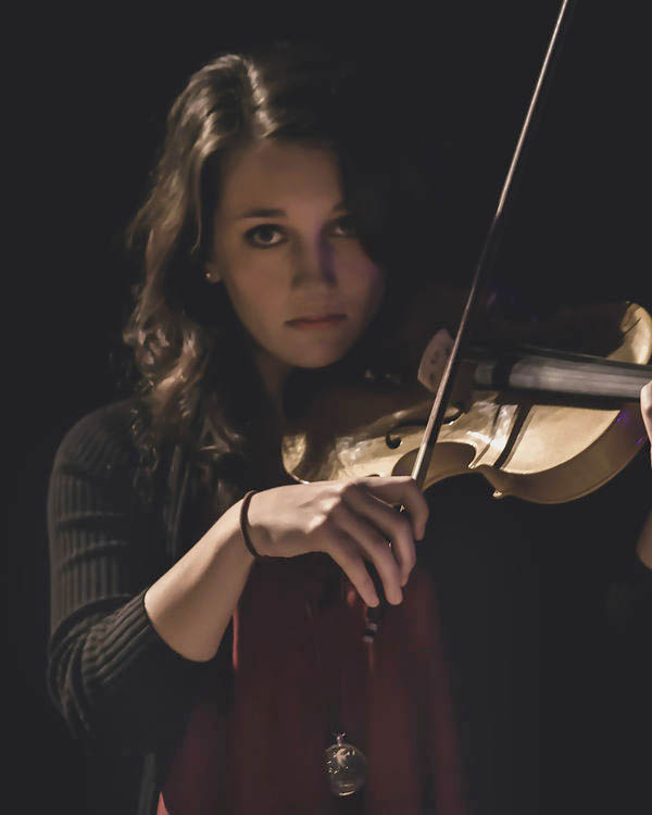
I'm new to photography as well but looking at the two pics I would pick the second one (bottom) as the better one color-wise because the photogragh brings out the natural beauty of the wood finish. I'm a fiddle player myself. :D
Jan 29, 2015 10:18:24 #
That's my problem, I think so too. I am going to have it put on canvas for her. The ambient light was in the way because they were in concert. Thank you all for weighing in. I need a class on color!
Jan 29, 2015 10:28:10 #

I am guessing that you trying to focus on the violin and not the girl - is that a correct assumption?
Check out Printers and Color Printing Forum section of our forum.
Jan 29, 2015 12:58:55 #

I share Shellback's concern. What is you subject. Normally it would be the girl but here you emphasize the violin. I like the redo best because the girl is better exposed but the violin exposure is better in the first image.
Shellback wrote:
I am guessing that you trying to focus on the violin and not the girl - is that a correct assumption?
Jan 29, 2015 14:33:11 #
Jan 29, 2015 14:40:07 #
Countrygirl:
Notice that the red tinge in the right cheek is modified.
Also see that the highlight in the arm and the violin
has not been washed out. The lip line has a touch
more color and the reflective highlight under her nose
has be taken care of. One of my clients was a state symphony
orchestra for eighteen years. You are on the right
track.
Jan 29, 2015 14:57:05 #
lporrel
Loc: California
I dislike the color in both samples. In both, the subject's face is red, and in the second, she has the same skin tone as cartoon depictions of Satan. On the color of the violin, they generally aren't tan/yellow, and the fingerboards are generally ebony. So, I suspect that the color is not being represented in a way that is even close to reality.
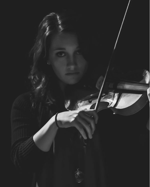
I like the composition and what you were doing with the light, and it might work really well as a high contrast black and white.
I like the composition and what you were doing with the light, and it might work really well as a high contrast black and white.
Check out Street Photography section of our forum.
Jan 29, 2015 15:09:29 #
lporrel
Loc: California
I'm working with The Gimp, and I'm not an expert, so what I am able to do is very limited. But, here is the idea: Low Key and High Key (sort of).
lporrel wrote:
I dislike the color in both samples. In both, the subject's face is red, and in the second, she has the same skin tone as cartoon depictions of Satan. On the color of the violin, they generally aren't tan/yellow, and the fingerboards are generally ebony. So, I suspect that the color is not being represented in a way that is even close to reality.
I like the composition and what you were doing with the light, and it might work really well as a high contrast black and white.
I like the composition and what you were doing with the light, and it might work really well as a high contrast black and white.

Jan 29, 2015 22:04:20 #

[quote=countrygirl146]I've been having trouble determining good vs bad when it comes to color. I realize this is somewhat a personal choice but don't know what is good and what is not. I've been working on photos for our church musicians. Could you tell me which of these is better and why?
I love the first. I am a fan of the softer look when it comes to people. The picture is very captivating to me and shows emotion. I love the way the lighting draws you to her wrist and fiddle.
I love the first. I am a fan of the softer look when it comes to people. The picture is very captivating to me and shows emotion. I love the way the lighting draws you to her wrist and fiddle.
Jan 30, 2015 13:57:55 #
Thanks. I have a friend who likes everything in black and white so I did do it that way but was trying for a different look. I have others.
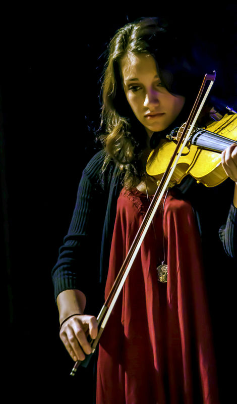
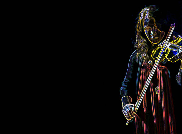
What do you think about this? Too much color? Bad crop? Should it be black/white?
What do you think about this? Too much color? Bad crop? Should it be black/white?
I'm not going for a portrait look with this; more like art. Hard to describe. Color doesn't look the same on the site as in my monitor either but I don't know what to do to fix that.
Jan 30, 2015 14:54:54 #
Countrygirl:
There is photography and then there is the end use that you would like to accomplish with the image. "Art" is very broad subject and it is subjective as to what works and what doesn't. In my experience with art directors and graphic artists I have found they are influenced by what they consider how the photograph should be used. To get a clearer understanding of how they think images should be take a look at this site.
http://www.graphis.com/store/magazines/
This image shows how they can convert what you saw into something very different.
If you want to reply, then register here. Registration is free and your account is created instantly, so you can post right away.
Check out The Pampered Pets Corner section of our forum.