Practicing Black and White.
Sep 17, 2014 21:55:34 #
ebrunner wrote:
Thank you. I really like the third one with the sepia. The first two were really experimental and I was putting them up just to see what people thought. I think I missed the boat with those two. Don't know unless you try. Thanks.
It was different with film to talk about a "keeper" rate.
My particular opinion is that with the advent of digital, one is doing very well when the keeper rate exceeds 10%. You're 1 for 3 on this set, which I call PDG (purty darn gud!) 33%!
;)
Sep 18, 2014 05:19:26 #
Agreed. You have the ability to shoot far more digital images than you would in the days of film. I have been trying to cut down on the number of exposures and make the ones I do shoot count. Still I'm happy with one out of three. Thanks.
Sep 18, 2014 05:25:58 #

Check out Travel Photography - Tips and More section of our forum.
Sep 18, 2014 10:16:05 #
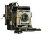
Number 3 for me too! It also adds a little humor by the way the hasp is attached making the lock a moot point. :roll:
Sep 18, 2014 10:37:17 #

I'll go with the rest; #3 is best, would like to see in B&W instead of the sepia, just to compare. :D
Sep 18, 2014 21:45:18 #
angler wrote:
Number 3 for me Erich, I love that sepia effect.
Agreed. I do like that one, and I think sepia works really well with old wood. Thanks.
Sep 18, 2014 21:46:01 #
snapshot4619 wrote:
Number 3 for me too! It also adds a little humor by the way the hasp is attached making the lock a moot point. :roll:
I did not think of that; but you are right. Good point. Thanks.
Check out Printers and Color Printing Forum section of our forum.
Sep 18, 2014 21:50:15 #
DickC wrote:
I'll go with the rest; #3 is best, would like to see in B&W instead of the sepia, just to compare. :D
I think the sepia works really well with the wood; but here is the B&W that I started with. (Well, the shot out of the camera was color and RAW)
Sep 18, 2014 21:51:41 #
sorry, that did not work. I must have left the draft in a format that the web site won't accept. I'll have to try again.
Sep 18, 2014 21:56:14 #
I really haven't study black & white but I thought B & W was supposed to be tones of gray with a simple composition of something artistic of the photographers interest?
I don't know just a thought.
I don't know just a thought.
Sep 18, 2014 22:18:52 #

The conversion you started with and let us download was to these tired ole eyes the best of the bunch. When doing an image THINK simplify, simplify. They all are good but number three is number one.
Tom
Tom
Check out Astronomical Photography Forum section of our forum.
Sep 19, 2014 09:40:04 #
ebrunner wrote:
I think the sepia works really well with the wood; but here is the B&W that I started with. (Well, the shot out of the camera was color and RAW)
I do like the sepia one but I can 'see' it in B&W, think it may be better for a contest. I've been in contests and judges like composition, contrast, and eye appeal, they view sepia, vignetting, etc. as 'dolling up', like trying to move the eye away from some irregularity. This is only my opinion, and good luck in your contest! :D
Sep 19, 2014 10:19:41 #

I like to use Silver Efex Nikon plug-in and tried to convert your original to B&W. If you do not mind I can show my result.
ebrunner wrote:
I think the sepia works really well with the wood; but here is the B&W that I started with. (Well, the shot out of the camera was color and RAW)
Sep 20, 2014 07:15:34 #
Dan L wrote:
I really haven't study black & white but I thought B & W was supposed to be tones of gray with a simple composition of something artistic of the photographers interest?
I don't know just a thought.
I don't know just a thought.
I think there are several ways of looking at this. In my local club B&W is called "mono" which means that the only color that is allowed is a color cast like sepia, cyanotone or bronze. This definition seems to be widely accepted. The third shot here only has one color cast which is uniform throughout the composition. In this case, sepia.
Sep 20, 2014 07:16:45 #
If you want to reply, then register here. Registration is free and your account is created instantly, so you can post right away.
Check out Black and White Photography section of our forum.