Light versus Dark
Mar 12, 2014 10:23:52 #
donaninc
Loc: New Jersey
I have this predisposal for light and shadows.
Am I over compensating in post processing for these pics or is my eye for for taking an ok pic and processing to extreme. Please review and any suggestions appreciated.
Time of day 1:00Pm, olypuus 620, 50-500 lens, pond covered in algy.
Am I over compensating in post processing for these pics or is my eye for for taking an ok pic and processing to extreme. Please review and any suggestions appreciated.
Time of day 1:00Pm, olypuus 620, 50-500 lens, pond covered in algy.
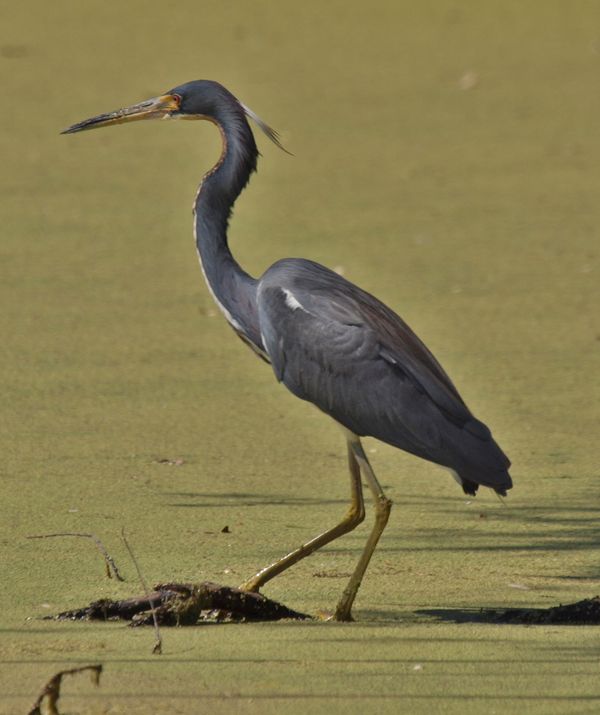
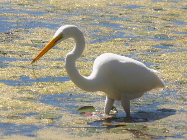
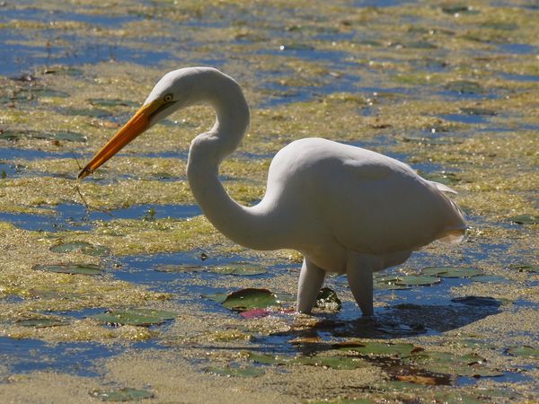
Original
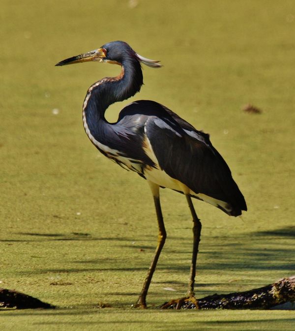
Processed
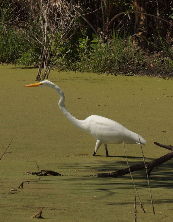
Original
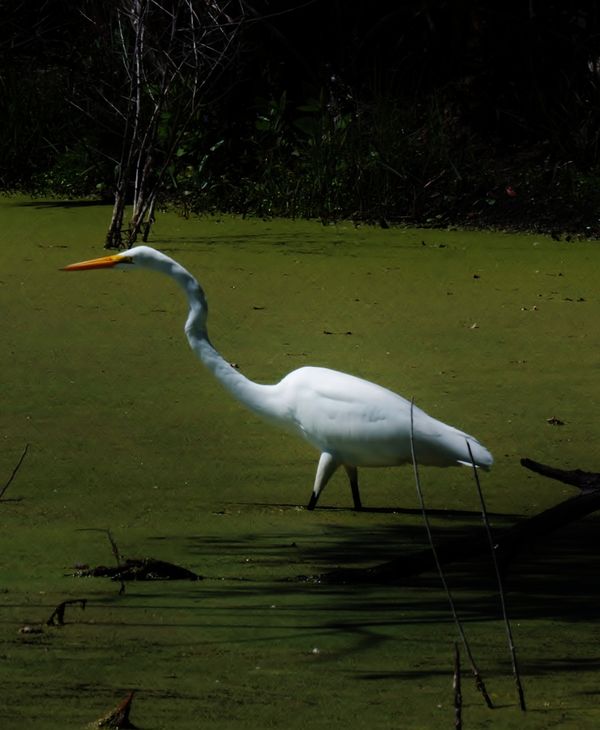
Processed
Original
Processed
Mar 12, 2014 13:43:09 #

I think you will find that the beauty is in the eye of beholder. For the most part I think the top one is a little to far, and the bottom one is right one. I am saying this because top one the algae looks off color, like sand. The bottom one the color seems more natural looking at the lily pad.
Mar 12, 2014 14:51:07 #
As Bill Houghton pointed out, how much contrast and saturation you want is an artistic choice. You have to decide what features you want to bring out, be it vibrancy, texture, softness or naturalism. I often turn to localized editing to amplify some features and subdue others. Another factor to take into consideration: how does it look in print? Some things don't translate quite perfectly from monitor to print. I often find myself boosting the contrast on images just a little to make the print express the look I want.
Mar 12, 2014 16:25:48 #
donaninc
Loc: New Jersey
Thank you for your comments. Sometimes i get these visions of the final result. I never thought of the minor differences that might show up in print. do you think the second picture is overdone? As I review after your helpful words I am torn between yes and no.
Mar 12, 2014 19:07:39 #
The first photo does not match the first, they might be taken on or about the first time. But they different.
The processed bird in the second is good, the back ground is seems out of place in that it should be greener (the algae that is).
The seond set the processed seems to be a little over done on the contrast as shown. The last set appears to fine.
Rook2c4, was saying that you monitor might not match your computer, and how it prints out also effect the PP you have done. A lot folks use a system to calibrate the monitor to the printer. Not knowing what the actual output would be would also play part in your present PP work.
Mar 12, 2014 20:26:27 #
donaninc
Loc: New Jersey
Thanks for your comments. The second set I am trying to highlight the Egrets neck hinges. I want to show how he strikes. I could not manipulate enough to totally achieve my thoughts. I am learning Lightroom will I have better controls?
Mar 12, 2014 20:27:10 #
donaninc
Loc: New Jersey
Bill Houghton wrote:
The first photo does not match the first, they mig... (show quote)
Thanks for your comments. The second set I am trying to highlight the Egrets neck hinges. I want to show how he strikes. I could not manipulate enough to totally achieve my thoughts. I am learning Lightroom will I have better controls?
Mar 12, 2014 20:35:26 #
Light Room is on the best for what your trying to achieve. Keep it up.
Mar 13, 2014 08:13:10 #

donaninc wrote:
I have this predisposal for light and shadows.
Am I over compensating in post processing for these pics or is my eye for for taking an ok pic and processing to extreme. Please review and any suggestions appreciated.
Time of day 1:00Pm, olypuus 620, 50-500 lens, pond covered in algy.
Am I over compensating in post processing for these pics or is my eye for for taking an ok pic and processing to extreme. Please review and any suggestions appreciated.
Time of day 1:00Pm, olypuus 620, 50-500 lens, pond covered in algy.
to my eye, each is over processed...
Mar 13, 2014 09:04:17 #
donaninc
Loc: New Jersey
hb3 wrote:
to my eye, each is over processed...
Thank you for your comments. After listening to all of the responders I tend to agree. I have to condition my mind to avoid the extremes, its not going to be easy. But comments from all of you will help. Thanks again
If you want to reply, then register here. Registration is free and your account is created instantly, so you can post right away.