B&W or Color
Dec 14, 2013 05:55:19 #

Lovely model who is no worse for wear in color or B&W. I think you are asking the wrong question, though. For me, it's 'front light or side light?' The cheek bones and blouse have too much glare which distracts from the beauty of your shot. Just my opinion, but I think a different choice of lighting scheme would bring out the wow factor.
Dec 14, 2013 06:02:21 #

Dec 14, 2013 06:58:58 #
Dec 14, 2013 07:30:52 #

Great shot but the shine is distracting.... but is the worse word in the English language.... However it is well posed, light is good and I would give it an award rating at the CClub.
B&W is not just a conversion, rather it is an art form. Topaz B&W2 opens up a whole new world for you. Download a 30 day copy and find that new world.
B&W is not just a conversion, rather it is an art form. Topaz B&W2 opens up a whole new world for you. Download a 30 day copy and find that new world.
Dec 14, 2013 10:10:14 #
Dec 14, 2013 18:12:06 #

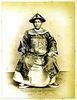
The B&W almost has a 3D look to it, it's got my vote---
Great photo by the way......
Great photo by the way......
Dec 14, 2013 19:32:49 #

I like the color better. The shine on her blouse in the black & white is too blown out.
Dec 14, 2013 19:34:10 #

Dec 14, 2013 22:39:55 #

dirty dave wrote:
Want to present one to some possible clients just can't pick.
Both fine shots. Hard for me to chose. I like color but B&W is probably more dramatic. :thumbup: :thumbup:
Dec 14, 2013 23:08:10 #

I think the b/w handles the contrast much better than does the color. The blown out areas work in b/w but don't (IMO) work so good in color.
Dec 23, 2013 08:13:41 #
Depends who your client is and what he/she would want it for. Why restrict your offering to only 1 image? Both are good. I would reduce the shine on the face, chest and dress first though.
If you want to reply, then register here. Registration is free and your account is created instantly, so you can post right away.