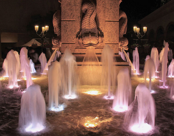
The fountain
Nov 26, 2013 02:20:05 #

At the Newport Beach Fashion Island Shopping Center I had an opportunity to photograph a fountian. Up for critique.

Nov 26, 2013 08:07:56 #

Brent, I like the colours in this image, very much. The soft browns-yellows-oranges, beautiful.
But it also leaves me wondering what the focal point of the image is:
If it is the water spouts, I would like to see a bit more space on either side and the bottom of the picture, so that they are not cut off or squeezed.
If it is the monument in the centre of the fountain, I think a portrait-orientation showing the entire monument with some of the fountain, would have done it more justice.
The lights behind the subject are far enough away and therefore faint enough that they don't seem to disturb although a different composition could change that.
Hard to tell distance, but I also wonder if you were close enough to the monument to be able to use a fill-flash and not have the very heavy shadow across the "nose-eyes-forehead" of the water-spewing fish?
In short: I really like the colouring, it is the composition I have a problem with!
EstherP
Nov 26, 2013 11:29:45 #

May we show your our edits (with notes on changes)? Or would you like our comments alone?
Nov 26, 2013 12:44:55 #
Bob Yankle wrote:
May we show your our edits (with notes on changes)? Or would you like our comments alone?
I give you my permission to do whatever you would like to do. And thank you for taking the time and effort to do this Bob.
Nov 26, 2013 13:06:26 #
EstherP wrote:
Brent, I like the colours in this image, very much... (show quote)
Thank you Esther for all the time and effort and thought that you have put into this image. To me, the focal point is the fish sculpture in the back middle. I cut off the edges because there were signs and other un-interesting things that I didn't want in the photo.......and didn't want to clone them out.
The entire monument is very high and would not be appropriate to show the entire thing. I know you didn't know the details but I am explaining just why I did it the way I did.
Nov 26, 2013 13:43:18 #
BrentHarder wrote:
I give you my permission to do whatever you would like to do. And thank you for taking the time and effort to do this Bob.
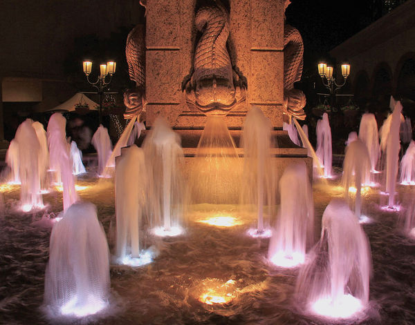
Brent, I played with the White Balance to put a bit more white into the water sprays, desaturated the colors somewhat so as to take off the hard glare of the lighting, put some more details into the shadow areas, lightened the dragons eyes a bit, cloned out little spots of light in the background, and shaved a little bit off the edges. Essentially, though, when I get done, it didn't look all that much different than the original, just a little bit more color-balanced.
Variation on the Fountain
Nov 26, 2013 14:10:18 #

A very good treatment Bob Y. Even without any pp program,other than basic,just lightening the shadows and toning down the hightlights makes the nice triangle leading to the center subject. I merely make such a suggestion but don't alter a photograph because then it is no longer my view. :) As for color,your choice certainly.
Nov 26, 2013 22:22:25 #
Bob Yankle wrote:
Brent, I played with the White Balance to put a bit more white into the water sprays, desaturated the colors somewhat so as to take off the hard glare of the lighting, put some more details into the shadow areas, lightened the dragons eyes a bit, cloned out little spots of light in the background, and shaved a little bit off the edges. Essentially, though, when I get done, it didn't look all that much different than the original, just a little bit more color-balanced.
Bob, I like how you cloned out the unwanted lights in the background. I also like how you lightened up the shadow on the fish and enhanced the water so you can see the ripples better. In my opinion, I like the colors of the original better....they seem more rich and deep.
Thanks for working on the photo!
Nov 26, 2013 22:53:19 #
As I came back to computer hours later and it went ping!
showing there was a response to this thread and read it,I as wondering ...what background lights ? I really like the picture just as you showed it,outdoors and large,and the background lights are neither large nor bright. Wouldn't
it be okay to leave them for placing the scene large and outside? Gone, and we get that black velvet background look...it just sort of loses a sense of scale?
Nov 26, 2013 23:36:03 #
BrentHarder wrote:
Bob, I like how you cloned out the unwanted lights in the background. I also like how you lightened up the shadow on the fish and enhanced the water so you can see the ripples better. In my opinion, I like the colors of the original better....they seem more rich and deep.
Thanks for working on the photo!
Thanks for working on the photo!
Brent, here's a slight modification to my original submission - saturation up, light levels down (but oh, so subtlely). Restores some, if not all, the richness of your original.
Variant 2 on The fountain
Nov 26, 2013 23:36:11 #
jenny wrote:
As I came back to computer hours later and it went ping!
showing there was a response to this thread and read it,I as wondering ...what background lights ? I really like the picture just as you showed it,outdoors and large,and the background lights are neither large nor bright. Wouldn't
it be okay to leave them for placing the scene large and outside? Gone, and we get that black velvet background look...it just sort of loses a sense of scale?
showing there was a response to this thread and read it,I as wondering ...what background lights ? I really like the picture just as you showed it,outdoors and large,and the background lights are neither large nor bright. Wouldn't
it be okay to leave them for placing the scene large and outside? Gone, and we get that black velvet background look...it just sort of loses a sense of scale?
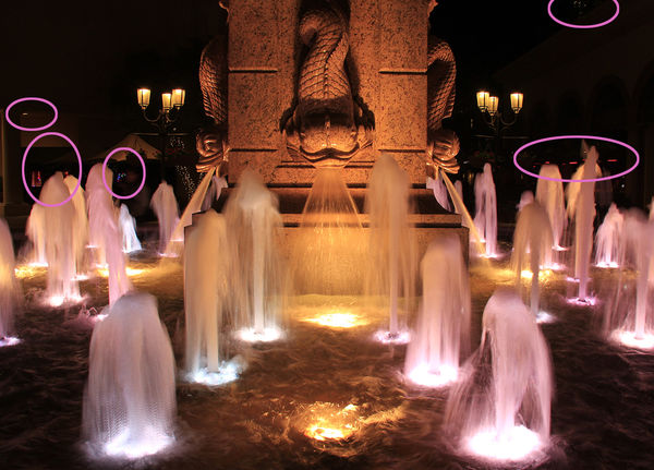
HI Jenny, I'm going to circle the background lights in pink so you can see what we are talking about.
Nov 27, 2013 00:15:30 #
yes,Brent,the very same lights. Did you think I didn't see them? Do they do anything negative by being there? Or do they help to establish it as an outdoor scene? They are definitely not bright, at least on my monitor.Maybe they are on yours though.
Nov 27, 2013 09:17:55 #

BrentHarder wrote:
At the Newport Beach Fashion Island Shopping Center I had an opportunity to photograph a fountian. Up for critique.
Normally, I am a big fan of the 'slowed-water' look, but I am not sure it works for me with a fountain... The long exposure may have been dictated by other things, but I think I would have tried to keep the water looking more 'natural', and not let it turn into 'milk'.
Nov 27, 2013 13:46:24 #

The exposure was 1/8 second, according to the EXIF data. This way, it sort of looks like a Willy Wonka cotton candy manufacturing site. Kind of stuck in the middle between catching the water in detail and that soft look of a long exposure. Did you take a series of photos at different shutter speeds? If not, it might be worth doing if you have the opportunity to go back there.
Nov 27, 2013 15:35:05 #
jenny wrote:
yes,Brent,the very same lights. Did you think I didn't see them? Do they do anything negative by being there? Or do they help to establish it as an outdoor scene? They are definitely not bright, at least on my monitor.Maybe they are on yours though.
Opps! Sorry Jenny......I thought when you said "what background lights ?" you didn't see what he was talking about, but now I see you really did, but the lights just didn't bother you. Every viewer has a different perspective of what they like and don't like.
If you want to reply, then register here. Registration is free and your account is created instantly, so you can post right away.