Check out Traditional Street and Architectural Photography section of our forum.
Please critique these 3 photos.
Dec 10, 2011 16:37:31 #

These photos will be critiqued in my photography class in Jan. and I'd love to compare your comments to theirs.
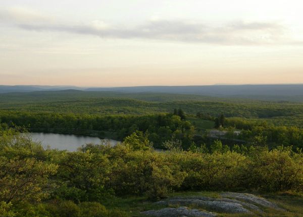
Stokes Sunset View
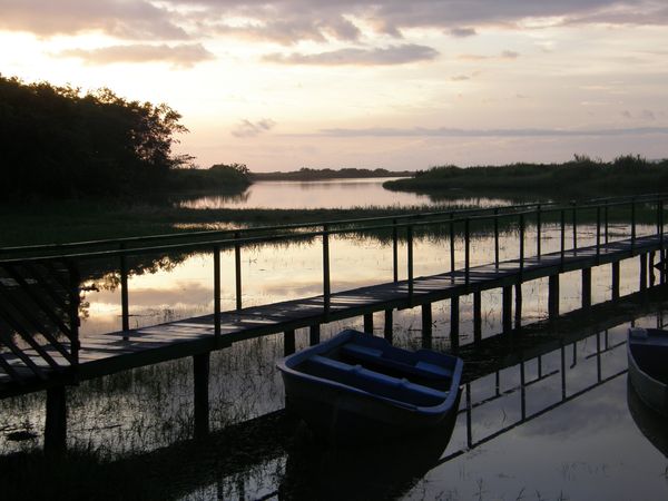
Costa Rica Dockside Sunset
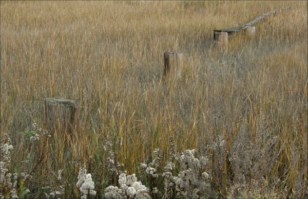
Marsh Memories
Dec 10, 2011 16:50:16 #

Dec 11, 2011 08:12:11 #

Nice shots. I think I would like to see a little more color in the sky on the first one. I like the bottom two just as they are.
Check out Landscape Photography section of our forum.
Dec 11, 2011 09:33:24 #
wildbrdr wrote:
These photos will be critiqued in my photography class in Jan. and I'd love to compare your comments to theirs.
The three have something in common, no definitive focal point. Try cropping to get away from the horizon in the middle too.
Dec 11, 2011 11:35:39 #

Dec 11, 2011 13:30:15 #
alaskanfrog
Loc: Alaska
wildbrdr wrote:
These photos will be critiqued in my photography class in Jan. and I'd love to compare your comments to theirs.
the photos are basically OK. #1, the horizon is too centered and doesn't really have a focal point. The colors are very good however. A better way for to improve this shot is to pan tilt your camera down.
An important consideration to keep in mind when doing photography, even outdoors and wilderness photography, is the use of; "The Rule of Thirds" when composing your shots.
Shot number 2 is the best of the three. The composition is far better, but the horizon is tilted upward from the left to the right. Again, the rule of thirds would apply very well here too. The sky is a bit blown out on the left side just above the trees. Setting and slowing down the shutter speed down would help overcome this. This photo would actually make a very nice, rich black and white image. Straighten and crop the photo and convert it to B&W, then play around with the gray tone.
The third photo, well there's no real place to focus on, other than the old posts sticking out of the vegetation. Lowering the camera and perhaps getting more of the wildflowers would provide a better composition, and having a horizon either of the sky, or a treeline might also improve this shot. With a bit of tweaking, sharpening the image just a bit, and adding just a tiny bit more saturation will also improve this photo by bringing out the details. Thank you for sharing.
Dec 11, 2011 15:53:31 #

In the Stokes and Dockside photos you may want to play around with gradient filters to add drama to the sky. With the Stokes you may also want to play around with some Nik filter effects to see different rendentions with the foliage. In the shadows of the trees you may want to see if there is any subtle detail there you may want to open up just a little. The Marsh photo has a nice feel to it, but you can always play around with color effects/color saturation to see what combinations you come up with. Also the dockside may have an interesting feel in b&w. Thanks for the views.
Dec 11, 2011 16:27:02 #
jfromla
Loc: Los Angeles, CA
In addition to what the others have said. I would add that one of my compositional tools that I always use is be aware of the edges. If you do this when you are composing your shot you will save yourself a lot editing time later on. Also be aware of where you eye is taking you. This is very hard in fast shooting but becomes apparent in the final shot.
Look at pic # 1. my eye goes to the row of brush in front and then jumps to the fuzzy horizon. Not a very pleasing transition.
In Pic. #2 My eye comes from the left edge, travels the dock, jumps to the brighter river and out to the horizon in a smooth transition.
In Pic #3 I like the post as a diagonal element leading the eye but the high key flowers on the bottom edge are disruptive. They are neither in nor out of the shot. The shooter has to be aware of his edges.
I will say that this is sometimes hard to do with many viewfinders that are not 100% of the shoot. This means that the Shooter has to either know his equipment or crop.
Dec 11, 2011 16:40:37 #


If you want to reply, then register here. Registration is free and your account is created instantly, so you can post right away.
Check out People Photography section of our forum.