Cocoa Beach Sunsise
Apr 20, 2013 10:18:25 #
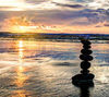
When Nature does not provide the conditions wanted, we make do. Yes I know it's overdone but I wanted the dramatic "artsy look"
Bob
Bob

Apr 20, 2013 10:25:32 #
Apr 21, 2013 05:42:23 #

Wow very impressed, I like the fact you can still see the horizon despite similar tones.... very dramatic.... I must have a go at doing some HDR photos....
Kev
Kev
Apr 21, 2013 07:02:49 #

Apr 21, 2013 10:46:03 #

Apr 21, 2013 12:34:51 #
Apr 21, 2013 13:49:10 #
Samuraiz wrote:
When Nature does not provide the conditions wanted, we make do. Yes I know it's overdone but I wanted the dramatic "artsy look"
Bob
Bob
:thumbup: :thumbup:
Apr 21, 2013 17:46:35 #

Apr 21, 2013 20:56:01 #
I think because of the (nearly) monochromatic effect you achieved a great dramatic picture. DJT
Apr 22, 2013 03:51:05 #

This is certainly a pic which has a strong impact. I like the treatment you have given it though I realise it may be pushing the boundaries for some. But despite the fact that I like it, in fact I like it a lot, there are a couple of factors which, for me don't work. HDR, no matter what style or degree of processing you use is about bringing out details that would otherwise have been lost by the camera's inability to cover a wide dynamic range. Certainly the shadows have worked well, though there are a couple of areas where the blacks seem a little crushed, but it works.. The problem is the highlights. The area underneath the pier needed to be light so that the pylons would contrast, however the light area is pure white, ie it is blown, so there are no details at all. The way to check this is drop the brightness down as low as it will go. Save the result. Then drop the brightness again and you will see that everything in the pic darkens again, but not the area under the pier. Save it and drop it further, the area under the pier doesn't change, it remains pure white. That means that either you have processed it in such a way as to lose all the detail or the original bracket of pics didn't have a shot with a sufficiently short exposure to grab the highlight details, my guess is the latter. I so wish you had been able to use the full dynamic range because some light sky details behind the pier would have transformed this into a real stunner. My other suggestion relates to your crop. The point to which the eye is lead by the clouds, the pier and the presence of the sun is just to the left of centre. All of the interest is on the left. The pic is therefore out of balance as there is little on the right to engage the eye. I would love to have seen this cropped top, bottom and the right to place sun on the right thirds intersection. Certainly this would result in a more conventional crop and sometimes convention needs to be challenged, but in this case, to my eye, it would have given a far better balance. I hope this helps.
Peter
Peter
Apr 22, 2013 05:31:31 #
My personal opinion is that the cropping is spot on, the cloud, horizon and pier provide leading lines to th centre of the pic (the sun). Sometimes its ok to break the rules, and for me this works, although I agree the light under the pier is a little blown
Well done Bob, I hope I can produce a photograph as good as this!
Kev
Well done Bob, I hope I can produce a photograph as good as this!
Kev
Apr 22, 2013 13:46:35 #
Thanks Grey Mule
Thanks Kimbee
Thanks Djtravels
Thanks Big ed
Thanks Conkerwood for your detailed analysis.
I may give the location another shot this Thursday for a full moon photo (weather permitting)
Thanks Kimbee
Thanks Djtravels
Thanks Big ed
Thanks Conkerwood for your detailed analysis.
I may give the location another shot this Thursday for a full moon photo (weather permitting)
Apr 23, 2013 19:51:40 #

If you want to reply, then register here. Registration is free and your account is created instantly, so you can post right away.