Which do you like?
Mar 28, 2024 17:53:37 #
#1 is my choice, but I'd suggest making the "photography" a slightly larger font, so the business does not get lost with your name. The camera in #1 stands out without dwarfing all the text.
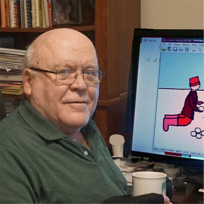
But one fact I sho9uld ask for before even posting which one I like is how you were going to be using this logo. That can make a significant difference. Here is an image of my business card and the logo for my new publishing company for the books I have written. Different purposes. I definitely do not think they are the best artwork out there; they are just illustrations. --Richard
But one fact I sho9uld ask for before even posting which one I like is how you were going to be using this logo. That can make a significant difference. Here is an image of my business card and the logo for my new publishing company for the books I have written. Different purposes. I definitely do not think they are the best artwork out there; they are just illustrations. --Richard
Mar 28, 2024 18:57:31 #
WAstinkbug
Loc: Silverdale, WA, U.S.A.
My favorite is number 4. They are all very nice though ... great job. I think it will come down to what fits your personality and photography style the best.
Mar 28, 2024 19:32:32 #
Mar 28, 2024 20:40:32 #
Mar 28, 2024 21:40:09 #

Mar 29, 2024 00:46:01 #

profbowman wrote:
#1 is my choice, but I'd suggest making the "... (show quote)
Nice of you to include an indication of why she should ignore your opinion.
Mar 29, 2024 10:00:58 #
Mar 29, 2024 12:09:08 #
Mar 29, 2024 16:40:34 #
Photolady2014 wrote:
A photography friend of mine made these for me since I'm not much with a computer except editing.
Which do you like?
Which do you like?
I VOTE FOR #1
Mar 29, 2024 18:23:07 #
Photolady2014 wrote:
A photography friend of mine made these for me since I'm not much with a computer except editing.
Which do you like?
Which do you like?
They're all interesting but to me #2 stands out. Good luck in whatever you're planning.
RTW
Mar 29, 2024 18:42:41 #
Photolady2014 wrote:
A photography friend of mine made these for me since I'm not much with a computer except editing.
Which do you like?
Which do you like?
No. 1
Mar 30, 2024 08:26:56 #

Mar 30, 2024 11:47:16 #
Mar 30, 2024 12:41:40 #
Mar 30, 2024 13:03:22 #

If you want to reply, then register here. Registration is free and your account is created instantly, so you can post right away.