Which do you like?
Mar 25, 2024 20:11:51 #
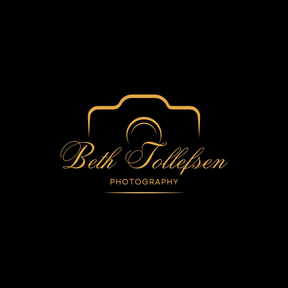
A photography friend of mine made these for me since I'm not much with a computer except editing.
Which do you like?
Which do you like?
Mar 25, 2024 20:15:37 #

Mar 25, 2024 20:29:13 #

Mar 25, 2024 20:31:43 #

Mar 25, 2024 20:36:26 #
Mar 25, 2024 20:42:21 #

Photolady2014 wrote:
A photography friend of mine made these for me since I'm not much with a computer except editing.
Which do you like?
Which do you like?
I like one and four. One stands out better with the style and color. Of course with that style a number of colors will work.
---
Mar 25, 2024 20:57:30 #

Mar 25, 2024 21:05:59 #

Mar 25, 2024 21:52:07 #
Mar 25, 2024 22:12:25 #
I like #1 over #2, but it's really a matter of projecting a formal, classy image, or more relaxed informal style of #2. If wildlife photography is your ONLY genre #3 is good too, but that locks you into that genre. Whichever one you decide, make several versions - dark/black, transparent and light/white backgrounds, especially if you haven't made a website yet. Overall my vote is for #1.
Quick post edit - I like the script in #2 better, but the camera in #1 better. Maybe sort of combine the two styles.
Quick post edit - I like the script in #2 better, but the camera in #1 better. Maybe sort of combine the two styles.
Mar 25, 2024 22:25:29 #

Mar 25, 2024 22:29:06 #
Mar 26, 2024 00:03:27 #

*Speechless*
Not quite thought.
1 - This for your own use and you ask some folks to decide for you? That makes no sense.
2 - Use the gallery or for your consideration section.
Not quite thought.
1 - This for your own use and you ask some folks to decide for you? That makes no sense.
2 - Use the gallery or for your consideration section.
Mar 26, 2024 05:32:42 #

#1 says style and quality whereas #2 - #4 say arty in different ways. You should choose whichever one you think best represents your output. I think I'd like #1 more if the camera was more easily recognisable.
Mar 26, 2024 05:33:55 #
What do you intend to use the design for?
Where will it be displayed?
How big will it be?
Why do you need a 'design'?
Whatever the answers might be I suggest you choose one, put it out of your mind for a few weeks, then return to have another look. Your initial enthusiasm might well have changed.
Don't rush into anything if there is money involved!!
If you want to reply, then register here. Registration is free and your account is created instantly, so you can post right away.