Versions
Sep 27, 2023 18:46:39 #

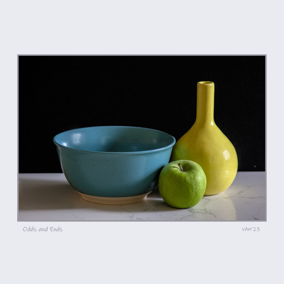
some quick fun in the kitchen with the benefit of northern window light.
Sep 27, 2023 18:47:25 #

Sep 27, 2023 18:51:50 #
Sep 27, 2023 21:04:53 #

Nice!! Simple, but nicely done! I like your choice of items; they are different but share a common shape. The fact that blue and yellow make green also tie them together nicely!
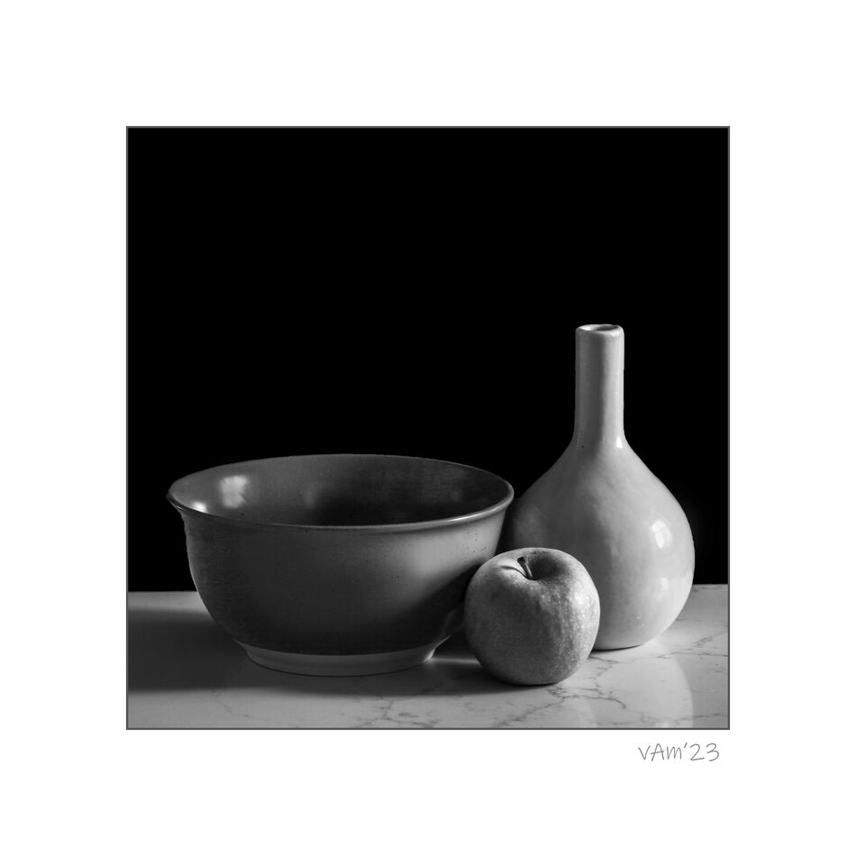
Usually, I opt for black and white but in this case I'm going to choose the color. Because each item is a different color each item is set apart; each item stands out from the other 2. In your B&W the colors are so close together in the gray scale that, other than shape, there isn't much to make each item stand apart from each other.
This is just what I see and what appeals to me; just my view.
Dodie
Sep 27, 2023 22:11:44 #
luvmypets wrote:
Nice!! Simple, but nicely done! I like your choic... (show quote)
thank you Dodie, for that generous comment! I'm glad you liked it so. Funny, that you mention things that I was unconscious of when I assembled the components, like how blue and yellow make green, and the rounded shape of the three items, but I did come to that realization after, and when I was doing the edits. Something else that I noticed that was kind of common to the three items, they all had openings at the top, and even the apple had a recession like opening there. My initial goal was to show soft light, which in this case, was filtered light from a north facing window. And how soft light tends to wrap around subjects with no harsh delineation between the bright, and the shadow areas. You might say the end result was a combination of some thought, and with a bit of unconscious luck, haha!
Sep 27, 2023 22:43:48 #
Sep 27, 2023 23:15:25 #
Sep 28, 2023 06:09:00 #

autofocus wrote:
some quick fun in the kitchen with the benefit of northern window light.

Sep 28, 2023 07:38:58 #
Sep 28, 2023 07:44:11 #
Sep 28, 2023 08:04:17 #
black mamba wrote:
Good work. I like them both but I lean toward the B&W as my favorite.
Tom
Tom
thanks very much Tom, I kinda' lean to the b/w too
Sep 28, 2023 08:24:33 #

Sep 28, 2023 08:28:53 #
Sep 28, 2023 16:18:13 #
autofocus wrote:
some quick fun in the kitchen with the benefit of northern window light.
pully good! The first one works quite nicely...colors are giving some punch to the image.Simple, clean, punchy!
Sep 28, 2023 16:27:20 #
Dan' de Bourgogne wrote: pully good! The first one works quite nicely...colors are giving some punch to the image.
Simple, clean, punchy!
pully good! The first one works quite nicely...colors are giving some punch to the image.Simple, clean, punchy!
most appreciated Dan, thanks!
If you want to reply, then register here. Registration is free and your account is created instantly, so you can post right away.