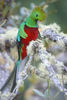
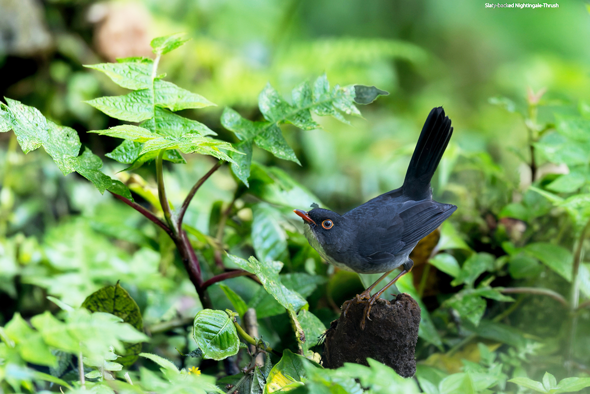
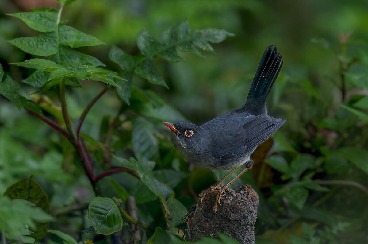
Is this image too dark
Jan 17, 2023 17:40:52 #
linda lagace wrote:
I agree with the prior responder. You really need to look at download to appreciate. That said . This is a beautiful picture. I do not think it is too dark but I do think I would have cropped a little more so the focus is really on the bird and his eye and bill. I am not a professional so take it for what its worth. I would have cropped pretty evenly around all four sides. (but not exactly I would adjust so focus is on eye and bill)
Thank you for your thoughts and opinion. Not sure that "not being a professional" is a factor. Your opinion is what counts.
Jan 17, 2023 17:44:13 #
R.G. wrote:
One of the main issues is your intent. Was it a d... (show quote)
Thank for your thoughtful reply. Usually, and also specifically in this image, my goal is to draw attention to the bird. Certainly in some images the background, perch, flower, etc, may steal the show, but that is the exception for me. I do sometimes use desaturation of the BG to help and also blur the BG occasionally. I have not used contrast as much, but I will experiment with that. Again, thanks for your help.
Jan 17, 2023 17:47:35 #
SalvageDiver wrote:
I don't feel the image is too dark, but there is a... (show quote)
Thank you. And you are right-the more I look at it, the more I prefer the original crop. I am not sure, but I think this is a juvenile bird, which may account for the lack of orange in the legs and beak.
You certainly are correct about the contrast adjustment bringing up the separation between BG and bird. Appreciate the effort to show that.
Jan 17, 2023 20:19:50 #

bajadreamer wrote:
My usual "technique" is to brighten the ... (show quote)
 Nice shot. Keep it as it is!
Jan 18, 2023 07:05:06 #

Jan 18, 2023 08:09:48 #
SalvageDiver wrote:
...I also feel that a light vignette helps further guide the viewer's focus to the bird...
I often use vignette in this fashion. A subtle bit of vignette, little enough so that it's virtually unnoticeable, can really make a (centered) subject pop without editing the subject at all.Jan 18, 2023 08:20:10 #

Jan 18, 2023 08:28:04 #

Jan 18, 2023 09:50:59 #

My question is: is the overall image too dark? Any other suggestions?[/quote]
I see what you mean.
I see what you mean.
Jan 18, 2023 10:58:17 #

You have a very good result! I think that Steve Perry would be proud of your efforts. As he cautioned in the video, not every shot is suitable for his recommendations and you always have to struggle to avoid overdoing.
Jan 18, 2023 14:16:19 #

bajadreamer wrote:
....I have not used contrast as much, but I will experiment with that....
As a general rule when subduing a BG it's a good idea to lead with subduing the highlights since they are the most eye-catching parts. Once that is done you'll probably want less of the other subduing adjustments. For my edit below I concentrated on reducing the contrast of the BG, but that needs to be done with caution since if you overdo it you could end up with a bland photo. As a general rule I prefer to err on the side of moderation and subtlety. You'll have your own preferences.
As well as reducing the highlights fully I also lifted the shadows a little since those two adjustments between them have the effect of reducing the overall contrast (as well as increasing the amount of visible detail - but not in an eye-catching way). I also used the Contrast slider for a further drop but it didn't need much. Other subduing adjustments included a little negative Clarity and negative Sharpening (going left with the sliders) plus generous amounts of denoise. All three of these adjustments have a softening effect. In this case only a very small amount of negative Saturation was needed (reducing the Contrast has a desaturating effect).
Other tweaks worth trying include using the Temp slider to give the BG a very slight blue tint (warm colours advance, cool colours retreat) plus using the HSL tool to subdue or enhance any problematic colours that aren't responding favourably to the global adjustments. Conversely, if you select the main subject/s you can give them a slight WB shift towards yellow (emphasis on the "slight"). Obviously whatever you do to subdue the BG you can do the opposite to emphasise the main subject/s.
.
Jan 18, 2023 14:57:57 #

bajadreamer wrote:
My usual "technique" is to brighten the ... (show quote)
IMHO, the lighting balance of the bird and its immediate background is very good. However, a large bright space on left side of the image diverts attention of a viewer from intended subject, the bird. But that’s just me, Baja!
Jan 18, 2023 16:11:46 #

Jan 18, 2023 16:12:47 #

bajadreamer wrote:
My usual "technique" is to brighten the ... (show quote)
I think it's superb the way it is 💎💎💎💎💎
Jan 18, 2023 19:06:22 #
I'm a big believer in leaving well enough alone!!! All this finagling of photos leaves me cold! The original photo (if that's what it is) is great. I wouldn't change a thing. This is from someone who uses only Picasa for post processing. And as little of that as I can get away with. To answer the question directly, No it's not too dark, it's perfect!
If you want to reply, then register here. Registration is free and your account is created instantly, so you can post right away.