Six Essential Typefaces
Nov 30, 2022 17:12:37 #

StanMac wrote:
Look at Directive Four, Ethnocentric, and Orbitron, which are included in my version of Word. They have a similar look to a Star Trek font.
Stan
Stan
Oh, I have Trekker, Sleepy Hollow, Snowy Caps, and a few other non-standard fonts installed on my system.
Nov 30, 2022 19:56:17 #

Nov 30, 2022 20:57:14 #

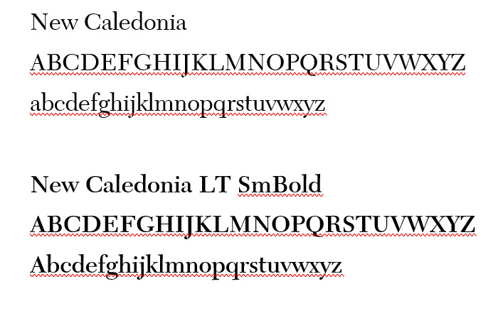
Years ago I came across a typeface called New Caledonia.
It was used in a Michael Crichton book
I don’t know if it was M.C. or the publishers but each typeface they used in his books was explained in the back of the book.
Very classy. Very easy to read. Similar but different enough from times new Roman.
Ive had it on every computer I’ve owned. Not easy to come by.
I’ll try to show a sample if I get on my computer tonight or tomorrow.
Also love a typeface called Libra.
Dec 1, 2022 00:35:35 #
drucker
Loc: Oregon
Don't worry about Futura and Helvetica — Arial will do just fine and it will be on virtually every computer. It was designed especially for the computer and readability on the screen.
I spent 60+ years in the printing industry with nearly all of that time spent in various areas of typography, type design, and using various machines over the years that created the finished type we used in books, magazines, and all sorts of other printed materials. In the later years we had to take screen legibility into consideration because much of the material had dual usage.
In the heyday of phototypesetting machines, each company had to create their own library of fonts that fit the requirements of their machine's capabilities. Usually this was just by copying and renaming — a font name could be copyrighted but the actual design of the letters could not. Thus, Helvetica became Helios, Times Roman became English Times, Americana became American Classic, etc.
The typographical world changed again with the advent of the Personal Computer (PC) and Adobe's introduction of Type 1 fonts followed by TrueType fonts and later OpenType fonts. Fonts have moved from physical shapes in metal and drawn on paper to shapes described by a computer program and those shapes can be infinitely manipulated by other computer programs to create what we see on computer screens and translates to hard copies by laser and inkjet printers.
Type design has become a major industry with type artists creating thousands of new designs each year. Many are created for exclusive use by one company as part of their brand identity, many others are basically copies of standard fonts with a few subtle changes with little or no improvement. Then there is the vast number of unique scrips, hand-lettered styles, and funky shaped alphabets that provide so much variety and uniqueness to advertising and product label design. The OpenType format allows for many variations of each character plus accents and unique characters for multiple languages to be included in a font that are accessible by programs designed to use them.
It's a bit hard to believe but over the years I've collected over 60,000 different fonts and maybe deleted that many more because they were just bad copies of other fonts. Even yet the inventory contains many virtual duplicates. In reality I keep about 20 of my favorite type families on my computer and all of the six but Futura are among them.
Dec 1, 2022 00:58:40 #
drucker
Loc: Oregon
Caledonia and Caledonia Italic was designed for the Linotype company in 1938 and the Bold and Bold Italic came a little later. It was and is a popular font for books. New Caledonia is a slight redesign for computer use. If I remember right the change was mainly in the italics. Linotype mats require that the regular and italic letter be exactly the same width. Computer fonts do not have that requirement and letters like the lowercase "f" can have a little more swash on the descender and extend slightly under the adjoining letter which isn't possible on the solid Linotype matrices.
I too like Libra and have it in the original letterpress lead type that I can use for printing, foil stamping, and bookbinding.
I too like Libra and have it in the original letterpress lead type that I can use for printing, foil stamping, and bookbinding.
Dec 1, 2022 01:13:47 #
RodeoMan
Loc: St Joseph, Missouri
I think that there was more of a general interest in typefaces when, in order to produce a book type had to be set, first on a printing press and later on a linotype machine. If you, Jerry or any other readers of this have any books published by Alfred A Knopf check the page in the book that has print. There will be a brief history of type used and why and also information about who designed the book and who printed and bound it. I believe Knopf was the only commercial publisher that did this for trade editions but could be wrong about that. The most important function of the typeface is to facilitate the transmittal of what the author has on the page to the mind of the reader in the most enjoyable and efficient manner. This short page of information about the printing history of a book is known as the COLOPHON. After browsing the colophons in several of my Knopf books, I am not convinced that we would be served by a reduction in the number of fonts available for people to use even more than I would think we should reduce the number of focal lengths available to photographers . If that fellow feels that six fonts are plenty, the fine, let him limit himself to those.
Dec 1, 2022 11:06:16 #
Here is a sample of New Caledonia I mentioned yesterday. I seem to have lost Libra.
Dec 1, 2022 12:46:00 #

Dec 1, 2022 13:25:39 #
Dec 1, 2022 14:48:53 #
Sendai5355 wrote:
Still prefer Arial.
Alafoto wrote:
I'll stick with Arial.
This is why I don't like Arial.
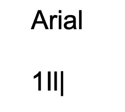
There are 4 characters in the second line. The characters are (number) one, (upper case) I, (lower case) L, and solidus (|). The number one is clearly distinct in Arial (not the case in all sans-serif typefaces) because a serif is added, but the next three characters are extremely similar. If any of them appeared as a single character, there is no real way to tell which character it is. If we are talking about text, you can infer which character it might be from the context, but a typeface should be useful for things other than just text.
Dec 1, 2022 19:50:06 #

jerryc41 wrote:
Most people erroneously call them fonts, but they ... (show quote)
When I was still working, often our company or our customer would specify a font for documents. Sometimes, in a proposal, where a page limit, and margins, was specified but a font not specified I used “Arial Narrow” to pack as much in a page as I could. At home, I find myself often using “Georgia” (I guess because I live in live in Georgia). When I want to be careful documenting passwords, I use “Consolas” as it makes it easy to distinguish O from 0 (zero) in a password since it slashes the zeros.
Dec 2, 2022 15:23:54 #
lnl
Loc: SWFL
Regarding Arial and other sans serif typefaces: my user name on UHH is lnl, which I entered initially as lower case. It stands for Ellen L. Many people respond to me here as Inl. I guess I should have thought of that.
Dec 2, 2022 17:51:01 #

jerryc41 wrote:
Most people erroneously call them fonts, but they ... (show quote)
The 6 essential typefaces are the 6 that the artist/designer likes best!
Dec 2, 2022 18:55:47 #
DebAnn wrote:
The 6 essential typefaces are the 6 that the artist/designer likes best!
So I like:
Times New Roman
Lucida Handwriting
Courier Monospace
That leaves me 3 openings for essential typefaces.
I have on occasion used other typefaces for special purposes but I can't call them essential if I only use them for ephemeral purposes.
I use special symbols for special things. I don't include them in my essential typefaces.
Dec 5, 2022 09:03:45 #
RichieC
Loc: Adirondacks
The fonts you list are all old. It's not a bad thing, new ones suck often. Spacing between letters, missing or limited ligatures or no glyphs at all. So I had to take a class in fonts, studied all of this. In my line of work as a Art Director, designer, I use type every day, I collect them... I have over 5,000- and this isn't unusual in my line of work. Most fonts are crap, but I have to open a document with a certain font, or match a font in a logo. etc. etc.
ANYWAYS, your font list were designed for letterpress printing– Ink applied to shaped letters then pressed into paper, or later, using oil/water/rubber blankets using plates exposed to a lithographic photo negative of the fonts. They were painstakingly created by hand by true masters, and are well thought out- and stand the test of time. So in this case, "old" isn't a detriment IMHO.
Century, of which Century Expanded is a version, ( Century schoolbook, Century Roman, and later New Century Schoolbook,) are originally 100 years old. The trouble with online use and electronic printing, is the technology... depending on the printer, it can only lay down a size bit of toner, or on your screen, a pixel. Where a serif narrows down to a point, a letterpress (ink) is infinite- it will print right down to nothing... where the computer/printer has to decide where the last bit of toner or antialiased tint of pixel will fall. Antialiasing is how your computer fools you into seeing sharp details, or a border that falls between pixels... it makes a row of pixels a tint. At a distance, your eye sees it as a sharp edge.
Anyways, there are fonts designed specifically for monitors and electronic printing. They reproduce the best o for certain uses. When using specific fonts online, you can add in the code the address for free online fonts. ITs easy to learn and add. You go to google fonts and choose the ones you wish to use, it writes a block of code that you copy and paste into the head of your web page... When someone goes to your page, they see the font you wanted them to see... Solves the font not available issue for most online uses.
Cheap ink jets are the worst, high end electronic printers are very fine, 3400 dpi... and can print very crisp tiny details. Even 600dpi can do a decent job. For awhile, old fonts looked bad... now except for online use... its all good.
Century variation New Century Schoolbook is a font specked by a client of mine. They had an ad agency spec it for them to create a consistent look throughout their publications... same with certain PMS colors and logo uses.. In their expensive write up, which all took place around year 2000, they touted it as ( and I quote) "a modern typeface for the new century". Then they specked an orange for their logo. People that know, know a consistent orange is one of the hardest colors to reproduce consistently in CMYK printing. A 1% off in yellow or magenta, and the shade varies widely. Meaning a fifth color is often necessary- making all print jobs way more expensive. Or you print for the orange, and peoples faces look weird... anyways I digress. Back to the font... If they knew what they were talking about, they'd know it was updated for electronic use in 1980, but is based on a font created for "The Century Magazine" in 1918... the "Century" they referred to was the 1900's I found this all quite hilarious... but they have over a billion in the bank and pay well, so whatever they want :)
BY the way: UH uses Verdana, designed in 1996 note how easy it is to read, and how clean the letters are.. I found this online:
"The Verdana font was released in 1996, so it's a modern typeface. It was designed with one purpose in mind: to improve readability in text used very small on a computer screen. Microsoft included Verdana as part of its Windows operating system, and so did Mac."
If you want to reply, then register here. Registration is free and your account is created instantly, so you can post right away.