Please critique
Nov 14, 2011 20:10:54 #
Nov 14, 2011 22:43:15 #

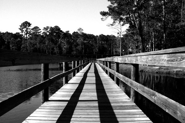
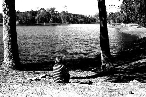
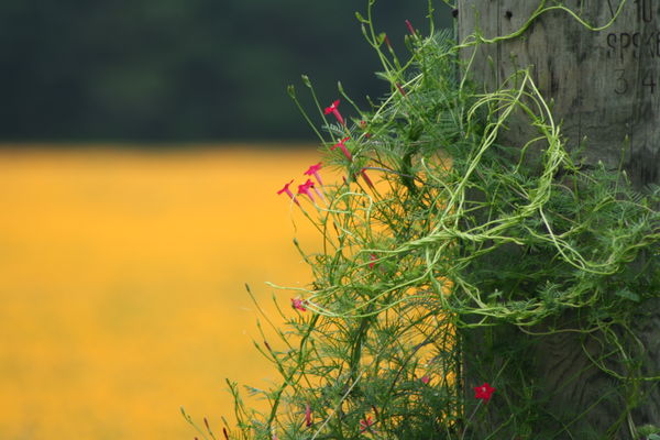
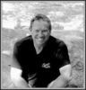
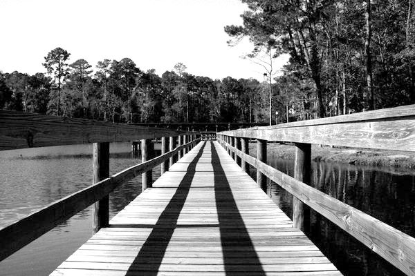
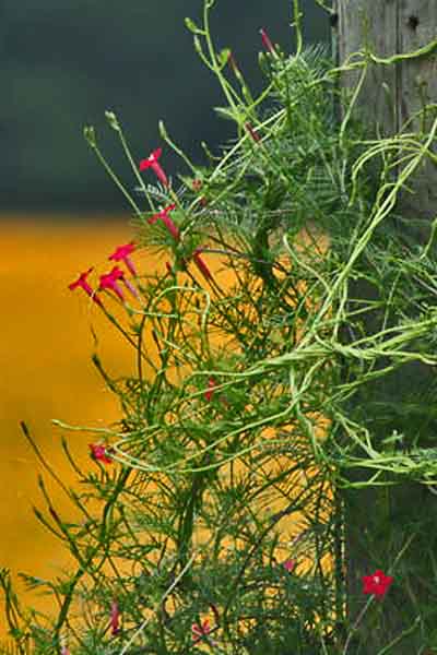
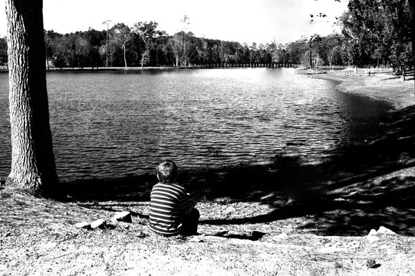
Nice perspective in the first shot. In the second shot, those two trees flanking the subject seem odd...like goal posts. I would try to crop out the tree on the right so that the lake edge feels like it goes to infinity. That would also bring the focus back to the little boy instead of the two very large trees. The third shot is a little too balanced side to side. Try cropping in from the left a bit and see how it feels. I would've like to see more of the blossoms, but that tangled up stuff is cool. Nice shots.
Nov 14, 2011 22:59:53 #
I think a little fill light helps to see the railing on the left.....too much shadow..... for #3 just to far away to be interesting. the wood contrast is good. (get close enough for detail) nature loves to show off.....show it.
Nov 14, 2011 23:08:42 #
shoot4fun
Loc: Pueblo West, CO
The converging lines on the first picture makes for great composition in this shot. Almost the feel of an Ansel Adams photo. Personally, I would crop the tree off of the left of the second picture so it looks like the boy is gazing off into infinity. Also, the right side has more visual appeal.
Nov 14, 2011 23:36:02 #
Greg-Colo wrote:
I think a little fill light helps to see the railing on the left.....too much shadow..... for #3 just to far away to be interesting. the wood contrast is good. (get close enough for detail) nature loves to show off.....show it.
I agree. Nice adjustment.
Nov 14, 2011 23:41:13 #
Jeanne wrote:
Nice perspective in the first shot. In the second... (show quote)
I agree with the cropping. The subject is in only about half the frame. I did a version cropping to portrait, sharpening, and adjusting the shadows and highlights.
portrait, sharpen, shadows, highlights
Nov 15, 2011 09:07:50 #
shoot4fun
Loc: Pueblo West, CO
The cropping give the picture more of a focal point; however, I liked the letters carved into the tree - top right on the original - they added a sense of mystery.
Nov 15, 2011 09:13:44 #

Jeanne and I are in agreement with the second shot: Goal-posts! I'd keep the darker one on the right and crop out the left one...
The third one: I understand the idea, but the clarity and color is off. I love the lettering being left in and if cropped at all, would have taken a smidgen off the left, not the right! Leave some contrasting yellow background there but maybe not as much as you have here.
The third one: I understand the idea, but the clarity and color is off. I love the lettering being left in and if cropped at all, would have taken a smidgen off the left, not the right! Leave some contrasting yellow background there but maybe not as much as you have here.
Nov 15, 2011 09:52:41 #
Thanks for the comments. I will definately relook at these and do some more editing work. 8-)
Nov 15, 2011 10:32:02 #
shoot4fun wrote:
The cropping give the picture more of a focal point; however, I liked the letters carved into the tree - top right on the original - they added a sense of mystery.
Excellent point. A square crop could work.
square crop
Nov 17, 2011 14:30:23 #
whoroba
Loc: Utah
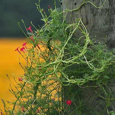
I edited the second phto to get rid of some of the distraction tried copping but did not work
Edited photo
Nov 17, 2011 16:09:07 #
DRON wrote:
Excellent point. A square crop could work.
shoot4fun wrote:
The cropping give the picture more of a focal point; however, I liked the letters carved into the tree - top right on the original - they added a sense of mystery.
Excellent point. A square crop could work.
Nice crop Dron, done did good.
Nov 17, 2011 16:09:52 #
whoroba wrote:
I edited the second phto to get rid of some of the distraction tried copping but did not work
I like this better, nice job on the crop.
Nov 17, 2011 16:10:59 #
Greg-Colo wrote:
I think a little fill light helps to see the railing on the left.....too much shadow..... for #3 just to far away to be interesting. the wood contrast is good. (get close enough for detail) nature loves to show off.....show it.
You did this one justice Greg, like it
Nov 17, 2011 21:33:30 #
whoroba wrote:
I edited the second phto to get rid of some of the distraction tried copping but did not work
Thanks. I am using corel paintshop photo pro x3 and still learning how to do some things. It is not the friendliest program, but hind sight is 20/20 and spent too much on it not to use it.
If you want to reply, then register here. Registration is free and your account is created instantly, so you can post right away.